|
|
Home | Audio | DIY | Guitar | iPods | Music | Brain/Problem Solving | Links| Site Map
This work is licensed under a Creative Commons License.
Designing with CSS – Part 2: Defining style properties and working with floats
Adobe
Adrian Senior
www.webade.co.uk
www.communitymx.com
www.ukcsstraining.co.uk
Created: 16 April 2007Welcome to the second part of this article series on CSS design concepts. If you missed Part 1, you can return to the beginning by following the link below:
Designing with CSS – Part 1: Understanding CSS design concepts
Part 2 of this series continues on from the topics covered in Part 1, as we examine how you can use Dreamweaver CS3 and CSS positioning to create layouts in your site pages. In Part 1 of the tutorial series, we reviewed how the included CSS templates in Dreamweaver CS3 allow you to create page layouts in just a few clicks; this is very different to the workflow used in earlier versions of Dreamweaver.
Requirements
To complete this tutorial you will need to install the following software and files:
Dreamweaver CS3
Sample files
Prerequisite knowledge:
This tutorial focuses on working with Dreamweaver CS3 to create site pages formatted with CSS styles and assumes you are familiar with working with both the Internet Explorer and Firefox browsers. (Other browser options: Safari, Opera, Flock, Google Chrome, or compare browsers.) This is Part 2 of a six-part tutorial series—be sure to review Part 1 of this tutorial to understand the concepts discussed in that section before continuing.
Removing default properties and values
Browsers apply default values to block level elements; unfortunately these default values are not consistent. These default values can, and do, vary greatly from browser to browser. With this in mind, we will create a CSS rule in our style sheet that will remove all the default values. This is an important first step, because without removing the default margin and padding values, the layout of the XHTML page will not display the same when viewed in different browsers. It is a best practice to always use this rule to "zero out" the default values, so that your page design is based on a standardized view, no matter which browser is used to view it. As you begin developing web pages with Dreamweaver CS3 that are formatted using CSS, remember to add this rule to every new page you create, because it may not be included in the default style sheet that is generated with your selected layout. As a general rule, removing the default properties and values inherent in the various browsers is not absolutely mandatory, although adding this rule does provide greater control. However, you must remember to specifically set margin and padding values for any page elements that require them.
To remove the default properties using the most efficient code, we will group selectors together. This is a new concept that is described in detail in the demo below. By grouping the selectors, we can create a single CSS rule that uses the wildcard selector to zero off all the default values. The wildcard selector is denoted with the asterisk symbol: *. The wildcard means "all"—which is a powerful way to refer to all page elements (body, etc.) at once. Remember that the order in which you list the rules in your style sheet is very important. The rule to remove the default values and start your design from a "zeroed out" space should always be the first rule in your CSS page. You could encounter odd display issues if the rule was placed below other rules, because when the browser "reads" the rule it would zero out all of the padding and margin values that were set in the rules that preceded it in the style sheet.
Here are the steps reviewed in the demo:
- Download the sample files provided in the first page of this tutorial
- Open the following files in Dreamweaver CS3: twoColElsLtHdr.css (which is located in the CssFiles folder) and index.html
- Make sure you are working with the CSS style sheet: twoColElsLtHdr.css
- Place your cursor at the top of your style sheet, directly below the utf-8 declaration, and press Enter twice to make room for the new CSS rule
- Type the wildcard selector and the opening curly brace, then press Enter: * {
- Type the following line of code, then press Enter: margin: 0;
- Type the following line of code, then press Enter: padding: 0;
- Type the following line of code, then press Enter: border: 0;
- Type the closing curly brace to complete the CSS rule: }
- This rule deletes the margin and padding values that already exist in some browsers, ensuring that the page is displayed using only the values set in the CSS rules that follow this rule
- Save the CSS page
In the steps above, we used the wildcard selector to remove all the default values from all page elements. It is highly recommended that you add this rule to any new CSS page you create, because it is very helpful in eliminating issues that you may encounter when troubleshooting the display of your page layouts. Now that we’ve removed the default values and reset every element to zero, we can begin the next task: adding specific values for the margin and padding for each element, to set the desired spacing.
To achieve this goal, we’ll use the interface within Dreamweaver CS3, specifically the CSS Panel and we’ll edit the index.html page while working in Design view in the Document window.
Here are the steps reviewed in the demo:
- In Dreamweaver CS3, make sure the file index.html is active in the Design view of the Document window
- Select Window > CSS Styles to open the CSS Styles panel
- Click the New CSS Rule button
- In the New CSS Rule dialog box, select Tag as the Selector Type
- Select P from the drop-down menu to the right of the Tag field to select the <p> tag
- Ensure that twoColElstHdr.css is the file selected to define the <p> tag rule
- Click OK
- In the Category column, select Type (if it is not already selected)
- In the Size field, enter the value: 80
- In the drop-down menu immediately to the right of the Size field, select %
- Click OK
- Review the content of index.html and notice that the text size has adjusted to the new size setting
- Return to the CSS Styles panel. The style created for the p is selected. Close the Font option and select the Box option
- In the Box option, in the margin field, enter the value: 1.5em 0
- Be sure to include a space between the values as you type them
- These are pair values; 1.5em will be applied to the top and bottom margins, and 0 will be applied to the left and right margins of all <p> tags
- Click on the index.html file to refresh the display in Design view
- Notice how the page updates to reflect the new margin settings
- If you’d like to see the CSS rule generated by the changes made to the CSS Styles panel, look at the code in the twoColElsLtHdr.css file to see the new CSS rule for the <p> tag. It will look like this:
p { font-size: 80%; margin: 1.5em 0; }- Save the twoColElsLtHdr.css file
In the instructions above, we entered a value of 1.5em for margin setting for the <p> tag element. You may be wondering why the "em" measurement value was used rather than another form of measurement, such as %. The em measurement is a relative value, and it is a good practice to use the em measurement setting to ensure that the various elements on your page scale proportionately. If you’d like to see how this works, experiment with changing the font-size value, and notice how the top and bottom margins on the p element increase proportionally with the size of the text.
Inheritance and specificity
In the exercise above, we created a CSS rule for the <p> tag element to define both the text size and the margins that surround text that is inside <p> tags. When you look at the index.html page, it may appear as though the CSS Layout already has a defined font—even though we haven’t set one. This is due to inheritance. When a CSS style is set, it will affect the element itself, as well as any other page elements within it. In this case, the <p> tag surrounds all of the text elements on the index.html page, causing the text to display differently when different values are set.
Let’s examine how inheritance works. To follow along with this next exercise, launch Dreamweaver and open index.html with the Document window set to Design view. Also, if it is not already open, access the CSS Styles panel by selecting Window > CSS Styles.
- At the top of the CSS Styles panel, click the All button to see all the styles.
- If the list below shows only twoColElsLtHdr.css, click the arrow to the left to expand the list of styles. Select the body rule.
- The properties section of the CSS Styles panel updates to show the values of the body rule.
- Click the Color Picker next to the Color property. Select a red color.
- Notice that the text content in index.html is now displayed in red.
In this example of inheritance, the text is inheriting its color value from the body property. If you look at the CSS Styles panel again, you’ll see the body has its font property set to 100% Verdana, Arial, Helvetica, sans-serif. Since the body surrounds all of the other elements on the page, changes made to the CSS rule for the body will cause all other elements to inherit the same styles throughout the page.
- Select the Color Picker again and select black.
- All of the text now returns to black.
- Select the P rule in the top section of the CSS Styles panel.
- Expand the font section by clicking the plus sign (+).
- Click the Color Picker next to the Color property. Select a blue color.
- All of the text that exists within p elements is now displayed in blue.
- Notice that all other text (not surrounded by <p> tags) remains black.
- Change your p element text back to black
- Save the CSS page.
In the example above, we’ve seen that when you add a color specifically to the p element, it overrides the inherited color of black that was applied to the body rule. This is the basis of specificity, where the CSS rule applied to a tag that is most specific to a page element overrides the inherited values of other CSS rules. In this case, the color setting on the p rule is more specific to the text than the color setting on the body rule. That is why settings made to the p tag override the inherited settings of the body tag. This is an important concept when working with CSS, and you can use this to great advantage when developing your style sheets. It is also critical that you understand how this works, because it will help you troubleshoot your CSS rules as you design them.
To learn more about inheritance, see the Developer Center article, Understanding Inheritance. To find out more about how specificity works and how to use it to your advantage, read Understanding Specificity.
Scaling font sizes
In the previous exercises, we examined how creating a CSS rule for the body with a default font-size of 100% resulted in all of the text to be displayed at 100%. Since the body is the element that surrounds all other elements, the body settings become the default for the entire page, if no other CSS rules are set. Then we added a CSS rule for the p tag with a font-size of 80% for text display. The CSS rule for p is literally stating that the text should be 80% of the default size. Since the body is set to 100%, this means the text display of the font-size is rendered as 80% of the default size, or 80% of 100%. If you change the default font-size on the body rule to 200%, the 80% you set on the p rule increases in size proportionally. Take a moment to try this and see the results, then set the body font-size back to 100%.
Now let’s draw our attention to the headers on the page. At the moment, they look a little too big for the page, because we’ve scaled down the font size of the p element. Let’s fix this now, by setting specific font sizes for each of the headers. This is the topic of the next demo.
Here are the steps reviewed in the demo:
- Click the text in the Main Content heading to select the <h1> header.
- Click the New CSS Rule button.
- The New CSS Rule dialog appears and the Selector field is already populated with the descendant selector that corresponds to the <h1> tag for the Main Content header.
- Double-check that the field next to Define in: contains the CSS file twoColElsLtHdr.css.
- Click OK.
- In the New Rule Definition dialog box, enter the following value into the size field: 150.
- In the drop-down menu to the right, select %.
- Click OK.
- The Main Content heading updates and its size is scaled in relation to the default size set in the CSS rule for the body.
- Save the CSS page.
Repeat this process for each of the remaining headings, using the values shown below:
- Set the <h1> tag in the header to 150%
- Set the <h2> tag in the lower content area to 125%
- Set the <h3> tag in the sidebar to 115%
Experiment with creating new CSS rules, and then reset the values using the property settings in the CSS Styles panel. This workflow allows you to establish the CSS Rules needed by selecting each element in the Design view of the Document window, and then makes it easy for you to adjust the settings while looking at the page until you are satisfied with the look of the page.
Grouping selectors
Grouping selectors is an ideal way to avoid writing repetitive styles. So far we’ve set CSS rules for three of the six available heading options; we’ve not yet specified the font sizes for h4, h5 or h6. It is likely that we’ll want to use these elements in our design at some point in the future, so let’s set the size for them now. Since we want all of the headers to display at the same size, we can create a CSS rule that uses a grouped selector to hold the property and value. In this example, we’ll set the font size of all three headers to 105%.
h4, h5, h6 { font-size: 105% }A grouped selector contains two or more selectors. A comma separates each selector.
Here are the steps reviewed in the demo:
- Click the New CSS Rule button.
- In the New CSS Rule dialog box, delete the contents of the Selector: text field.
- Type: h4, h5, h6 into the Selector text field, (note the commas and spaces).
- Double check that the CSS style sheet is selected in the Define in: field.
- Click OK.
- In the CSS Rule Definition dialog box, enter the following value into the size field: 105.
- In the drop-down menu to the right, select %.
- Click OK.
- Look at the new rule in the style sheet.
- Save the CSS page.
Understanding the height property
The height property is an area that can often cause confusion when first designing CSS layouts, so the next exercise is designed to demystify how it works. In the sample files for this tutorial, you’ll find a page called height.html. Open this page in Dreamweaver, with the Design view setting in the Document window. The height.html page contains a <div> tag with an ID of "BlueBox" that has a fixed height of 100px. The CSS rule that defines the height of the <div> tag is in the <head> section of the height.html page. It is also shown below:
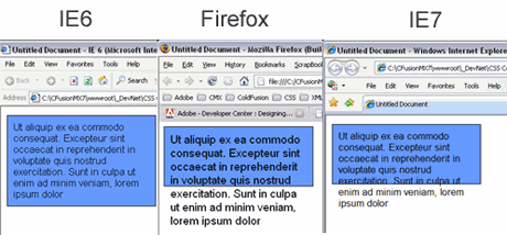
#BlueBox { background: #6699FF; height: 100px; width: 250px; border: 1px solid #000000; }If you preview the page in Internet Explorer 6 and increase the text size from the browser’s view menu, you will see that the blue box expands to hold the content. Repeat these steps again using both Internet Explorer 7 and Firefox, and you’ll see that text flows outside of the blue box, which is the expected behavior. This is a perfect example of how the same page can look different when viewed in different browsers. In this case, the IE6 browser automatically increases the height of the box to encapsulate its contents, which is not representative of the CSS rule applied to the <div> tag. Fortunately, this issue was resolved in IE7. In the newer version of Internet Explorer, the <div> tag respects the properties set by the CSS rule and does not display the blue box larger than the applied settings, (see Figure 1).
Figure 1. The same page looks different when viewed in different browsers. Increasing the text size in IE6 causes the blue box to expand, which is not the expected result.
It is important to be aware of these browser differences, since IE6 renders the height property differently from other browsers. This is not to suggest that you avoid setting specific height values for elements on the page. Rather, this exercise is designed to show the importance of double checking your work by viewing the page and initiating changes in font size in various browsers before publishing, to ensure that the site layout displays acceptably in all situations.
Working with floats
The float property allows you to move a floated element either to the right or to the left within its parent container. The float property is very useful and once you learn to use it, it is likely you will use it frequently when designing CSS layouts. Let's start by examining how to float images within a p element. It is a common practice—at least for me—to set up two generic float classes. This is a design convention I use on every site I build. One class floats elements to the left; the other floats them to the right. When you use Dreamweaver to create your CSS layout, the code generated looks like the examples below:
.fltrt { /* this class can be used whenever you wish to float an element to the right side of the page. The floated element must be placed above the element that will display next to it in the source code. */ float: right; margin-left: 8px; } .fltlft { /* this class can be used whenever you wish to float an element left on the page */ float: left; margin-right: 8px; }As we discussed in Part 1 of this tutorial series, all class selectors begin with a period.
The sample files provided at the beginning of this tutorial contain a folder named images. Inside this folder you’ll find an image file called bmw.jpg. This image of a car will be used to demonstrate how images can be floated to the left and the right within a container (the p element).
Here are the steps reviewed in the demo:
- In Dreamweaver, open the sample file named index.html and select the Design view setting for the Document window.
- Place your cursor immediately to the left of the first letter of the top section in your main content area, right before the paragraph of text below the Main Content header.
- Click the Image button in the Insert bar tab.
- In the Select Image Source dialog box, navigate to the source files images folder.
- Select the only image in the folder: bmw.jpg.
- In the Image Accessibility Attributes dialog box, enter a short description into the Alternate text field, such as BMW.
- Click OK.
- The image is inserted into your page.
- With the image selected, right-click on the image tag in the Quick Tag Editor.
- In the drop-down menu, select Set Class > fltrt.
- Note that the image moves to the right side, and the text flows around it.
- Repeat this process to add the same image to the lower content area, but this time after selecting <img> in the Quick Tag Editor, select Set Class > fltlft.
- Note that the image moves to the left side, and the text displays to the right of it.
- Save your XHTML page.
When you float an element, you are effectively removing it from the document flow. This allows the other elements on the page that are placed directly below to move up alongside and when possible flow around the floated element. Applying the float class to an image allows the text to flow around the image; a floated image can be imagined as an element that has been removed from the document flow.
For more information on the document flow, please read the introduction to the Developer Center article I wrote, An introduction to CSS positioning. Although the article was written for Dreamweaver MX 2004, the information provided is still relevant—the article discusses working with CSS rather than the specific Dreamweaver version.
Where to go from here
To learn more about CSS design techniques, especially if you want to learn to make your pages accessible to the Section 508 and WAI specifications, check out the CSS template that is available from the Community MX site, in the section CMX JumpStarts, called Paris. If your sites require Section 508 compliance, this template is a very useful tool, as it provides a foundation to build upon, and it contains helpful guidelines for building your sites. The template was designed as a learning guide, and can be used over and over again as a starting point for your site projects. The template design is the first in a series, so be sure to check the Community MX site to find other helpful CSS templates.
Once you feel comfortable working with float classes and have had a chance to experiment with the concepts presented in this part, get more information about CSS design best practices and techniques in Part 3 of this six-part tutorial series: Designing with CSS – Part 3: Using CSS for site layout.
About the author
Adrian Senior owns the UK-based web design agency Webade, which has been in business since 1998. He is also a member of Team Macromedia and a partner at Community MX. The year 2004 saw Adrian's first trip to America, where he visited Orlando and delivered two sessions at the TODCon conference. Adrian also provides training courses for companies who need to train their designers how to build compliant, accessible web sites using CSS and xhtml. He's been married to his wife, Janette, for 24 years and has two children, Antony and Eleanor.Home | Audio | DIY | Guitar | iPods | Music | Links | Site Map | Contact
