|
|
Home | Audio | DIY | Guitar | iPods | Music | Brain/Problem Solving | Links| Site Map
This work is licensed under a Creative Commons License.
Designing with CSS – Part 1: Understanding CSS Design Concepts
Adobe
Adrian Senior
www.webade.co.uk
www.communitymx.com
www.ukcsstraining.co.uk
Created: 16 April 2007This is the first in a series of tutorials about working with Cascading Style Sheets (CSS) using Dreamweaver CS3. In Part 1 of this series, we’ll begin by covering basic CSS usage and site structure information. We’ll discuss common issues that come up when working with CSS, as well as provide information on using shorthand and longhand versions of the CSS syntax.
With the release of Dreamweaver CS3, working with CSS layouts has never been easier. This six part series of tutorials is designed to give you the information you need to utilize the latest enhancements to Dreamweaver and take your web development projects to the next level. Part 1 and 2 of this series offer a solid foundation of how CSS works. Once you have the basics down, you’ll move on to Part 3 to begin creating a simple but effective CSS layout—using the new design layouts available in the New Page dialog box. By following the instructions provided in this series of tutorials, you can take advantage of the excellent new features available in Dreamweaver CS3.
All of the lessons that are covered in this series of tutorials come with sample files that you can download at the beginning of each part. Use the sample files as the basis for your own projects, or keep them as a resource to review as you follow along with the instructions. For clarity, the site structure referenced will remain the same throughout the entire series. If you’d like, you can keep an identical structure of the sample site files on your local hard drive for easy reference as you complete each part.
Creating a Cascading Style Sheet
Before we get started, it is important to look at why using CSS for site projects is a good idea. Using font tags embedded within the HTML page to control the look of the text is an obsolete web design tactic. By default, Dreamweaver CS3 uses styles rather than font tags to redefine the appearance of your text content. Going forward, it is best practice to take advantage of the new features in Dreamweaver and use CSS styles, rather reverting to the old method of defining text formatting using font tags. Let me explain why. After providing some background on the future of web technologies, you’ll see why switching to CSS will not only improve your designs but will also make the process of updating and maintaining sites much easier in the long run.
To begin with, font tags are deprecated, which means they may not be supported by browsers in the future. Font tags are no longer a part of the XHTML specification. That is a good enough reason not to use them, because at some point older sites using font tags for text formatting will not display correctly.
The real problem with font tags begins as soon as your design client requests changes. Maybe the font color needs to be changed or perhaps they request that the font face changes from Verdana to Arial. If the site content is formatted using font tags, making these types of changes can take a huge amount of time. By contrast, you can make changes such as these—and indeed far more complicated changes—in a very short time by editing an external style sheet. By using an external file to control the text, document and layout elements, you can apply site wide changes instantly. In addition, sites using CSS styles result in easier document manipulation and lighter, faster-loading pages. There are many benefits to using CSS.
In previous versions of Dreamweaver, it was necessary to have an advanced understanding of CSS to create your own designs. However, with the release of Dreamweaver CS3 this is no longer the case. Dreamweaver CS3 provides you with just about every conceivable option for a layout, and they are all available to you with just a few clicks. You may be thinking that you still need to know CSS in order to understand what is going on and have a clear concept of what the CSS styles are doing within the layouts. That is absolutely correct, and that is the purpose of this series of tutorials.
Dreamweaver CS3 goes even further than just providing you with layout options. The generated CSS for each of these new layouts is commented, so that you can read your way through the style sheet to see exactly how specific rules affect each individual layout. This is a huge step, because it opens up new opportunities for developers who are new to CSS, and it makes it easy to get started using CSS styles for formatting and layout.
Getting started with CSS
Let's start at the beginning of the CSS trail and look at the methods available to you when you want to apply a Cascading Style Sheet to your HTML documents. You can use an external style sheet, an embedded style sheet, or inline styles. External style sheets are best because they give you the most control over your styles. Many developers also find it easier to use external files, because then the formatting is separate from the contents of the web page. The New Page dialog box in Dreamweaver CS3 enhances this process. We’ll discuss some of the options available in the upcoming sections of this tutorial.
Using an External Style Sheet
By using an external (linked) style sheet, you exercise global control over the appearance of every page in your site that is linked to that CSS file. This is most powerful way to use CSS. By using a linked style sheet, you have the ability to make site wide changes on any number of pages by simply making changes in a single location. Major site updates can be completed in what may amount to no more than a few seconds' work. Powerful indeed!
Dreamweaver CS3 offers functionality that differs greatly from the previous version. Let’s explore the New Page dialog box now.
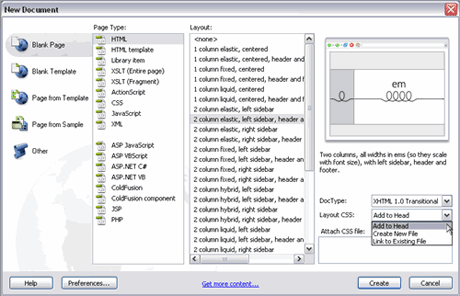
- Select File > New or press Control-N to open the New Document dialog box, (see Figure 1).
Figure 1. The New Document dialog box in Dreamweaver CS3
In the left column there are five options:
- Blank Page
- Blank Template
- Page from Template
- Page from Sample
- Other
Clicking on each of these options updates the content listed in the Page Type column. For the purposes of this tutorial, we’ll be concentrating on the Blank Page option. But be sure to explore the alternatives and review the new options that can be found when each option is selected.
- Select the Blank Page option in the far left column.
- In the Page Type column, choose HTML.
- When HTML is selected as the page type, the Layout column to the right updates with an extensive list of layout options.
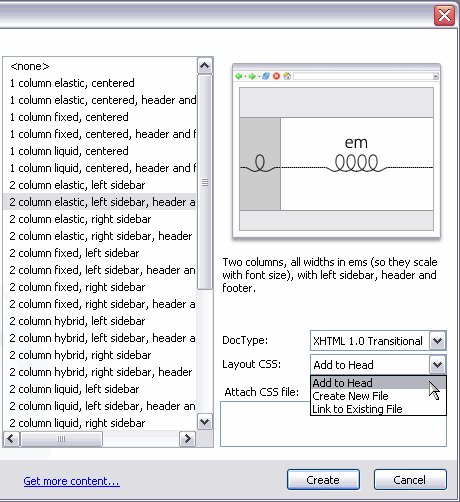
- Select the 2 column elastic, left sidebar, header and footer option, (see Figure 2).
Figure 2. Select the 2 column elastic, left sidebar, header and footer layout option
Notice that a visual display of the page is shown on the top right side, the looped lines indicate the layout’s flexibility. (Some of the other options display straight lines and padlocks to indicate that they are fixed width layouts).
You can select a doc type version from the DocType drop-down menu. For this tutorial, keep the default setting of XHTML 1.0 transitional.
The Layout CSS drop-down menu allows you to select how the layout you’ve selected will be added to your new page. Selecting the option Add to Head will embed the CSS styles directly into the new HTML document. If you want to create a new external style sheet for this new HTML page, you would select Create New File. Or if you are working with an existing HTML page and want to add this new CSS layout code to it, choose Link to Existing File. (In this case, leave the default option of Add to Head).
It’s important to note that you also have the option to click the link icon next to the Attach CSS file option. This feature allows you to link this new CSS layout to another pre-existing style sheet. (The screen shot in Figure 2 does not show the link icon, because it is obscured by the Layout CSS drop-down menu options).
- After selecting the Add to Head option, click Create.
- The CSS layout is automatically generated and displayed in Design view.
You’ve just created a CSS layout with a few clicks. Select the code view button and review the CSS content created by Dreamweaver CS3. This layout will work well in the latest browsers, and the CSS also contains filters that allow the design to render successfully in older browsers as well. This is a huge time saver. If you’ve had any previous experience working with CSS in the past, you are aware that most of the time involved with developing CSS layouts is spent debugging and fixing display issues in older browsers. Dreamweaver CS3 has done this work for you.
And that’s just the beginning. If you examine the code and scroll down to the closing <head> tag of your page, you’ll see a conditional comment immediately above it that resolves certain CSS issues that could cause problems when the page is viewed in Internet Explorer for Windows. The descriptive comments added to the CSS code from start to finish are very helpful and make it easy to understand. The CSS file generated by Dreamweaver is now ready to deploy in your latest project.
Close your page without saving it (unless you wish to save it to a local folder outside of this tutorial to use for your own purposes later).
Creating the site definition
In this section, we’ll set up the site and define it so that Dreamweaver understands the site structure for your project. This tutorial assumes you have prior experience working with Dreamweaver and know how to define a new site. If you are unsure, see TechNote 14028: How to define a site in Dreamweaver.
After you define your site in Dreamweaver and specify the local root folder, create a subfolder inside the local root folder named CssFiles, that exists at the root level of your site.
We’ll now recreate the page we generated using the previous instructions, with one slight change. In step 6 of the previous section of this tutorial, you selected Add to Head from the CSS Layout drop-down menu. This time, select the Create New File option and then click Create.
The Save Style Sheet File As dialog box appears. Navigate to your CssFiles folder (located within your newly created local root folder from your site definition) and save the Style Sheet file there. The CSS file has been pre-named, and you should keep this default name as you save the file.
Next, save your XHTML page in the root of your site’s local root folder. Name the file index.html.
Now that you’ve saved both your CSS and XHTML files, it’s time to take a look at the code in the XHTML page. It should look like the code example below:
<link href="CssFiles/twoColElsLtHdr.css" rel="stylesheet" type="text/css" /> <!--[if IE]> <style type="text/css"> /* place css fixes for all versions of IE in this conditional comment */ .twoColElsLtHdr #sidebar1 { padding-top: 30px; } .twoColElsLtHdr #mainContent { zoom: 1; padding-top: 15px; } /* the above proprietary zoom property gives IE the hasLayout it needs to avoid several bugs */ </style> <![endif]-->
In previous versions of Dreamweaver, the workflow involved creating a style sheet first, and then adding the code to define the XHTML page’s layout and appearance. This is no longer necessary. Dreamweaver CS3 has already completed all this work for us. After just spending a few minutes defining a site and selecting layout options, you’ve created a brand new site project that implements a browser-compatible layout. The included layout options in Dreamweaver have already saved us a great deal of time!
Margins, padding, and doc types
Starting with version MX 2004, Dreamweaver adds a complete doc type to every web page you create. This was another big step in the right direction from Macromedia because an incomplete doc type can cause many problems when working with CSS.
An example of a complete doc type is shown below. In this case, the code displays a Transitional XHTML doc type:
<!DOCTYPE html PUBLIC "-//W3C//DTD XHTML 1.0 Transitional//EN" "http://www.w3.org/TR/xhtml1/DTD/xhtml1-transitional.dtd"> <html xmlns="http://www.w3.org/1999/xhtml">
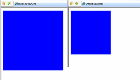
Working with XHTML pages that have an incomplete doc type will cause your browser to go into what is called "quirks mode," (see Figure 3). This will very quickly cause you to lose your hair and your sanity if you are aiming for a pixel-perfect design. Always ensure that your doc type is complete. Following this best practice will save you time when you are troubleshooting display issues when your page is viewed in different browsers. If you are using a version of Dreamweaver prior to MX 2004, you can view the available doc types to use at the World Wide Web Consortium site (W3C).
You should also be aware that if you put any text above the doc type—even a comment—and you viewed the page in Internet Explorer, the browser would go into quirks mode. There is an exception to this rule: You can include server-side code above the opening XHTML doc type tag. Server-side code is, of course, processed on the server and therefore is not returned to the browser in the manner discussed here.
Figure 3. The differences between quirks mode and standards mode can be considerable
The results of adding comments or other non-server-side code above the doc type can be clearly seen in Figure 3. While these changes in the way the browser renders a page may not mean too much to you at the moment, you’ll soon see the importance of ensuring your pages are rendered in standards mode. The smaller box in Figure 3 shows Internet Explorer 7 in quirks mode, while the larger box in Figure 3 shows Internet Explorer 7 in standards mode. In this instance, placing a simple HTML comment above the doc type declaration triggered quirks mode.
Understanding margins and padding
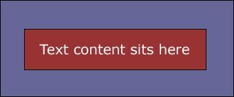
Margins and padding exist within many of the XHTML elements you will use within your CSS design work. A <p> tag is an example of an element that has padding, (see Figure 4). The text located inside the <p> tag is clearly visible and the red area surrounding the text indicates the presence of a padding value. The black border around the red area indicates the boundary of the <p> element. Increasing or decreasing the padding value causes the red area to expand or contract to match the value you provide in your CSS rule for the <p> element.
The purple area represents the margin value. The margin value pushes away other elements surrounding the <p> element, as long as they are in the document flow. (We’ll discuss document flow in more detail later in this series.) Increasing and decreasing the margin value determines how closely the elements surrounding the <p> element are allowed to encroach upon it.
Figure 4. Padding surrounds the text inside a <p> tag, and the margin defines the area within the document that contains the content
So to recap: Padding resides within an element and margins reside outside the element.
The syntax of CSS
CSS is a simple language. It is easy to read and takes very little time to understand the basics and start building your own style sheets. After you complete this section of the tutorial, you’ll have a good understanding of the syntax and various elements that exist within CSS rules. Let’s begin by creating a simple rule that clearly lays out the structure used to specify a CSS rule:
selector { property: value; }
Selector
The first part of the rule is called a selector. The selector represents a structure that can be used as a condition to define how a particular element, (or a set of elements) looks in the browser.
Property
The property section of the CSS rule defines a specific area of the structure, such as padding or margin properties.
Value
The value section of the CSS rule defines a measurement—in general terms. If you are defining how a <p> element may look, the property might be a reference to the <p> element's padding and the value might be 10 pixels. This is how the CSS rule would look:
p { padding: 10px; }
A CSS rule may, of course, contain many property and value pairs. Each would perform a specific task within the structure to provide you with the look and feel you want for the rule.
Property and value pairs are separated by a colon (:). The space after the colon is optional. Immediately following the value, there is a semicolon (;). Some developers say that the semicolon after the last property/value pair in your CSS rule is optional. However, I prefer to leave it in place. There are no ramifications for having the semicolon after every property/value pair, and consistency can help eliminate potential issues down the road.
That is really all there is to CSS syntax; it is as simple as that. While it is always good to know your code, it is also good to know that Dreamweaver writes the CSS rules for you, as you shall soon see.
Longhand versus shorthand CSS
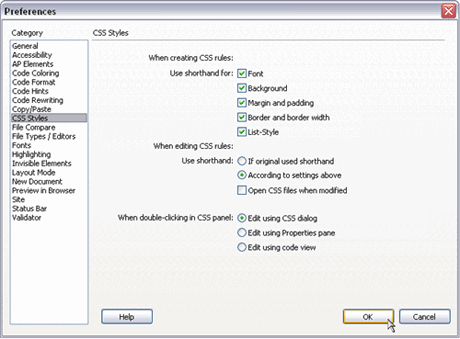
When you write your CSS rules, you have an option of two different writing styles: longhand and shorthand. Dreamweaver allows you to set your own preference for the writing style. Here are the steps to access the CSS preferences in Dreamweaver CS3:
Select Edit > Preferences. In the Preferences dialog box, select the CSS Styles option in the Category list, (see Figure 5).
Figure 5. The Preferences panel allows you to set your CSS writing preferences
By selecting all the Use Shorthand For options, as well as the According to Settings Above option, you are instructing Dreamweaver to write your CSS rules in shorthand. That's fine, but what is the difference between longhand CSS and shorthand CSS writing styles?
The obvious answer is that shorthand creates a smaller file. Shorthand allows you to condense your rules in such a way that you can assign multiple properties and values in a single line. More importantly, you can write your rules and modify them faster—less work all around.
To show you how this is achieved, I will write the same CSS rule in longhand and then again in shorthand. The difference will be obvious. Once you are familiar with shorthand, I will show you how it can be condensed even further to reduce the amount of required information.
Let's begin by creating a CSS rule that redefines the margins of the body element. The following CSS rule defines the margins using longhand CSS:
body{ margin-top: 0; margin-right: 10px; margin-bottom: 0; margin-left: 10px; }
The following CSS rule is the shorthand version of the same code:
body{ margin: 0 10px 0 10px; }
As you can see, there's quite a bit of difference between the two writing styles. Using the shorthand method, you eliminate the need to describe each side of the body you want to affect on the property side of the rule. By simply declaring "margin," you avoid having to declare each margin property within your CSS rule. You also are able to apply the values for top, right, bottom and left margins in a single line of code. This reduces the CSS property from a four-line affair to a single line.
How does the browser know which value is for which side of the body element? Simple, the browser takes the order of the values into consideration and then applies them accordingly. Reading from left to right, the values are applied to the top, right, bottom, and left margins. In this example, we are specifying a 0 margin to the top and bottom of the page, while the left and right margins each have a value of 10 pixels.
You can further reduce the shorthand rule as follows:
body{ margin: 0 10px; }
When the browser comes across a rule like this one, it knows that the values are pairs of values. The first value is taken and applied to the top and bottom margins while the second value—10px in this instance—is applied to the left and right margins.
If all the margins of the body are the same value, you need to only set the value once:
body{ margin: 0; }
In the rule shown above, a value of 0 is applied to all four sides of the body element. Zeroing the margins on the body element is a good practice, at least initially. Browsers tend to apply default margins on the body (and other elements) if they are not explicitly stated. Explicitly zeroing the defaults and setting the margins you require for your layout is the best way to guarantee that browsers will apply the margins you want. Leaving the defaults can result in unexpected displacements within your page because the default margins can vary greatly from browser to browser.
The Opera browser is a special case because it also applies a default padding setting on the body element. This means you need to zero out the padding value on the body as well as the margins to get a consistent cross-browser starting point. To achieve this, your final body rule would look like the one below:
body{ margin: 0; padding: 0; }
The CSS rule above provides you with a cross-browser zeroed body element—a good base from which to start when laying out pages. You will notice that the CSS files generated by Dreamweaver CS3 already contain the zeroing for your padding and margins on the body element.
It is important that you know how such settings are generated. With that in mind, I will run through the practice now, using both the CSS Style Definition dialog box and the code hints options. The page described in the following movie isn’t a tutorial page and you do not need to add this rule to your style sheet. In fact, this rule already exists in the tutorial style sheet with the supplied sample files, as mentioned earlier. But if you’d like, feel free to create a new practice page to see how you can create your own rules using the CSS Style Definition dialog box and/or using the code hints.
Here are the steps reviewed in the demo:
- Click the New CSS Style button in the CSS Styles panel. The New CSS Style dialog box opens.
- Select the Tag Selector Type option.
- Type body into the field or select body from the Tag drop-down menu.
- Double-check that the option for "This document only" is selected.
- Click OK to open the CSS Style Definition dialog box.
- Select the Box category option.
- Ensure that the Same for All options are selected for both Padding and Margin.
- Enter 0 in the Padding field.
- Enter 0 to the Margin field.
- Click OK.
- In Code view, review the code that Dreamweaver added to the page. Although Dreamweaver added a value for the measurement (px), this is not necessary for a zero value.
- Select the body rule and delete it. Next we’ll use the Dreamweaver code hints to write your CSS body rule.
- Type body { into the Code view in the Document window. As you begin typing, the code hints appear.
- Select margin from the code hint list.
- Enter a value of 0 after the margin property: margin: value.
- Press Enter to go to the next line of code and type p.
- Select padding from the code hint list.
- Enter a value of 0 after the padding property: padding: value.
- Select the rule and delete it.
It is possible to reduce the amount of characters in a hexadecimal color value within your style sheet rules. If a color is defined in three pairs (for instance, red is #FF0000), the same color could be written as #F00, because each character represents a matching pair. The F represents FF and the single zero in the second and third positions of the value indicate 00 and 00. This technique can only be applied if the color value contains three pairs. Other examples of this would be #FFFFFF (white) written as #FFF and #000000 (black) written as #000.
Alternatively, some color values can be set using the color's name:
- color: red;
- color: black;
- color: white;
The syntax of CSS is a flexible one. In many cases, it allows you to use different syntax to achieve the same results.
In the next section of this tutorial, we will look at how you can layout your web pages correctly by using semantic markup.
Semantic markup
"The Semantic web approach develops languages for expressing information in a machine processable form" (W3C)
The line above is a quote, so it resides within a pair of <blockquote> tags. The blockquote tag alerts screen readers, indicating that the text within the <blockquote> tags is a quote and not just another paragraph. Screen readers are machines that enable visually impaired people to surf the web. Creating a semantically correct document in its simplest form is just one case of using the XHTML elements supplied with the specification to lay out your document correctly.
Each element provided in the XHTML specification is designed for a specific purpose and each element has a specific meaning. An <h1> element is an example of a header. A machine reader recognizes text that exists between header tags as a header (or title), just as text within <p> tags is recognized as a paragraph. However, not all tags are semantic in their makeup.
Take the <span> tag, for instance. A <span> tag has no implied meaning associated with it; it is simply a container element. The <span> tag can be useful for applying specific formatting to an element on the page, but it should only be used if there are no tags already available for that element. For example, if a <span> tag is placed around a line of text and then styled to emphasize text within a paragraph, it will render correctly, but it would be much better to use the <em> tag for this purpose. This is what the <em> tag was designed to do. When the screen reader encounters an <em> tag, it knows that this text should be emphasized; in turn, the machine screen reader emphasizes the text within the <em> tags.
Hierarchical structure
Surrounding text with a <p> element and then using font tags—or CSS rules for that matter—to make the text look like a header, (such as increasing the size of the text and applying a <strong> tag) does not make that text a header. The finished result may look like a header to the human eye. However, that's where the association of the text with a header ends. To a machine reader, the text is still just a paragraph.
To create a header, use one of the header elements. The header element you use depends on the location of the header in your document. For example, an <h1> tag should surround the main heading on your page. The next level of subheadings would be surrounded by <h2>, and so on. It is not necessary to use all the headings within your document, but they are available if you require them:
- h1
- h2
- h3
- h4
- h5
- h6
Each header element is hierarchical in nature. To machine readers, <h1> is the most important header and <h6> is the least important header. Each level of header has a natural place within your documents. Some web designers surround text with a <td> tag within a table. This is not recommended, because it does not give machine readers any indication regarding how to read the text. If with the text is basic copy and exists below a header, then the text should be surrounded by a <p> element. Machine readers understand the <p> tag. They can identify the type of content and how it should be read. It is very important to set up your document in a hierarchical manner that is easily read by machine readers as well as humans. Using hierarchical structure to present your site content in an organized fashion will ensure that browsers and search engines can correctly navigate the elements on your page as well.
The code example below provides an example of a well-structured page:
<body> <h1>Use h1 elements for your main title heading</h1> <p>Place the paragraph text within the first set of p tags.</p> <h2>Use the correct element for sub headings, in ascending order.</h2> <p>The next paragraph text should be inside another set of p tags.</p> </body>
At this point, you may be thinking, "Organization sounds fine but those <h1> elements are huge! Creating semantically correct documents is important, but is it possible to make the pages look good at the same time?"
The answer is "Yes," and we’ll see how that is accomplished in the next section of this tutorial.
Understanding CSS selectors
CSS allows you to redefine elements and make them appear however you specify. This is very useful, because you can set the size of an <h1> element to fit your design. You can also set the font face, margins, padding, color, background color, and a whole list of other properties—all within a single CSS rule. This practice will ensure your documents are semantically correct.
But it gets better. First, you redefine the <h1> element by adding a CSS rule in a style sheet that is linked to the pages in your website. After that, you can change the appearance of all <h1> elements in your entire site—in a matter of seconds—simply by making a single change in one location. The demo below provides instructions on how to edit an <h1> element and demonstrates how you can easily control the way your document renders by editing an external style sheet.
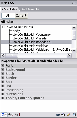
The sample file named twoColElsLtHdr.css includes a descendant selector setting for <h1> elements that exist within a <div> with an ID of "header." The properties for CSS rules can be accessed in the CSS Styles panel, (see Figure 6).
Figure 6. The properties of the CSS rules are listed in the CSS Styles panel
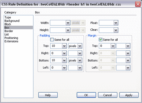
Click the All option at the top of the CSS panel to see all the rules that exist within your style sheet. While this option is selected, double-click the <h1> selector, (highlighted above) to access the CSS Rule Definition dialog box for the <h1> selector. If you click through the different categories listed on the left, you’ll see that the only properties set for this rule exist in the Box category, (see Figure 7).
Figure 7. Click the Box category to review the CSS rule set for <h1> elements
The Box category displays the values set for the margins and padding for <h1> elements. After reviewing the settings, click Cancel.
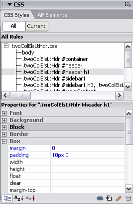
To access the settings within the CSS panel:
- Select the <h1> rule.
- Expand the Box information by clicking on the plus sign (+) next to the word Box in the properties section of the CSS panel.
- The values for the margin and padding applied to <h1> elements are displayed. These values reflect the rule settings in the CSS file named twoColElsLtHdr.css, (see Figure 8).
Figure 8. Expand the Box information in the properties section of the CSS panel to see the values set for the <h1> element
Simply click any of the values to edit them. By highlighting a selector in the top of the CSS Styles panel, you can then choose any of the property items listed in the bottom to create new properties and add values that will affect the way the active selector will display.
Here are the steps reviewed in the demo:
- Click the <h1> selector to highlight it.
- Expand the Font option by clicking the plus sign (+) next to the word Font.
- Click the color chip in the Color picker.
- Select a green color from the color swatches.
- Notice that the header changes color to match your selection.
- Click the Color picker again, which is currently set to green.
- Click the Default color button.
- The <h1> header element returns to black.
The CSS Styles panel is very powerful, and we’ll be working with it in upcoming parts of this tutorial series. Spend some time becoming familiar with the different settings that are available, to get a better sense of how you can style your page elements. For the remainder of this part of the tutorial, we’ll focus on the various selector types used when creating CSS rules.
The ID selector
The sample CSS file named twoColElsLtHdr.css begins by defining a <div> with an ID selector. This <div> can be thought of as a container or "wrapper" that will surround all of the other elements on the webpage. Using wrapper <div> containers is a common practice in CSS positioning, and we will examine how they work in Part 3 in this series of tutorials. To write an ID Selector in CSS, you prefix the <div> name with a pound sign (#), as shown below. The margins set here should look somewhat familiar to you, because they are written using the same syntax we used to set up the body margins earlier. This CSS rule uses pair values to define the margins. In the example below, both the top and bottom margins are set to zero, and the left and right margins use the auto setting:
#wrapper{ width: 770px; margin: 0 auto; }
The auto value may be new to you, so let’s examine how it works. In Part 3 of this tutorial series, we’ll format a document using CSS positioning to create a fixed-width layout. The width of the container or wrapper <div> is set to 770 pixels to eliminate horizontal scrolling for viewers who have their browsers set to an 800-pixel-wide resolution. In the code example above, the margin value of auto is applied to the left and right sides of the wrapper <div>. This causes the page content to center horizontally, regardless of the users' browser window width. The space on either side of the fixed-width wrapper <div> is distributed evenly, because the pair values are set to auto in the CSS rule. We’ll see how to set these values in the Creating an ID Selector demo at the end of this section.
The pound sign (#) in the CSS rule above indicates that the wrapper div is an ID selector. However, the pound sign is not used when you reference the ID selector from within your XHTML code. When inserting the wrapper <div> into your XHTML document, you would use the syntax shown below:
<div id="wrapper"> Our wrapper div content </div>
As you can see, the <div> wrapper is referenced using id="wrapper"—the pound sign in the CSS rule relates to an "id" in CSS. The properties and values set for #wrapper within the style sheet are applied to the <div> with an ID of "wrapper" in the XHTML code.
Note: Only use an ID selector name once in your XHTML document. An ID selector is used for an element that is unique, and will not appear in multiple references in your XHTML page. If the element (such as a series of <div> tags) will be repeated in your document, use class selectors instead. Keep in mind that if you define an ID selector in your style sheet and then reuse that selector name on an image swap behavior within the same document, the behavior will not act as expected and you may see strange results. Be very cautious about using only unique names for ID selectors.
Here are the steps reviewed in the demo:
- Click the New CSS Style button in the CSS Styles panel. The New CSS Style dialog box appears.
- Click the Advanced option for Selector Type.
- Name the ID selector #wrapper. When you create an ID selector, you type the name into the Selector field. An ID selector is always preceded by the pound (#) sign.
- Double-check that the option for "This document only" is selected.
- Click OK.
- Select the Box category.
- Deselect the Same for All option in the Margin section.
- In the Top text box, enter 0.
- In the Right text box, enter auto.
- In the Bottom text box, enter 0.
- In the Left text box, enter auto.
- Select the Border category.
- Deselect the Same For All option in the Style area. For this example, we’ll add a 1 pixel solid black border to the left and right sides of the #wrapper ID.
- Select Solid from the Right and Left pop-up menus for the border style.
- Deselect the Same For All option in the Width section.
- Enter 1 in the Right and Left text boxes for the border width.
- Deselect the Same For All option in the Color section.
- Click the Color picker and select black for the Right and Left border colors.
- Click OK.
Your #wrapper selector is now listed in the CSS Styles panel.
In this demo, we’ve created an ID selector, then set margin and padding values and added a border. For further information on ID selectors, please see my CSS tutorial in the Design Basics Series.
The class selector
Unlike the ID selector, the class selector can be used as often as desired within your XHTML document. Instead of using the pound (#) sign, the class selector is preceded by a period (.) within your style sheet, as shown in the class selector example below:
.leftimage { margin-right: 15px; margin-bottom: 5px; }
The period (.) in the style sheet indicates that the rule is a class selector. However, the period is not used when you reference the class selector from within your XHTML code. For example, if you were inserting the leftimage class into an image source tag in your XHTML document, you would add the class reference as shown below:
<img src="images/mypic.jpg" alt="some text" width="145" height="180" class="leftimage" />
The final outcome when a browser renders the page is the same whether you use a class selector or an ID selector. In situations where you need to apply the settings declared within a CSS rule more than once in the same document, you’ll use a class selector instead of an ID selector.
Here are the steps from the demo:
- Click the New CSS style button in the CSS Styles panel. The New CSS Style dialog appears.
- Click the Class option for the Selector Type.
- Name your class selector .leftimage. A class name is always preceded by a period.
- Double-check that the option for "This document only" is selected.
- Click OK.
- Select the Box category.
- Deselect the Same For All option in the Margin section.
- In the Right margin text box, enter 15.
- In the Bottom margin text box, enter 5.
- Click OK.
The .leftimage class is now listed in the CSS Styles panel.
Pattern matching and the descendant selector
The descendant selector is a powerful way to target specific elements that exist within specific areas of your XHTML documents. Using a descendant selector, you could, for instance, easily target any <em> elements that reside within <p> elements. It is not necessary to create a separate class and then apply it directly to the <em> tags. You can simply target the elements within an element from the style sheet. When using descendant selectors, a space is added between the first element and the second (see the code example below). Think of a descendant selector working just like the forward slash (/) does in a folder hierarchy within a URL. You are creating a "path" to the elements that you wish to apply CSS formatting. Here is an example of how a descendant selector is used to apply styles to all of the <em> elements that exist within <p> elements in your site pages:
p em{ color: #0033CC; }
The rule above says "Find <p> elements and if those <p> elements contain <em> elements, change the text color of the text inside the <em> tags to the hexadecimal color #0033CC." The rule above will ignore any <em> elements that exist outside of <p> elements, and will also ignore any <em> elements that exist within a different element. Descendant selectors rely on pattern matching, so if the pattern is broken (the <em> is not directly inside a <p>) the text color change is not applied. The descendant selector allows you to pattern-match your XHTML documents and affect specific elements that are within other elements—while not affecting ALL elements of that tag on the page. Watch the demo below to see how this works:
Here are the steps reviewed in the demo:
- Click the New CSS style button in the CSS Styles panel. The New CSS Style dialog box appears.
- Click the Advanced option for the Selector.
- In the Selector text box, enter p em. Make sure there is a space between the two elements. This is important; this space is known as a descendant combinator.
- Double-check that the option for "This document only" is selected.
- Click OK.
- Select the Type category.
- Click the Color picker and select a blue hexadecimal color #0033CC.
- Click OK.
- In Design view of the Document window, type the words: This is a paragraph
- Highlight the word "paragraph."
- While the word "paragraph" is selected, click the italic button (the button with the I icon), which is just to the left of the three text alignment buttons in the Property inspector.
- Notice how the word paragraph turns blue, because an <em> tag, which is nested inside a <p> tag, surrounds that bit of text. This text color change occurs because the pattern that matches the "p em" descendant selector is found and the rule is applied.
The p em descendant selector is now listed in the CSS Styles panel when the All button is selected. Hopefully this simple example of using descendant selectors illustrates how useful and powerful they are when CSS rules are applied to nested elements in multiple web pages.
Conclusion
Let’s take a brief look at the topics covered in this first part of the CSS tutorial series. So far we’ve used Dreamweaver CS3 to generate a CSS layout. We’ve examined how to create CSS rules (using the Dreamweaver interface as well as typing the code into the document), and we’ve discussed the three major types of selectors: class, ID and descendant selectors.
Specifically, you should now be familiar with the following concepts:
- Creating ID selectors
- Creating class selectors
- Creating descendant selectors
- Zeroing off the body element (Setting 0 values for the margins and padding—to ensure browser compatibility)
In Part 2 of this series, we’ll explore CSS further. We’ll examine how the XHTML document interacts with the information in the CSS Styles panel, and provide instructions on editing CSS styles while in the Design view. In the next tutorial, we’ll discuss how to avoid common CSS issues and learn more about using CSS to format the design of the page, in addition to adding text styles. Part 2 sets the foundation you’ll need to create a web page that uses CSS positioning for the page layout, which is covered in Part 3.
The CSS rules described in this tutorial will be put to good use as you work your way through this tutorial series. Experiment with creating CSS rules using the Dreamweaver interface, and explore setting different values in the properties for each type of selector.
Where to go from here
Follow the links below to learn more:
Once you feel comfortable using the different types of selectors, continue with Part 2 of this six-part tutorial series:
Designing with CSS – Part 2: Defining Style Properties and Working with Floats
Home | Audio | DIY | Guitar | iPods | Music | Links | Site Map | Contact