|
|
Home | Audio | DIY | Guitar | iPods | Music | Brain/Problem Solving | Links| Site Map
This work is licensed under a Creative Commons License.
Rhythm and Repetition
Aside from alignment and grouping, elements can be linked using rhythm: a regular or irregular repetition of common stylistic features.
Rhythm is the most subtle and abstract of the 'associating' tools.
It helps to associate elements by repeating a common stylistic feature or arrangement. This even works when elements aren't grouped or aligned, but often works in conjunction with these techniques.
Rhythm is a common technique in graphic design. It can work whenever a style is repeated. Familiar examples include bulleted lists and headings.
It's easiest to show how rhythm/repetition works through examples.
Simple example of rhythm
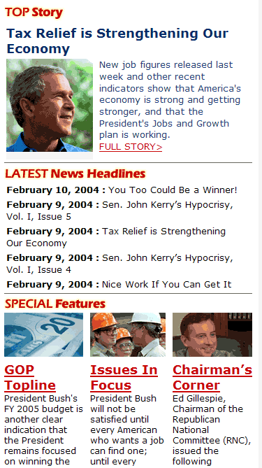
This snippet from the US Republican Party's homepage (no affiliation is implied), shows rhythm in effect.
The section headline style is repeated, all the instances are left-aligned and separated with a common horizontal divider. This creates a rhythm. Once you've decoded even one or two examples, your brain creates a rule or pattern on the fly You then use that rule to recognise and interpret subsequent examples of the header.
The brain also applies rules in this way when scanning a page.
You quickly notice that the bottom Features are also clearly related. As well as being horizontally aligned, rhythm is also noticeable in their regular size, regular spacing and repeated styles of the images, headlines and copy
Example: Associating elements using rhythm alone (no alignment or grouping)
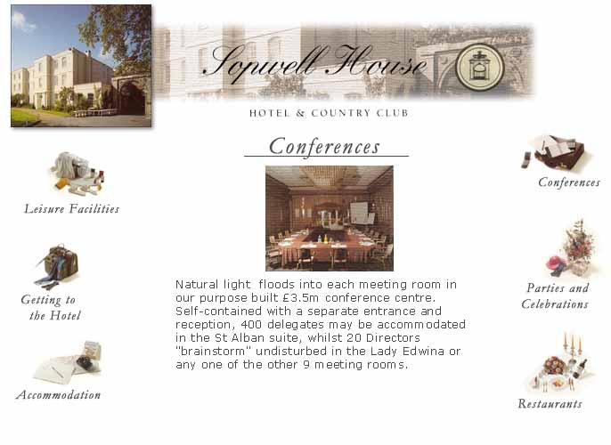
In this example, the 6 main navigation links aren't all grouped or contained spatially, or aligned around any common axis. They are clearly associated as peers, which is effected through rhythm.
The rhythm is created through a number of stylistic features: font, visual layout of each item, and a roughly circular arrangement.
Using rhythm allows for a spacious and informal layout, using an elegant balance, without loss of clarity.
Example of lack of rhythm
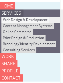
This is the menu from Skinnycorp's (otherwise great) site.
It's a good example of missing rhythm. The first-level menu items ought to be regular widths, to make it clear that they are related.
The result is a menu that's dominated by the dark grey negative space. It's difficult to focus on the second-level items.
Home | Audio | DIY | Guitar | iPods | Music | Links | Brain and Problem Solving | Site Map | Contact
![]()
