|
|
Home | Audio | DIY | Guitar | iPods | Music | Brain/Problem Solving | Links| Site Map
This work is licensed under a Creative Commons License.
Readability
Everyone benefits from clear, readable text content. People with visual impairments benefit particularly.
On this page:
Don't use too many font sizes
Font sizes are a great differentiator. They work as signs that say "Here is something important" or "Here is a new section - This big bit tells you what the section is about, the small stuff below is the actual content". Just like any other means of visually differentiating elements, there needs to be a sufficient level of visual difference for text size to work.
For this reason, it is not recommended to use more than 3 different main font sizes to render your main content (i.e. main header, sub-header, body). This only applies to the main body content. Other screen elements may use alternative sizes (such as superscript/subscript, labels, advertisements, separate nav links, footer nav etc.)
Use sans-serif face for all body copy
Different classes of typefaces (fonts) have different innate levels of readability.
Serif vs. Sans-serif fonts
The following 2 paragraphs should be displayed first in a serif font, then in a sans-serif font. Read both word-for-word and then judge which is easier to read.
Serif
Serif fonts have worked well for hundreds of years. They tend to look more old-fashioned and 'establishment'. The serifs - the flowing marks at the points of letters - work by leading the eye on to the next letter, making for a smoother and easier read. However, this only works at high resolutions (e.g. print). At low-res, the extra complexity decreases clarity, and the reduced whitespace between letters makes recognition slower. I find that serifs become more acceptable at higher sizes.
Sans
Sans-serifs are literally fonts that don't have serifs. They look more modern and open. Sans-serif fonts are more readable than serifs on pixel-based displays, because they are simpler, which translates well to low-resolutions.
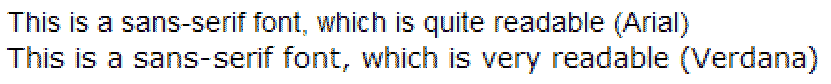
Many sans fonts have been developed specifically for electronic media. The most readable sans-serif fonts are broad, providing ample space between letters, which facilitates recognition. In the opinion of most designers, Verdana is the most effective font for body text.
Verdana is specifically good for body text, because it's a broad a spacious font, which leaves an ample square space for each letter. This makes it easier to distinguish each different letter at low resolutions.
Don't use too many typefaces
Different fonts project their own personalities, which can be helpful for branding.
In general body copy, I would always recommend using Verdana (1st preference), Helvetica or other sans-serif fonts. Titles and other page features (logos / navigation / ads) may use a huge variety of other typefaces to create different feels. However, it is generally acknowledged that too many different typefaces is counter-productive.
As a rule, don't use more than 3 different typefaces throughout a single web page design.
Emphasis
Create emphasis through using underlines, bold and italics, but use them sparingly. To draw attention to a whole line, consider using a coloured background, or emboldening, which are less detrimental to readability than underlines or italics.
Emboldening increases contrast, and contrast only works when it has something to contrast against. Lots of bold text doesn't draw attention, it competes for attention, creates extra noise and decreases readability. See my case study on foruse.com.
Italics are quite handy for emphasising words or short phrases. They tend to have a softer emphasis than emboldening. Italics should not be used for blocks of text, because they can have a similar effect to serif fonts at small resolutions, reducing readability. Sans-serif fonts that work well on screen can have poor readability in italic form.
Similarly, underlining text can serve to emphasise certain words or short phrases, when used in moderation. Be careful that underlining for emphasis is not mistakable for hyperlinks (perhaps by having hyperlinks in blue without underlines in normal state, exhibiting the underline on hover).
Alignment
Left-aligned text is easier to read than right-aligned text.
Full justification (where words are stretched so that they meet both the left and right margin, as in this paragraph) is only effective with pretty long lines of text (40chars+). However, on-screen text is easier to read in narrower columns, which makes it hard to justify full justification! In my opinion, a web page is the wrong place for fully-justified copy, because it doesn't have the resolution to implement it smoothly.
The above fully-justified column remains relatively readable. This somewhat narrower column uses fully-justified text, but notice how the reading flow is jerky and awkward, particularly with substantially longer words.
Contrast in text
It's very important to have sufficient contrast between text and its background. Use white background with black body text where possible. If not, black on the lightest background colour you can manage. An alternative is white or brightly-coloured text on a black or very dark background colour, but this seems slightly more tiring.
Case / Capitalisation
DON'T USE CAPS FOR BODY TEXT, BECAUSE IT DECREASES THE CONTRAST BETWEEN LETTERS WHEN THEY ALL TAKE UP THE SAME SIZED BOX.
Capital letters are useful because they announce the start of a piece of text (sentence) or an important piece of information such as a name. They lose their effectiveness when over-used. Full capitalisation is more tiring and slower to read, because it reduces recognition by making all letters a similar size.
In titles, use capitalisation consistently. I prefer to capitalise the more important words in titles, and keep the lesser filler words in lowercase (and, the, to, a, etc.)
Spacing text
Clearly, whitespace is vital for text to be readable. Whitespace around elements is known in design-speak as guttering, or margin when applied to blocks of text. It's useful because it helps the eye to identify a block of text as a group, and also helps you quickly find the beginning of each line.
Use proximity to associate headers and titles with content. Proximity also requires whitespace, so use space around all paragraphs and headers, but make sure a header is nearer to its child content than previous paragraphs. This softly suggests further levels of association, and helps scanning.
The spacing between letters is known as letterspacing, track kerning or tracking.
The spacing between lines is called leading (derived from the thin strips of hammered-out lead used by typesetters).
CSS allows designers to change letterspacing (through the letter-spacing property) and leading (using line-height), but should be only considered with very good reason. Do not be tempted to reduce letterspacing or leading below the default value, as this will reduce readability.
Text block size
Blocks of text should not be too long or too wide.
When paragraphs get long, they're harder to read because there's less whitespace. Whitespace gives paragraphs shape, which acts like visual bearings, making it easier to find your place, and to find the start of the next line. Using more, smaller paragraphs suits web content particularly, because it lets you subtly highlight more useful phrases, by putting them in their own paragraph, or starting a new paragraph.
For similar reasons, long lines (wide paragraphs) are slower and harder to read than narrower ones. Lines of around 100 characters present neat bite-size chunks of text that can easily be decoded, and also make it really easy to scan round to the start of the next line. That's why newspapers and magazines use several columns on a page, and why books use the same common format.
Home | Audio | DIY | Guitar | iPods | Music | Links | Brain and Problem Solving | Site Map | Contact
![]()
