Home | Audio | DIY | Guitar | iPods | Music | Brain/Problem Solving | Links| Site Map
This work is licensed under a Creative Commons License.
Logo design
Logos are graphical shorthand that can represent a company or product, and communicate certain characteristics.
In order for a logo to be visually effective, it must exhibit certain related fundamental design characteristics:
This article describes how to employ these simple characteristics to create a strong logo, using real-world examples.
Characteristic 1: Shape
A distinctive logo (or icon) has a recognisable shape, so that it is still recognisable from its outline. Your brain loves to use shape to identify things, because it can do it very quickly. (Note: this is also the main reason why white space is important).
What gives a logo distinctiveness? The outline should be simple, but not too simple, and clear. Also, meaningful elements should be clearly differentiated, with the use of white space where required.
Try the squint test on the following logos...
Examples of good shape


No matter how you treat the Apple logo, its strong outline shape is unmistakable.

Lotus's unique shape works very well, set in a circle of contrasting colour. The other meaningful shapes (word and letter-form) fit nicely inside the shape, with just enough clear space to keep the elements sharp.
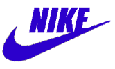
The Nike logo ('Nike' text and symbol, or 'Nike' or symbol alone) are such recognisable shapes, that they can be displayed in almost any colour combinations.
Examples of poor shape

At small scale, this logo fails in several ways. One problem is that the shape is made of a combination of thick and thin elements. On the squint test, thinner elements are the first to disappear, so the remaining shape has to be bold and clear. This shape is not bold enough, due to: a lack of 'integrity in a solid form; insufficient white space between elements; drop shadow adding visual 'dirt'.

This logo also has inconsistent weight, employing thick and very thin sections together. Ignoring those, the remaining central shape is nondescript. The image is too busy, made up of several adjacent planes that don't have enough contrast to carry weight.
Characteristic 2: Presence
Your logo has good presence if it fills much of the available space with shapes that carry meaning (e.g. words, recognisable symbols). This makes it bolder and clearer, and hence more recognisable. The more space you fill with elements that don't either help recognition or add meaning, the less presence your logo will have.
Examples of good presence


See how much of the rectangles they occupy are filled by these 2 logos. The City Hall records logo is even bigger than its bounds.
Examples of poor presence

The words make up very little of this logo, only around 13% of the area. The ellipse shape is very common, and unrecognisable on its own. Note how the font used is too bold to be clear to read. The only strength of this logo is its bold colour.

The key elements "FTL" are too weak to draw the focus. The FTL letters are lacking white space to differentiate them and suggest that they are significant. The strongest forms are the spiral line and the dark oval, but neither is meaningful.
Characteristic 3: Weight
Good weight means that a logo (or icon or logotype) does not rely on fine (slim or light) features in order to be recognisable. If a logo is bold, it can be effective in more environments. The best logos have a weight of presence are recognisable when viewed alongside other strong images. (see Picadilly Circus)
The use of colour is vital to getting a clear, bold logo or icon. Too many colours, gradients, 3-d effects and complex patterns can be detrimental to your logo's weight.
Tip: Try to use as few different colours as possible.
Remember, the more colours a logo has, the harder it is to reproduce in different formats.Tip: Avoid gratuitous 3-D effects - your logo must work without them.
Examples of good weight

In IBM's logo, the horizontal lines are a secondary feature to the main shape. The logo is still recognisable without them.

Strong weight, colour and shape make Dell's logo recognisable.
Examples of poor weight

The text is way too light, as is the other visual clue (the palette shape). The 3-d emboss effect on the text also reduces contrast and readability. What has a farm got to do with a painter's palette?
Characteristic 4: Contrast
Contrast aids shape-recognition by making the edges between elements clearer. Good logos (and icons) have lots of contrast on the edges of meaningful visual elements.
The squint test is great for checking contrast. Also consider that users may be colourblind. Another helpful test is to try desaturating your logo in a graphics application, and check whether it is still clear and recognisable.
Examples of good contrast

(See also all good logos above).
The RockShox logo uses both colour-on-white and inverse (light-on-dark) contrast together, to good effect. Great presence and strong colours make this impactful and highly recognisable.

The McDonald's logo has less tonal contrast, but the perceived contrast between strong, flat colours makes the shapes clear. Note the clear space around the text.
Examples of poor contrast

The logo shape behind the text is too light to see clearly. Also, the important "venture capital" text is too weak in light grey. On the squint test, you are quickly left with only the strong single word "Mobius", which may not be meaningful.

Text has too little edge contrast, as it's less bright than the highlight from the 3d effect.
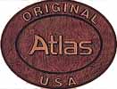
Text is too thin for so little contrast against background.
Home | Audio | DIY | Guitar | iPods | Music | Links | Brain and Problem Solving | Site Map | Contact