|
|
Home | Audio | DIY | Guitar | iPods | Music | Brain/Problem Solving | Links| Site Map
This work is licensed under a Creative Commons License.
Imagery
Don't reinvent the wheel for functional imagery.
Concentrate creative effort on imagery that adds value in branding or message (content).
General guidelines for imagery/graphics
Use imagery to add meaning: either to the brand, or to the content.
Try to be as economical as possible, and get more meaning from fewer graphics. Imagery that has meaning (Primary imagery) should be the focus of a page design.
Concentrate primary imagery in the following areas:
- Site id / Logo
- Primary content
- Primary navigation
Where other graphics are used, they should support the primary imagery, by helping the eye move over lower-priority elements. This does not mean that non-primary areas can not be rich and subtle, but they shouldn't be attractive, in the literal sense. Flat colours, subtle contrast, gentle gradients, smooth curves, and fresh white space can help the user focus, and look great.
Remember the site's goals and the users' goals, and apply graphics in a suitable proportion.
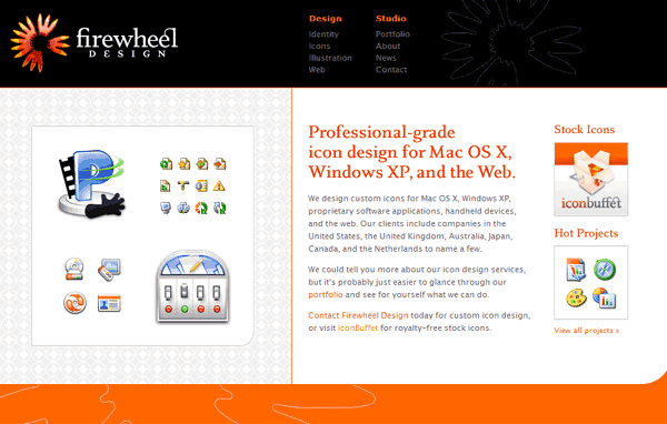
Effective use of imagery: Firewheel design
©Firewheel design, see www.firewheeldesign.com
Firewheel's site is an excellent example of energy well spent, creating a pure, focused experience.
This screenshot is 2/3 real size, and it's still clear what's what.
Navigation is simple text - there's nothing clearer or more intuitive.
Background/Interface imagery is concise. The designers clearly knew what brand image they wanted to project, and did it simply with confidence.
What draws your eye? Initially, the Firewheel logo is attractive but simple.
Secondly, the page title "Professional-grade.." stands out because of its boldness, colour and clarity.
You are then drawn to the other imagery on the page, all of which carries value, reinforcing the company's credentials, giving the user good quality information on Firewheel's products and services, as well as looking good!
The page is also relatively quick to download.
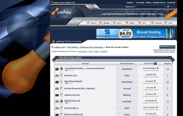
Problematic use of imagery: Yaxay
Yaxay.com is a popular (and highly recommended) community site for designers.
Its pages are graphically intense, which is typical of the design target sector. Most sites aimed at a web-designer audience employ very rich graphics, in order to demonstrate a level of graphic design skill to pass a supposed level of respectability.
The downside is that the content of this site definitely comes second to the background/interface. It doesn't prioritise the user's goals, and I think the user experience is compromised.
I go on Yaxay nearly every day, but find it quite a tiring experience, compared to an energisingly fresh design (like Firewheel.com).
Specific issues:
- Heavy use of obscure icons increases clutter and reduces content clarity
- Sheer amount of contrasting, busy, contrasting shapes pulls the eye all over the place
- The content area has less contrast than the interface, which makes it harder to look at
- The content text is unnecessarily small, which makes it harder to read
It is quite possible that the designers of Yaxay were clear on their goals, and had decided that graphical richness was the right approach in order to hit a goal of gaining respect from their target audience. If so, they succeeded - it would be hard to criticise their graphic design ability. The initial experience of the brand is "skilled, rich, modern"..
However, I think they failed to prioritise the user's goals highly enough. Sites that fail to serve the user's goals will tend to fail.
Navigation
Clarity is more important than attractiveness for navigation (and other functional controls). Controls should be easy to identify, and their purpose should be obvious. The easiest way to achieve both of these qualities is to use established conventions.
Don't reinvent functional controls
You're more likely to reduce usability by spending on designing functional and iterface controls. It's very difficult to create effective icons, and time-consuming for little impact.
Beware icons
Icons are incredibly powerful, when they work! A good icon is a compact visual shorthand that represents a complex idea in the minimum space. A good icon doesn't need decoding - its meaning is so unambiguous or familiar, e.g. Printer means "Click here to print", or an exclamation mark in a yellow triangle means "Warning" or "Alert".
However, it is extremely difficult to design an effective icon, and harder still to design a consistent set. Think hard about your reasons for using an icon. If it's justified to use them, go for established 'iconic' images.
Don't try to reinvent the wheel. An image doesn't just become an icon, in any sphere of design. It has to be used over a period of time, adopted by more people, and become established in the community consciousness.
New conventions are being established all the time, e.g. the two round-faced people, originally from MSN Messenger, are becoming global shorthand for 'buddies' or 'contacts'.
Home | Audio | DIY | Guitar | iPods | Music | Links | Brain and Problem Solving | Site Map | Contact