|
|
Home | Audio | DIY | Guitar | iPods | Music | Brain/Problem Solving | Links| Site Map
This work is licensed under a Creative Commons License.
Grouping
Grouping similar elements helps the brain quickly decode a page layout.
Proximity, Alignment, Containment, Rhythm and Styling are all tools that help indicate grouping.
The power of proximity
The simplest way to associate a number of elements is to group them together.
What grouping does is make similar things appear similar.
That way, the scanning eye can decipher a title (for example) and immediately associate that title with all the objects around it. By making similar things similar, grouping makes different things appear different. "Why are the objects in that group instead of the other group..? They must be different."
2D design uses a range of grouping techniques, from paragraphs and margins to navigation bars and clustered form elements.
As with other design tools, grouping with proximity relies on contrasting forces, in this case whitespace. If all elements are closely-spaced, proximity becomes less effective.
Simple example
These icons on designer Jakub "Jimmac" Steiner's site are clearly grouped into 2 sets using proximity, and subtle containment.
Grouping problem

Grouping needs whitespace, its opposing force, to exist. These navigation buttons are grouped so closely together, that the buttons and labels are equidistant, which would definitely confuse users.
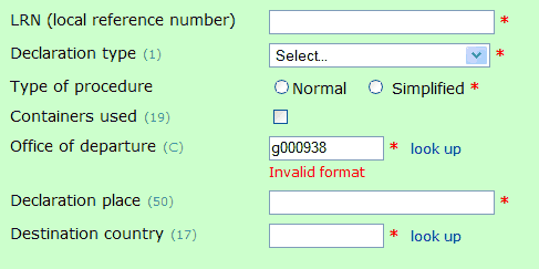
Grouping in form elements
In this form, it's clear what each of the 2 radio buttons means ('Normal' & 'Simplified'), due to the proximity of each button with its label.
It's also obvious which field has the error in it, because of proximity.
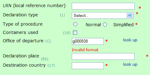
Compare with what happens when I mess up the proximity.
All that has changed is the spacing between elements, and the form is suddenly really hard to interpret.
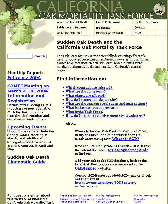
Several groupings on a page
This example uses grouping and whitespace very effectively to identify related elements:
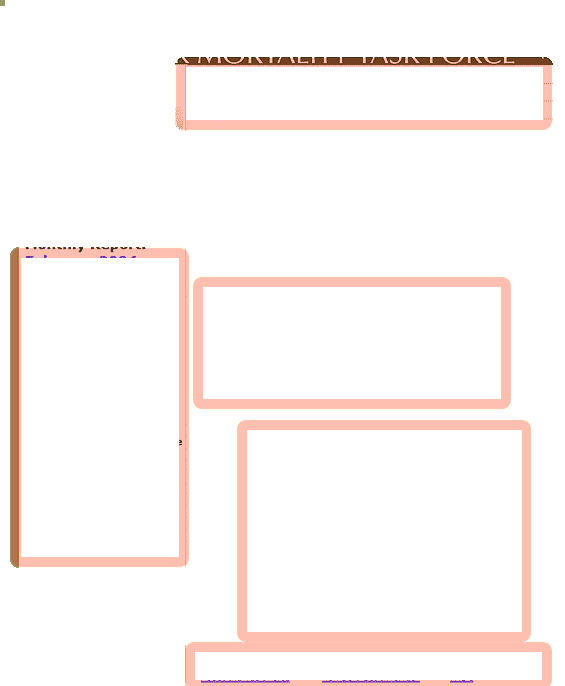
Here's the same screenshot, with groups marked on.
Top navigation works in an unusual 3x3 grid (also linked by style and alignment)
Left column shows 'other useful links'. They are grouped because there is more white space above and below the group than there is between the elements
The bulleted list is naturally grouped, as lists are normally padded with white space (also benefits from stylistic and alignment grouping)
Home | Audio | DIY | Guitar | iPods | Music | Links | Brain and Problem Solving | Site Map | Contact
![]()