|
|
Home | Audio | DIY | Guitar | iPods | Music | Brain/Problem Solving | Links| Site Map
This work is licensed under a Creative Commons License.
Favourite logos
When I find a really nice logo, icon or button, I save a copy to file for future inspiration.
Here's my collection of logos, with descriptions of why I think each one works.
See article on designing logos for guidelines of logo design fundamentals.
Important notice
I haven't recorded details of where I've found all these logos or who did them.
If you're the designer of anything you find on this page, let me know and tell me if you're happy for me to continue to publish your work.
I'll happily attribute all work to original authors and link through to your site.
What makes a good logo
It's a bit intangible, but good logos tend to be clear, often bold, relatively simple, appealing and should say something about the thing they represent (whether factual or qualitative information).
Logos

The vDeck logo combines 100% clear text (you can't beat bold black on white for legibility) with an appealing glassy button.
I know that glassy effects have been around for years, but I think they'll look good for a while yet, because they're just so damn NICE.

I simply love 37Signals' range of logos (Campfire, Backpack, Basecamp).
Like vDeck above, this is a combo of crystal-clear black text with a suckably appealing coloured graphic.
What's great about this one is how it delivers a combination of differentiated areas of clean colour with softness & richness.

A pleasant variation on the theme.
The graphic element of Feedburner's logo is brighter and bolder, but the text is less clear (as it's in super-heavy weight and blue rather than black or charcoal).
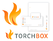
If you've got room for any more flames (do they risk becoming the chilli pepper of 4 years ago?)...
Jon Hicks' design gives the flames a stronger, more distinctive outline, which lets them break out of any container and stand alone.
The lower-res print variant loses the gradients of the hi-res and uses simplified flat colours, while maintaining the signature shape.

This works.
The logo gets away with its shiny, glassy surface through a very strong, recognisable, shape.
Lovely font too.

This lovely logo combines crisp text with a soft, appealing "feature", which in this case is realistic.
A first-class logo, which is engaging and different yet still simple enough to work at a range of sizes in a variety of media.

Graphic/text combo again (from Lucian Slatineanu), this time on a dark background.
The graphic on the badboy logo seems complicated, with its gradients, but works because the overall shape is simple and recognisable. The font on the logotype matches the graphic well.

A truly excellent logo from Javier at Emaginacion.
It fuses strong flat colours, clear text and simple but recognisable shapes into a pleasing and interesting combination.

The graphic element of this logo by Domenico Catapano has a bold and relatively recognisable shape, and creates two interesting negative shapes (
).
I think this logo would stand out more and be more memorable with a feature of some kind.

No more separate graphic elements, the WebJay logo is strong enough to stand alone.
The typography and colour give it a fat, friendly feel, and I like the feature on the "J", which is raised from the baseline to give it dynamism and has added vibes to represent what the brand's about.

Another strong singleton logo. This one is super-bold because it's making a super-bold statement.
The badge "O" adds interest for your second look, and the subtle rounding of the badge nicely offsets the flat red of the lettering.
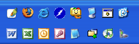
Jon Hicks' Firefox and Thunderbird logos are well-known masterpieces.
Like the 37Signals logos (above), they are attractive at high sizes due to appealing shapes, colours and lighting effects, yet when reduced down to the size of a small icon they still work.
Working at low-res is due to using clearly differentiated areas of colour or tone that are still recognisable when reduced in size.
I find my Firefox icon is one of the easiest to locate in my WinXP quick start menu (below). I just look for the orange crescent. The blue offsets the orange whatever the background colour may be.
A classic logo, simple text/graphic duo with few colours (which makes life easier reproducing in print & on t-shirts etc.).
There's nothing really clever going on here. It just works. By the same token, there's nothing really interesting or particularly appealing.
However, this is a well-executed example of this type of logo, which is good for most companies.
Home | Audio | DIY | Guitar | iPods | Music | Links | Brain and Problem Solving | Site Map | Contact
![]()