|
|
Home | Audio | DIY | Guitar | iPods | Music | Brain/Problem Solving | Links| Site Map
This work is licensed under a Creative Commons License.
Contrast
Contrast is the most fundamental design device:
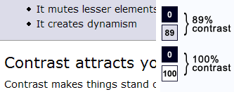
- It differentiates elements
- It brings out dominant elements
- It mutes lesser elements
- It creates dynamism
Contrast attracts your eye
Contrast makes things stand out from their surroundings, be more noticeable. Things with higher contrast will be more noticeable.
Contrast is the most common problem area I find when analysing designs, usually because there just isn't enough contrast, or the highest-contrasting elements aren't the right ones.
How to use contrast
Designers use contrast to help users to browse effectively by guiding the eye swiftly and effortlessly around the page. A web page that has been well crafted feels refreshingly easy to look at, because it helps to minimise the difficulty of interacting with a screen (see above). All screen features compete for the eye's attention. High contrast is employed to promote more important features. Low contrast helps to make less important features recede a little from view.
Example of insufficient contrast
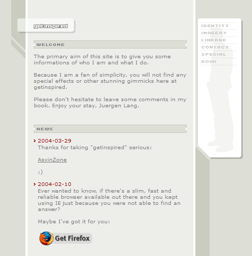
This is a nice layout, with the pleasant angular shapes winding around the main content area. I also like the subtle silhouette behind the navigation.
There are a few big problems. Firstly, there is simply not enough contrast to make the content clear to read. Grey text sits on a grey content background, against a grey page background. This is compounded by the smallness of the text and logo, because size multiplies contrast. By far the most noticeable item on the page is the 'Get Firefox' logo.
In addition, the site logo is far too small. A site ID is a vital element for letting a user know where they are. Apart from being too small, the logo is oddly positioned to the bottom-right of its containing box.
For a site home page, the content says very little in too many words, and fails to give the most relevant information. "The primary aim of this site is to give you some information of who I am and what I do," would be much better expressed in terms like, "This is the personal site of Juergen Lang, a web developer working in Linz, Austria..." and then go on to describe why you should look further.
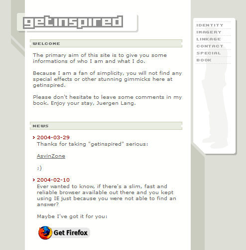
A few quick changes increase the contrast significantly, by making the content background much lighter, darkening the side nav links, and magnifying the site logo.
Readability and scannability are both dramatically increased by the simple increase in tonal contrast.
Another small change I've made is to move the section headers towards the left. In the original above, the news bullets extend further left than their header, which feels slightly odd.
One to try
Visit Alex King's site, and try switching the styles using the icons at the top-right. Which is easiest to read?
Contrast devices
Areas of high contrast attract the eye more than elements of low contrast.
- However, you can only use this if there are areas of low contrast to stand out from. If everything on a page is high in contrast, everything will be fighting harder for attention, and the result is a page that is actually tiring to look at.
Sharp changes in tone attract.
- The greater the difference in tone, and the sharper the boundary, the higher the contrast
- Thick lines attract more than thin lines -but - lines that are too thick (fatter than the spaces between them) lose clarity. As a mass, black (the design term for super-bold) text has more contrast on the page, but the individual characters have less contrast in relation to the space that each word occupies, and so lose clarity
Areas of tone/colour that are different (from the page background or colour scheme) stand out
This is obvious. If you put an orange logo on a predominantly blue page, it will stand out because the colour contrasts. A single white box on a dark page will stand out because there's a lot of tonal contrast.
New things with high contrast stand out more than familiar things.
When the user has already seen even one page and identified that dark bar at the top as "navigation", and that strip below it as "a banner ad" they'll automatically start to ignore it.
Therefore, when there's something important for the user to see, it's easier to show if it's placed in a part of the page that changes, i.e. content canvas. Otherwise, it would have to work a lot harder to be seen.
Movement attracts.
Things that move are obviously very effective at attracting the eye. In real life, we need to be more interested in moving things, because they're more likely to be food or a threat. Our brains are tuned to respond more to movement out of the corner of the eye than to things in centre-vision that move.
Movement doesn't just mean animation. To a lesser degree, the visual suggestion of movement also attracts. Diagonal lines attract more than square lines. Busy patterns attract more than flat tones.
Example: Amok
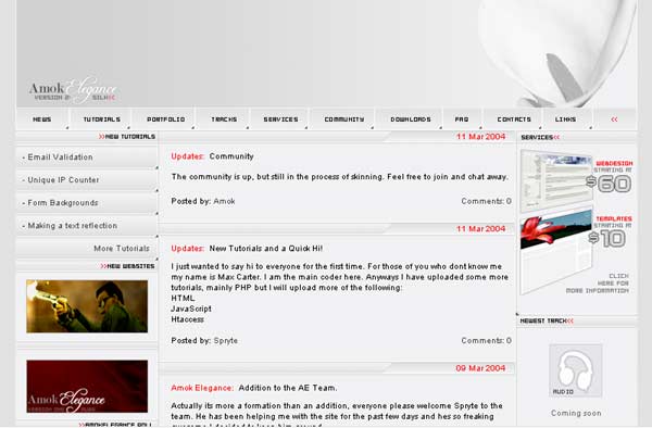
This is a nice-looking design (this view is 2/3 size), which uses pleasant subtle gradients.
However, the contrast balance is wrong. The areas of high contrast don't highlight the more important features.
The most noticeable screen elements are:
- The two ad panels on the left side (these point to external 'featured sites', and don't relate to content)
- Also high-profile is the top image on the right-hand side, which is high-contrast and features a diagonal (this is promoting a design template for sale; content on this site, but again not the focus of the home page)
- Less noticeable is the very nice flower image in the background of the top bar.
At 2/3 scale, there is nothing else really noticeable on this page, but a design with good contrast should be understandable even at this scale.
Recommendations:
To make the design more effective, contrast should be added to draw attention to the intended focal points of the page. Main navigation, page and section titles, and site logo should be clear. The page is generally very light, so what it needs is extra darks.
It might also benefit from extra clarification of the sections on the page. The navigation should be distinguished from the main content area, as well as any secondary areas (side links and adverts).
The Squint Test
The squint test is an easy way of assessing the overall contrast of a page.
All you need to do is close your eyelids so your eyes are about three quarters closed, so that normal text becomes blurred and unreadable. All you'll be able to make out is areas of lights and darks, and strong colours. This will reveal the areas of highest contrast.
Check where your eyes tend to focus. What are they drawn to on the page? This will give you a good impression of the most 'attractive' elements. Are they the right ones to help your visitors use the site successfully?
Try the squint test on the Amok screengrab above. You'll see that the two left-hand blocks are most attractive, then the image on the right, and maybe then the background image at the top right of the page.
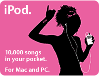
Try it on something that uses simple, clear colour and contrast, like this iPod advert.
Measuring contrast
To check contrast, you need to compare the brilliance/luminosity of the foreground and the background. The greater the difference, the greater the contrast.
For the following examples, I took screengrabs, reduced them to greyscale in Photoshop, and took luminosity readings with the colour picker. Try the squint test on these:
Example A: Web Design from Scratch
WDFS uses black/white for the majority of body text, for maximum readability. Certain blocks of text (introductory paragraphs, comments and callouts) are displayed on variations of light grey, but still offer around 90% contrast.
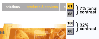
Example B: sealedmedia.com
The main navigation uses white or mustard yellow, on a mid-to-dark grey background. The white contrasts only 32% against the grey, which is probably insufficient for people with visual impairments.
Yellow/grey has very little tonal contrast - only 7%. This design relies on the yellow's contrasting hue; which is not a safe option for certain colour combinations.
The yellow colour is used for the current section, which is a mistake. The current link should be permanently highlighted, either with extra light, extra coloured light, or extra contrast. While the yellow is adding colour, it is not coloured light, and reduces contrast far too much.
Example C: transformationalbreath.co.uk
This site puts black text over a grey & white background image.
The minimum contrast is 91%, which is sufficient for the text to be universally readable.
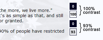
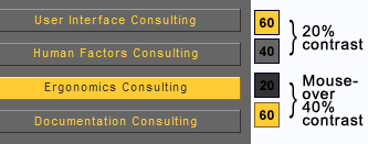
Example D: usernomics.com
The default state has yellow over a mid grey, which gives a tonal contrast of only 20/100.
The startling mouseover style (dark grey/yellow) has more contrast, but only 40/100.
Home | Audio | DIY | Guitar | iPods | Music | Links | Brain and Problem Solving | Site Map | Contact
![]()