Home | Audio | DIY | Guitar | iPods | Music | Brain/Problem Solving | Links| Site Map
This work is licensed under a Creative Commons License.
Containment
'Containment' is the effect where one or more elements is shown as part of a group or category, through a visual mechanism.
There are two variations of mechanism: strict encapsulation, where the element is totally contained within a box; and softer containment, where the box is suggested using the hierarchical cascade and white space.
Strict: Encapsulation
This is where you show that an element is part of, or a child of, or (one-way) related to, another element, by placing the child within the bounds of the parent. The parent might be identified simply by a label that's either inside the box and towards the origin, or sitting on the edge of the box.
In this example, the three panels clearly belong to the group "Home page - Features", because the title bar defines a box that contains the three objects below.
Here, the title describes the child items: they are all "Features on the home page"
Alternatively, it might simply be a box within a box that is otherwise identified (e.g. links associated with this document).
Soft: Hierarchical cascade
This is the softer alternative to the more literal encapsulation. It doesn't depend on the 'higher' element actually encompassing the 'lesser' element, but the containment is suggested through visual superiority. The 'superior' element should be laid out near the 'lesser' or child elements, and toward the origin (either to the left, or above, or both).

Although there is no physical containing box, the title "Bargain flights" obviously applies to every item in the list.
This is suggested because the title is situated between the list and the page origin, and reinforced by the title bar projecting a little further left (towards the origin) than the list, and spanning its full width.

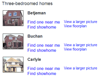
The 3 types of house all belong to the category "Three-bedroomed Homes"
Although the title "Three-bedroomed homes" does not span the the full width of the child elements, it projects slightly left of their left edge, and no other element exists in the imaginary box created by the white space.
Example of too much encapsulation
This page uses too much encapsulation, with the result that everything seems separate, with nothing related to anything else. You also don't know where to look first.
Several self-contained sections, like the blue header, create hard breaks across the full width of the content area
The only way to maintain visual relationships in this scenario would be to use strict alignment, indenting elements different amount to suggest their relationships. The centre-aligned navigation here is particularly ineffective.
Example of incomplete encapsulation
This snippet shows incomplete boxes. It's encapsulation that's started but not finished.
I think that the end result is worse than having all boxes or just using whitespace and no boxes at all. It causes an illusion that the brain finds unsettling.
Home | Audio | DIY | Guitar | iPods | Music | Links | Brain and Problem Solving | Site Map | Contact