|
|
Home | Audio | DIY | Guitar | iPods | Music | Brain/Problem Solving | Links| Site Map
This work is licensed under a Creative Commons License.
Case study: Business Improvement Network Redesign
The Business Improvement Network is a highly successful free club for quality improvement professionals who meet together to share their knowledge and experience.
A busy website serves the network's needs well, attracts new members every week, and gives members access to lots of free information.
The site needed a design facelift to match the BIN's high standards.
Original screenshot: Home page
(50% scale, click to enlarge)
Summary critique:
The BIN home page is pretty effective. It opens with a concise message introducing the Business Improvement Network.
The page layout is relatively clean and clear, but the visual style appears cheap and lacking in personality. A new logo and colour scheme can deliver quick benefits.
The relatively long menu hints at over-segmentation. The homepage needs a greater sense of activity and personality, to encourage the visitor to explore further into the site.
Detailed breakdown:
Page layout
Spatial layout is a conventional 2-column format, consisting of a single left-column and main page content area. The logo/navigation column is solid and full-length, while the main content area is otherwise unbordered. This gives a slight sense of emptiness.
A few pages on the site use an additional floating right-column. On the home page, the bulleted list and Amazon search box are out of place, floating in space. Their relationship to the other content is unclear: is it secondary callout content, or a second column of main content?
Layout changes can fix these small problems:
- The content area would benefit from being framed with solid page 'furniture'
- Secondary content should be separated the main page body, e.g. by placing it inside a callout box, or in a separate area
Branding and colour
The white and red colour scheme is bold and bright. However it tends to say 'cheap' (Several UK high-street brands that compete on price and use this colour scheme include Curry's, Comet, Argos, Staples, Safeway, Iceland).
The blue-green colour in the sub-head text doesn't fit with the red at all.
Aside from the simple and dated logo, the homepage uses no imagery to communicate. Relying on text alone gives an unnecessarily serious impression, probalby unhelpful for making new friends. The result is a homepage that feels a bit harsh and faceless.
A few images can say a lot about quality (professional links), personality, and reality (at least saying "we exist").
Content
On the whole, copy is brief and well-written. Paragraphs are short, typically one sentence, which is highly readable.
The tag line ("...share, learn and develop with fellow professionals...") is not sufficiently descriptive (doesn't differentiate qualitatively), and a bit too prominent considering the value it adds.
As a rule, instructions on how to use the site can be avoided. The home page says, in bold, "If this is your first visit to the site, we recommend at least a quick browse through this Introduction... Otherwise click here to skip the introduction."
(The hyperlink doesn't follow good principles, because it doesn't say what you'll get or where you'll go).
In this situation, it is much more efficient to trust the visitor's instincts, present them a clear menu of information, and let them choose how much they read.
Navigation
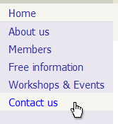
The menu seems to have a lot of items, which a bit off-putting. It makes the site seem big, and likely to take a lot of work to trawl through (it's at least 12 clicks wide, and we don't know how deep!).
Some sites that cover very broad content might need 12 level-one links to be usable. In general you should look for the balance that matches likely usage patterns, providing recognisable signs for content that matches typical goals (contact you, find out more about you, get stuff).
This site is, in fact, over-segmented. One area that looks prime for consolidation is the events: "Next Workshops", "Past Workshops", "Host a Workshop", and "Other Events" all fall neatly under "Workshops and Events", particularly when the "Other Events" link reveals a page saying "No other events are currently scheduled."
This is a great example of the risks of dividing a site into too many sections at the top level. Clicking the "Other Events" link gives a disappointing experience, which is totally unnecessary. If all event details: previews of future workshops and other events, summaries of recent events, and a call to action to host an event yourself, were collated onto a single page, the result would always be a rich, busy page that showed ongoing activity.
Original
Redesign
Notes on the redesign
A classic 3-column layout is used beneath a full-width page header that places a clean new logo boldly front-and-centre.
The green-based colour scheme is soft and vibrant, tempered by the juxtaposed greyscale body. The colours fill the space, which makes the site appear more 'full', yet the flat, square shapes require only a few small files.
A simple new logo re-uses the original's diamond format (an awkward shape for a logo), and applies simple colour and text.
BIN has an extremely impressive list of members, but this was concealed on the "List of Members" page. A selection of members' logos, a simple professional logo, and a member's mugshot (formerly on the "Members' feedback" page) combine to present a more professional and personal image.
Similarly, some of the excellent member feedback has been floated up to the home page. This takes advantage of the principle that "it's easier to let someone else sell you than it is to sell yourself". The member quote picks out an excerpt in bold that sells the BIN's benefits.
The menu has been halved in size to six items, and is now much plainer and easier to comprehend. It also allows use of a simple footer menu.
The menu is CSS-only, and uses a CSS mouseover effect that makes it absolutely clear what is clickable. (Following good mouseover practice, the whole target highlights, and there is no dead space between hotspots. The active hotspot displays conventional bright blue text. )
Home | Audio | DIY | Guitar | iPods | Music | Links | Brain and Problem Solving | Site Map | Contact
![]()


