|
|
Home | Audio | DIY | Guitar | iPods | Music | Brain/Problem Solving | Links| Site Map
This work is licensed under a Creative Commons License.
Artorg.co.uk is an online community for artists and designers.
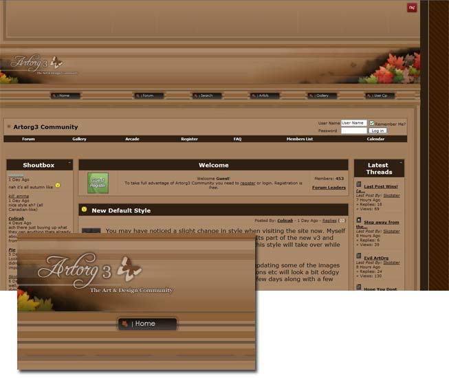
At first view, this is a really nice-looking site. It has an appealing, soft colour scheme offset with well-chosen graphics, and the content appears solid and orderly.
Once you go beyond the pretty imagery, you find a layout that lacks orientation, and doesn't do quite enough to promote its content.
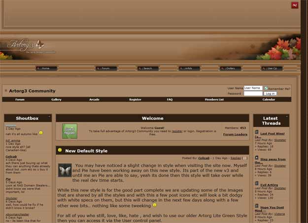
Screenshot (Home page, 50% scale)
Summary critique:
The brown colour scheme is soft, warm, and welcoming with reasonable tone. The main content area could benefit from more tonal variation.
Navigation is too dispersed, and the page lacks focus, which weakens the overall image.
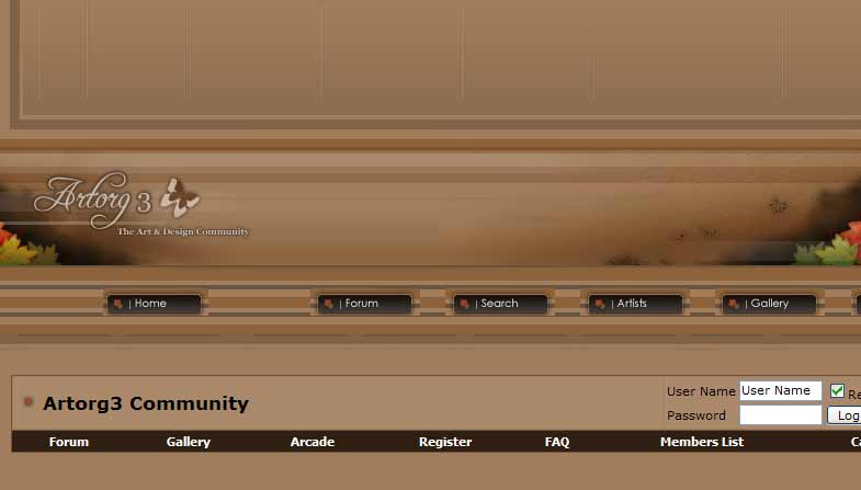
There is definitely too much empty space at the top of the page. At 800x600 resolution, no content makes it onto the screen.
Actual visible area of Artorg.co.uk's homepage at 800x600 resolution (Mozilla/Win)
Detailed breakdown:
Branding
The natural imagery is lovely; the site logo is elegant and just subtle enough, although it is weakened by being low down on the page.
It's nice to see a strap line, but "The Art & Design Community"could be more descriptive. There are hundreds of art and design communities - what differentiates this one?
Colour & Tone
Although the decorative graphics are minimal, the have more impact through the consistent page colour scheme.
There's not quite enough tonal difference. The strongest darks and greatest contrast draws the eye to navigation, instead of content. The base colour is too mid-tone. Content boxes should be made distinctly lighter. Text is reasonably sharp, and would be even more readable against a lighter content background colours.
Layout
The page has a problem with vertical space and ordering. The empty space at the top of the page serves no use.
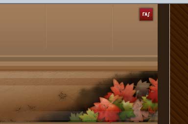
The tiny logo at the top-right is too weak to have any claim to describe the site overall, and I don't know why it's there.
The Artorg logo should definitely be higher in the top-left, in order to dominate the page. Currently, it looks like Artorg is a subsidiary of this rAs(?).
There is too much empty space under the community nav bar.
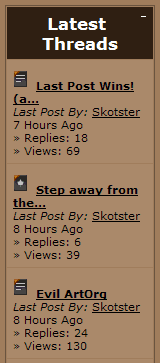
'Latest threads' is badly aligned. It reuses the same data (author, replies, views).
A) How relevant is this data to users' goals?
B) It might be better to use columns, which could minimise repetition and enable scanning of most important data (title and author).
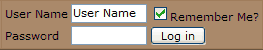
The login control does not read in a logical flow order.
Username sits above Password, which is okay, but then the 'Log in' button is to the right, below "Remember me?". The natural order of dialogue would be:
- "I am X" (username)
- "I can prove it because I know the.." (password)
- "I do/do not want you to remember these details" (remember me)
- "Enter" (log in button)
Why is "Remember me?" a question? I'm not asking the site anything? It should be a command! If I want the site to remember me, I should only have to instruct it to.
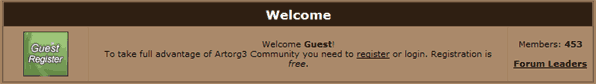
'Members 453' doesn't belong in the 'Welcome' panel. It's a property of the community, therefore it should be encapsulated directly in the community's bounding box.
Navigation
Why are there 2 different horizontal navigations? The second one doesn't seem to be a subset of the first. If it's all part of Artorg Community, the secondary navigation should be clearly encapsulated inside the primary level's bounding box.
One effect of this duplication is that there are 2 gallery links, and 2 forum links! This is totally confusing. If we are to believe that we're looking at a consistent site, it must project a clear and solid information architecture.
The link style in the community nav bar is identical to the box headers in the rest of the page (bold and white). If they're links, they should be visually identifiable as links. Buttonising might work.
Top-level nav is ineffective. One reason is that the text is too small and light, particularly against the much bolder elements lower down. The nav links are so far spread out to suggest (deliberately) that they're unrelated, as though they are links to different sites. But they are related, and they should be grouped to show that.
Content
The icons in the 'Latest Threads' box are obscure. Obscure icons is quite a common 'feature' on community solutions. It's very hard to create icons that effectively convey a message at small scale. In this case, the icons' extra clutter outweighs any benefit, even for experienced users.
What does 'Forum leaders' mean, and why is it in the 'Welcome' panel?!
The 'Guest Register' box in the 'Welcome' panel is weird. It's so out of place that it looks like content pic.
Original
Redesign
Screenshot at 2/3 scale:
Layout changes
The quickest gains can be achieved here with a more compact, economical layout.
I've recovered a lot of the premium empty space at the top of the screen, and made the content more compact. I've also applied a grid format. This approach brings the main content forward (nearer the origin), and arranges the secondary items (login, search, latest threads, shoutbox) around a consistent axis.
The benefits of a simple grid are that it makes the content appear simpler, and lets the user quickly scan and identify the different elements in a sweep of the eye, rather than zig-zagging around.
I've arranged the 'Latest threads' in another grid, to reduce the amount of wordage on the screen. It has also lost the 'Views' property, which is nearly always a pointless feature - replies is a much better indicator of activity.
Both 'Latest threads' and 'Shoutbox' are now in wider columnns, allowing more of the useful text to be shown, and benefitting from more readable line length.
Overall, this design shows the same content and features as the original, in almost 50% of the screen area.
Navigation changes
I've combined the two navigation bars into a single bar, removing the duplicates. The nav buttons are now more closely grouped, and positioned directly beneath the site id (as they all belong to the site).
Colour & Tone changes
The colour scheme and imagery are largely unchanged. The main difference is in the content areas, which are now on a lighter and less saturated background. This helps the content stand out from the page background.
The main content area (about/welcome/self-promotion) has a lighter background tone than the secondary areas, which further increases the tonal contrast, attracting the eye.
'Latest threads' and 'Shoutbox' use subtle changes in tone to differentiate rows, a convention which makes easier side-to-side scanning.
Functional changes
I've rearranged the Login function onto a single line, in the order of logical dialog flow.
I've also brought the Search function onto the home page, rather than having its own page. Making search instantly accessible is proven to increase its usage. Assuming there are additional search functions on the other page, it is conventional to describe them with an 'Advanced (search)' link.
Content
It's important for any site or page to state clearly what it is, so that the user knows when they're in the right place or not. I've left the site strap line alone, and altered the introductory paragraphs to include a permanent statement of purpose and welcome, inviting the user to explore further.
I thought it would be nice to showcase recent media content on the home page - what could better describe an artistic community than its artistic output in the form of imagery?
Decoration
The graphics are so nice, there's no room for improvement. The only changes I've made are to lighten the logo image, to bring it out from its background to dominate the page more, and apply a larger, stronger font to the site strap line. I've re-used the same font (AccentGraphicMedium) in the (graphical) section headers.
Home | Audio | DIY | Guitar | iPods | Music | Links | Brain and Problem Solving | Site Map | Contact
![]()