Home | Audio | DIY | Guitar | iPods | Music | Brain/Problem Solving | Links| Site Map
This work is licensed under a Creative Commons License.
Alignment
Alignment is another way of creating associations between visual elements, which help users quickly understand the relationships of objects on a page.
Alignment works by visually associating a number of elements. When you see a number of aligned elements, you instinctively believe that those elements are peers of each other, or share some other common property.
This is a really useful tool for quickly letting a user know what they're looking at by instantly spotting relationships between different elements.
Properties of alignment
Alignment works on any screen elements: paragraphs of text, images, buttons, pictures, links, even combinations of all of them.
Although aligned elements are often grouped spatially, they don't have to be. Alignment works across the entire screen, even when the axis is broken by another element. However, arranging elements in a line or grid is stronger because it also benefits from grouping.
Top-edge and left-edge alignment are stronger than right- or bottom-edge alignment, because of the natural flow of the cascade. Groups that are aligned by their left or top edges seem to be more important than they would be if right- or bottom-aligned.
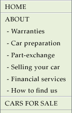
Alignment axes that start near the origin (top-left of the screen) are superior to those that sit further right or further down. This is a useful way of indicating a visual hierarchy, particularly when you have too many elements to arrange into a neat cascade. See the first example screenshot below. Spot the top-level navigation links that are only associated by their alignment axis. The second-level links sit along an axis that starts further out from the origin. This makes them inferior to the first-level links - even if they were above some of the first-level links.

In this example, the 2nd-level links (Warranties, Car preparation...) are still inferior to all the top-level links (HOME, ABOUT, CARS FOR SALE).
Although the L2 links are superior to the CARS FOR SALE link, it is associated with the higher first-level links by its alignment axis. Because that axis goes nearer the origin than the L2 link axis, all the elements that sit on it are superior to the members of the L2 axis.
Grids
Grids are a really useful tool for page design, and for forms especially. Once you find a design that seems to work because it uses strong and complimentary alignment axes, you can take the grid made by those axes and re-use them on other pages. Re-using layouts based on common (invisible) grids can strengthen a site's consistency.
This is design company gpin.co.uk's homepage (75% scale). I find the excellent top image instantly appealing, but the page is really hard to work out, due to chaotic layout.
I think that one way to make this design far more useful would be to apply a simple grid-based layout.
A simple example
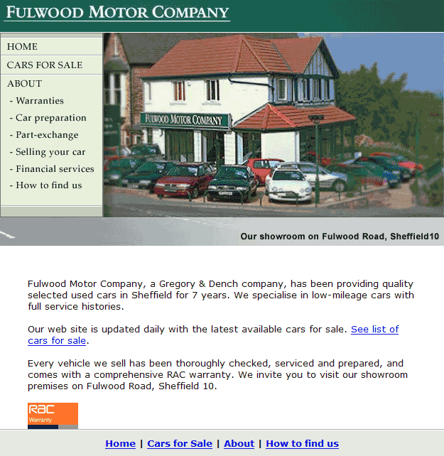
In this example, there are four alignment axes at work:

The same image, with alignment axes marked
A more complex example
Example of insufficient alignment
Home | Audio | DIY | Guitar | iPods | Music | Links | Brain and Problem Solving | Site Map | Contact