|
|
Home | Audio | DIY | Guitar | iPods | Music | Brain/Problem Solving | Links| Site Map
This work is licensed under a Creative Commons License.
Color Theory & the Color Wheel
Color is a vast, complex subject that encompasses nearly every aspect of human endeavor. Consequently, the following tutorial will concentrate primarily on the the color wheel and the classic color schemes used in graphic arts. For your convenience.
The Color Wheel
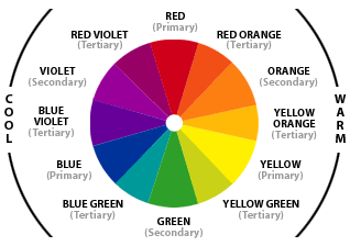
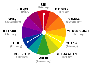
All of the colors we can perceive are produced by the mixing of certain basis colors. There are three categories of colors:
- Primary Colors (Red, Yellow, and Blue) are those that are not formed by the mixing of any other colors and can be said to be "pure" colors.
- Secondary Colors (Orange, Green, and Violet) are those formed by the mixing of two or more primary colors.
- Tertiary Colors (Red-Orange, Yellow-Orange, Yellow-Green, Blue-Green, Blue-Violet, and Red-Violet) are those produced by the mixing of two or more secondary colors.
The color wheel also visually illustrates color "temperature"--warm vs. cool--as vital psychological components in delivering a specific color's message:
- Warm Colors (Red, Orange and Yellow) are associated with the warmth of fire and sun.
- Cool Colors (Blue, Green, and Violet) connect in the mind's eye with the coolness of sea, sky, and foliage.
Colors are further broken down in terms of their properties: "Hue", "Saturation", and "Value":
- Hue and Color are synonymous terms and can be used interchangeably. Hue is color in its purest form. The colors of the color wheel are hues.
- Saturation and Chroma are synonymous terms and refer to the intensity of a color. Saturation is determined by how much or how little gray a color contains.
- Value is the lightness or darkness of a color. Lightened values are called "Tints", darkened values are called "Shades", and medium values are called "Midtones".
|
||||||
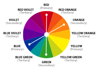
| According to color theory, harmonious color combinations use any two colors opposite each other on the color wheel, any three colors equally spaced around the color wheel forming a triangle, or any four colors forming a rectangle (actually, two pairs of colors opposite each other). The harmonious color combinations are called color schemes – sometimes the term 'color harmonies' is also used. Color schemes remain harmonious regardless of the rotation angle. Following are the "Classic Color Schemes." |

Monochromatic Color Scheme The monochromatic color scheme uses variations in lightness and saturation of a single color. This scheme looks clean and elegant. Monochromatic colors go well together, producing a soothing effect. You can use it to establish an overall mood. The primary color can be integrated with neutral colors such as black, white, or gray. However, it can be difficult, when using this scheme, to highlight the most important elements. |
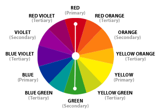
| Complementary Color Scheme The complementary color scheme is made of two colors that are opposite each other on the color wheel. The complementary scheme is intrinsically high-contrast and draws maximum attention. When using the complementary scheme, it is important to choose a dominant color and use its complementary color for accents. Using one color for the background and its complementary color to highlight important elements, you will get color dominance combined with sharp color contrast. Click the graphic on the right to open a new browser window and view the Complementary Color Wheel in action. |
 |
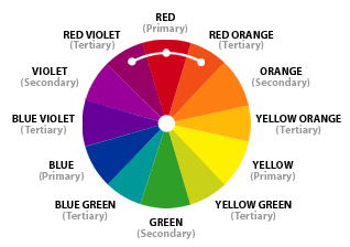
Analogous Color Scheme Analogous colors are colors that are in close proximity to each other on the color wheel that share similar hue and saturation. The graphic example on the right shows Red and two analogous colors of Red Violet and Red Orange. Analogous colors are most often used to achieve proper color harmony. Click the graphic on the right to open a new browser window and view the Analogous Color Wheel in action. |
 |
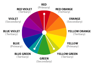
| Split Complementary Color Scheme The split complementary scheme is a variation of the standard complementary scheme. It uses a color and the two colors adjacent to its complementary. This provides high contrast without the strong tension of the complementary scheme. Click the graphic on the right to open a new browser window and view the Split Complementary Color Wheel in action. |
 |
| Triadic Color Scheme The triadic color scheme uses three colors equally spaced around the color wheel. This scheme is popular among artists because it offers strong visual contrast while retaining balance, and color richness. The triadic scheme is not as contrasting as the complementary scheme, but it looks more balanced and harmonious. Click the graphic on the right to open a new browser window and view the Triadic Color Wheel in action. |
 |
| Tetradic Color Scheme The tetradic (double complementary) scheme is the richest of all the schemes because it uses four colors arranged into two complementary color pairs. This scheme is hard to harmonize; if all four colors are used in equal amounts, the scheme may look unbalanced, so you should choose a color to be dominant or subdue the colors. |
 |
Home | Audio | DIY | Guitar | iPods | Music | Links | Brain and Problem Solving | Site Map | Contact
![]()