Home | Audio | DIY | Guitar | iPods | Music | Brain/Problem Solving | Links| Site Map
This work is licensed under a Creative Commons License.
Three-dimensional illusion effects are powerful devices that can achieve excellent results.
They can also add significantly to overall page filesize, and can reduce usability if overused, so should be used deliberately and with care (unlike the title image above, see cooltext.com if you want one).
Suggesting "Clickable" or "Interactive"
In the real world, things that are pushable tend to be three-dimensional, such as buttons on a radio. The designers of early graphical user interfaces for computers used this to create a really concise GUI shortcut to say "clickable".
The button effect is one of the strongest design conventions in interactive design.
Examples:
The top navigation area of this web page (50% scale) uses 3D in 3 ways: to give the horizontal line richness and weight, to make the top-right buttons appear more clickable, and to make the first-level navigation appear more clickable.
The 3D effects on the links are subtle, but they obviously say "Click me". This is helped by the fact that the page uses a flat white background.
In a similar idiom to buttons being clickable, we are used to the concept of instrument 'panels' in the physical world. Often, groups of controls are put together on a raised or lowered panel (which has the ergonomic benefit of being locatable by touch alone). Also, screens nearly always have a bevelled edge.
Graphical user interface (GUI) designers have taken advantage of this convention when creating digital controls. Input fields, drop-downs, multiple-select controls and radio groups have traditionally used bevelled or grooved effects to distinguish them from plain 'page'.
Application windows have bevelled edges, which helps to strengthen their 'container' properties.
Example:
This table uses cascading style sheets (CSS) to give the column headers a solid appearance.
The subtle 3D effect makes you suspect that there's something to click on the headers, which sorts the columns.
Differentiating objects from their surroundings
3D creates a sense of space between different elements. That makes it a very effective way of reinforcing differences. Shadowing, including drop-shadows, gradients, and highlighting, is the most useful principle.

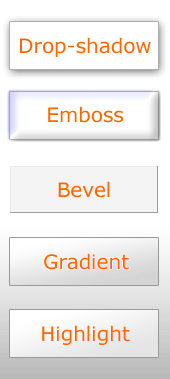
This example shows five typical techniques that use shading (lighting effects) to differentiate an element from its surroundings.
Drop-shadows and bevelling/embossing are familiar.
This bevel example shows how real 3D effect can be achieved with very subtle colour changes.
Remember that gradients are also lighting effects: they suggest an illusion of light.
Highlighting makes an element seem nearer. It can be as simple as putting a lighter tone next to a darker one: this one puts a lighter gradient over a shaded background.
Example:
Subtle drop shadows and embossed lettering make the site logo and strapline stand out from their background.
Adding richness
3D effects can suggest a rich, multi-layered, realistic, believable environment. The golden rule is: use with care Nothing works if it's applied to everything - things need something to stand out *against*.
Be consistent
Light source is often crucial. Two things to remember about all 3D/shading effects is that they're both light effects and illusions.
For the illusion to work, the user needs to believe that what they're seeing could be real. To create a physical illusion, you need a plausible facsimile of reality, and consistency in treatment. For example, if you had an element appearing to be both behind and in front of another element, the illusion effect could be broken.
One of the most common mistakes in 3D effects is to use different lighting sources on different elements. It's OK to have more than one light source, and a lot of design does that today, because it produces lighter and softer effects. However, the overall light environment has to be just believable enough.
Home | Audio | DIY | Guitar | iPods | Music | Links | Brain and Problem Solving | Site Map | Contact