|
|
Home | Audio | DIY | Guitar | iPods | Music | Brain/Problem Solving | Links| Site Map
This work is licensed under a Creative Commons License.
Doing it with style
When I say "style," I am not referring to style sheets, although they may well play a big part in how you implement your style. I mean visual identity. If you design a page with a strong visual identity in the first place, any parts that contributors add correctly will look as if they belong there; they won't look stuck on. Identity sometimes relates to a company and sometimes to a branded product; in essence, it is the outward expression of that company or brand that uniquely and distinctively sets it apart from all others.For any company or brand, the logo is the primary facet of that identity. The best identities often go further than that. Logos are usually set-in-stone visual devices that are applied with rigorous consistency. You can't argue with that principle if you are trying to build a solid identity. Unfortunately, such rigidity doesn't always produce the best effect. A circular or square logo, for instance, gets hopelessly lost when it appears on a long, thin sign, the side of an airplane, or a narrow strip at the top of a web page. It would be nice to stretch it and give it more presence in such situations, but that is seldom allowed.
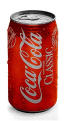
Companies that frequently need to present their logos in odd shapes and sizes find it better to have a flexible element within their identity. A prime example of this is the white-on-red swirl of the Coca-Cola Company, which finds itself equally on the bottle cap, soda can, and company website:
You also see it in the identities of petroleum and airlines companies where long, thin "canvases" are common. Although the logo itself stays absolutely consistent, the adaptable element can be stretched or squeezed to fit any given shape, which helps maintain brand identity. Adding such an elastic element to your web page design is more or less essential, especially when the page scrolls down and away from the main logo at the top.
The stripes below are part of the company's identity or appearance, and are infinitely adaptable. They can stretch to fit any given space and can even bend upwards on a tailfin or downwards the edge of a web page:
There are many ways to give a web page an identity using background images but a more subtle approach is to use a consistent typographical style—maybe it's a particular typeface, color combination, or the use of some other mnemonic device that makes the page more distinctive, and therefore more memorable.
Certainly, if you study the house styles of magazines, newspapers, and some book publishers, you'll get a strong sense of "belonging to" from their pages. For instance, the website of The New Yorker borrows the long-standing identity of this 75-year-old magazine (click the image below to enlarge it in the browser):
Ultimately, you should be able to identify the publication (or website) by seeing just a small part of any page.
Creating such a visual identity for your websites helps in many ways. Apart from the obvious belonging-to aspects, it holds everything together as a cohesive entity; every time visitors encounter this identity, it builds upon and reinforces the strength of the brand. Remember, it is only too easy for your site's visitors to jump from your pages to someone else's. A strong visual identity helps provide an anchor for the reader in the same way that a landmark does when you are navigating an unfamiliar city or terrain.
Finding your type
Typography is all about hierarchy of information. Web typography is not the same as print typography; it is a different medium with different demands and restrictions. For starters, you don't have much choice of body typestyles. It's extremely likely that you will use the same typeface as thousands or millions of other websites. Many of the default typefaces used for web pages aren't even suited to screen display; they are printer fonts and what you see onscreen are, at best, loose approximations.What typefaces are at your disposal often don't come in the same variants you see in print. You have regular and bold, but no light or extra bold—and things like expanded and condensed are unheard of. Unfortunately, this is the palette you have to work with; you must find other ways to differentiate blocks of text and create the required hierarchy of information.
Working in color
What you do have, fortunately, is color. Color on web pages, unlike the printed page, is cheap and plentiful. Where you miss out on weights of type, you can simulate with color and tone. Use high contrast to make text stand out and low contrast to make it less prominent. Using pale gray text on a white background achieves the same effect as using a light typeface (click the image below to see the text rendered in the browser):
Of course, when you go beyond body copy—to headings, menus, navbars, and such—the possibilities increase dramatically for creating your own unique look. Add distinctiveness by using less common fonts, rendered as small GIF files, and play all those tricks like adding soft drop shadows that are impossible with regular text.
Making your contribution
The folks who use Macromedia Contribute are more used to using Microsoft Office than a page layout program or a web page editor—a fact that was not lost on the program's designers. Macromedia took this into account in their design philosophy by avoiding techno-jargon and providing a work environment that immediately feels familiar and intuitive. As the web designer, you can do some things to make sure that any additions or modifications to the site are not going to stand out like the proverbial sore thumb and dilute the site's identity.Provide your clients with a customizable kit that is partly built but contains templates and style sheets that control the look and feel of the website. It should consist of some constant pages that don't change and some other pages where contributors can modify existing copy or add new information—news, product prices, or recipes for Hungarian goulash. Just make it clear to them that they won't designing anything; they are not designers. You have to provide templates where information can be added (or removed) in a modular manner so that it appears to belong to the page, not look bolted on as an afterthought.
What I'm talking about is "unerring consistency." Luckily, you have style sheets to work with. Anybody who uses Microsoft Word understands (or should understand) what styles are; Cascading Style Sheets are not all that dissimilar.
In Word, styles are (hopefully) given meaningful names when they are created: bodycopy, big headline, sub headline, picture-caption, and so on. Although CSS gives you the ability to redefine the properties of H1 through H6 as hierarchical headlines, these abbreviations are largely meaningless to most people. It is better to provide an externally-linked style sheet containing style definitions with meaningful names that users will understand. Think in "Word terms"; you might know what H3 means but Product_Title makes more sense to the contributor.
Controlling readability
One of the most common mistakes made by people more used to word processing than typography is to make lines of text too long. Long lines of text that go from margin to margin are hard to read.
Good typographic practice requires that a
line of text should be between one-and-a-half
and two times the width of a lowercase
alphabet for best readability, as the line below
shows. This converts to approximately
seven to ten words long.
abcdefghijklmnopqrstuvwxyzabcdefghijklmStudies about how we read show that the eye scans groups of words, not individual ones or whole sentences. Anything that blocks this natural process impedes communication.
If the line
is too short,
this scanning
pattern is
disrupted. This is
okay for
subheadings or
captions but
becomes very
tiring in
large amounts.If a line is too long or short, it becomes more difficult for the eye to group phrases. With long lines, returning to the beginning of the correct next line becomes a hit-and-miss affair.
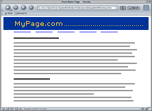
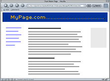
Web pages do not have a definite fixed width; they depend on screen size and whether the surfer has maximized the browser or not. To allow text line lengths to be arbitrarily controlled by browser width is not a good idea. You should set a maximum column width either with a table cell width or a CSS box. When the Contribute user adds text to the page, it should be constrained to this maximum width.
Fluid layouts that stretch to fit the screen width can compromise line length, and therefore readability (shown below at left). Control the body text column width by floating a narrow table or CSS column in the screen width. You can use the space on either side for menus and captions—or just leave it empty (shown below at right):
Of course, the size of the text might vary, especially if you have specified the font size in ems or percentages rather than absolute pixels. Although there are arguments for both methods, never use points because point sizes are only relevant to printed text, not to screen text.
If there is a requirement from the client to make web pages printable, be aware that printing regular web pages is an inexact science that varies from browser to browser. You can improve matters by providing a separate style sheet for printing (using media="print") but if you are addressing an international market, remember that much of the world uses international A4 size for office paper, not the American letter size (8½ × 11 inches), which is slightly wider and less tall. Again, this is a good reason to control your column widths so that the text doesn't go hard against the side margins.
Designing beyond text
Other than text, there are two other elements that a Contribute user might want to add to their website: tabular data and images.Tables: You're supposed to use these to hold columns and rows of figures but they're commonly used to control the overall structure of a web page. There are similarities between adding rows and columns in a Microsoft Excel spreadsheet and in a web page but there are also some traps for the unwary. When it comes to specifying style definitions, some browsers don't inherit styles into individual table cells correctly, so you can't depend on generic <body> or <p> styles alone. Always add definitions for <tr> and <td> tags into your style sheets for best browser compatibility and reliability within tables; then provide further classes that can be used inline to provide variations for headings, color changes, and so on.
To set a dependable default type style for the entire page—including table cell contents—add p, tr, and td style definitions to your style sheet:
p, tr, td { color: black; background-color: white; font-family: Verdana, Geneva, Arial, sans-serif; line-height: 16px; }
Avoid situations where the user can insert the default "3D look" into table borders because they look amateurish—and that is what you are most likely to get. Provide styles that give cell backgrounds subtle colors to help define and separate columns or rows (click the image below to see the table rendered in the browser):
Many typographers also frown upon horizontal rules; the 3D ones provided for in HTML are particularly tacky. Using default HTML techniques do not help to build a strong identity and should be avoided:
Try to find more imaginative and distinctive ways to separate areas of text using white space or blocks of color. Anything that gets away from that default HTML document look is going to improve the perception of the web page—and its publisher. CSS gives much more scope to do something different and original:
That's what makes a strong identity.
Images: Adding images to a web page can be challenging even for relatively experienced web designers. Images present a number of problems regarding file size and quality. One of the first things a web designer learns is what image format to use and in which situation—JPEGs for photographs and GIFs for flat color graphics. To find out more about these two graphics formats, read my article, "Converting Images to Successful Web Graphics."
Unfortunately, you won't have much control over the size or quality of images that Contribute users insert and, in my experience, you can expect problems. Contributors are unlikely to have the suitable tool for the job.
Trying to make subjective judgments about optimal JPEG compression or the color-depth of GIF files requires a trained eye—and a decent monitor. Typical office monitors and laptop screens are far from ideal for this kind of work.
As far as graphics software is concerned, Microsoft Office does not provide an image editor so your contributors will use whatever software came with their scanner or digital camera, which can vary between adequate and dreadful. Or they may use some cheap 'n' nasty shareware program. All you can really do is recommend something that you think is more suitable for the job.
To sum up, here is a list of pointers to keep in mind when designing a site that will be modified by Contribute users:
- Design pages with a strong visual identity so that they appear to belong together—even when scrolled.
- Include a flexible element to complement the logo.
- Use text fonts consistently.
- Use more distinctive fonts, such as small GIF files, for headings and navigational items.
- Create a do-it-yourself kit for users of Contribute—templates, style sheets, and some instructions.
- Name CSS styles consistently and descriptively so users can apply them without guessing what they're used for.
- Control the length of text lines so that they are neither too long nor too short for optimal readibility.
- Make pages easy to print; include a print style sheet.
- Make content in tables easy to change, and make tables fit the design of the page so they're not in an amateurish "default" style.
- Monitor the Contribute users' submitted images for size and quality and make recommendations where necessary.
About the author
Joe Gillespie is a new media consultant based in London. Since 1996 he has published Web Page Design for Designers, a site dedicated to the more creative aspects of web design. He also designs screen fonts for web designers, such as the classic MINI 7.
Home | Audio | DIY | Guitar | iPods | Music | Links | Site Map | Contact