|
|
Home | Audio | DIY | Guitar | iPods | Music | Brain/Problem Solving | Links| Site Map
This work is licensed under a Creative Commons License.
The Design Spectrum
"Design" encompasses a very wide spectrum of disciplines and applications, which address an enormous range of different problems.
When designing a product, the techniques and priorities a designer should use change according to its purpose.
This article introduces a simple conceptual model that I find helpful when designing or critiquing web sites.
When embarking on a design project, it is very important to be clear on its objective.
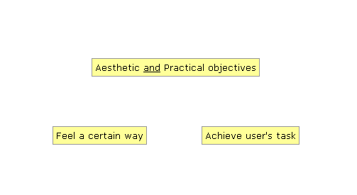
The design spectrum is a way of visualising the relative aesthetic and functional priorities of a design project.
What is design?
Design, in all its forms, is a discipline of making something to do a job. Anything that is deliberately and consciously created is 'design'.
Often, design's job is to influence consumers to have certain feelings or emotions. Products that have this objective belong somewhere on the left portion of the spectrum (below).
The Design Spectrum
Conversely, often its objective is to help the user achieve her own tasks. Products that have this objective belong somewhere in the right portion of the spectrum.
Frequently, a product has both aesthetic and functional objectives, needing to be both attractive and useful. Such products would appear somewhere in the middle of the spectrum.
Put in historical context
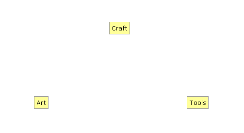
In terms of traditional human design, you could say that fine art - art for art's sake - occupies the left portion of the spectrum. This is stuff whose singular purpose is to be enjoyed through the senses, so their sensory properties are most important.
Toolmaking belongs towards the far-right. Tools are objects whose use lies in a particular physical function, so their physical or behavioural properties are most important. There is no real benefit in putting effort into making a spade, pig trough or carburettor beautiful.
In the middle you would put crafts, where function and aesthetics mingle: clothing, home furnishings, cutlery, instrument-making. The ergonomic properties of these products are usually important; sensory, physical and behavioural properties can vary in importance.
Traditional design
So where does web design fit in, and what has this got to do with me?
The spectrum model helps to illustrate several important facts:
Design is not opposed to usability
There has been a long-running debate in the web design community, often described in terms of "design versus usability" or suggesting that usability is diametrically-opposed to design. This is absurd. All web site creation is design, whether it is more aesthetically-biased or functionally-biased.
People often mean "design for beauty" when using "design" in this context. It is fair to say that designing for one end of the spectrum is opposed to designing for the other end, in as much as they can have opposing objectives.
Design applies to the full breadth of created works
The effectiveness of your design depends on the original objective
High-aesthetic sites are pleasurable and effective when their aesthetic delivery is appropriate and skillful.
Alternatively, high-functionality sites are pleasurable to use and effective when they allow the user to fulfil his goals.
Is this a fundamental incompatibility? Only at its extremes. There are good natural reasons why usability and aesthetics are at odds: it comes back round to how a product is meant to be consumed.
The way to enjoy design at the most artistic end of the spectrum is to notice it, stop in front of it, look at it and let it sink in.
But the way you appreciate design at the functional end is when you don't notice it at all! It has helped you do what you came to do and go about your day without fuss or interruption. In fact, if you notice this type of design, it generally means that the design is failing in some way.
This is not a problem: it's natural and it's okay. It only becomes a problem when designers labour under false beliefs, and try to design at odds with a product's reality.
Two common skewed web design beliefs are: "All web sites should be beautiful" and "All web sites should follow usability conventions".
Not all web sites need to be beautiful
Designers often use too many graphics in the false belief that it is important to make sites beautiful (as illustrated above). In cases where the product's objective is primarily functional, i.e. helping the user complete tasks to achieve goals, aesthetic considerations may be unimportant. In fact, filling web sites with gorgeous graphics can negatively affect the product's effectiveness, for several reasons (two of which are slower page loads, and delayed controls).
Some people criticise Jakob Nielsen's site useit.com for being unattractive, and hence not portraying brand identity. However, Jakob is not a graphic designer and is not selling his skills in graphic design. He sells his skills in usability engineering, his site does a decent job at manifesting the essentials of that, and that serves his brand quite effectively. (Having said that, the site could definitely be made much nicer to use, which would definitely keep people browsing longer.)
Usability conventions are not always important
Many web sites have very little functional purpose, but exist to demonstrate a designer's skill, or to be enjoyed as art. High-aesthetic sites may deliberately break usability conventions, such as hiding content behind 'easter egg' links, or pushing the envelope on dynamic navigation for its own sake.
Graphics should help fulfil a purpose
For high-function sites, design elements should be used sparingly where they directly help the user fulfil their objectives. There are many examples of this rule being broken. One such is my online banking system, which takes me to a 'Confirm' page when I logout. In order to complete the logout, I have to select one of two graphical buttons: 'confirm' and 'cancel'. As the buttons have no ALT tags, I'm forced to wait for the buttons to download and render before I can proceed.
For high-aesthetic sites, graphics should still directly support the site's objective. For example, if it is one objective of a site to position a brand with certain attrbitutes, say to appear trendy through skate style, all the graphics used should be in that mode.
When you include a graphical or pictorial element, be clear what purpose it serves and how - it's the law.
Sites can be both attractive and usable
Most web sites are between the two extremes, and the designer has to balance the conflicting demands of usability and attractiveness. Scratchmedia believes it is possible to succeed at this, and it is possible to fail.
Figuring out a site's proper objective is the most critical design task
The best way to increase your chance of success is to get clear on your product's purpose and objectives before you do your design or redesign.
Draw a design spectrum, and mark where your site should sit between the poles.
Keep checking this against your product as it develops. Is your design hitting the mark?
Home | Audio | DIY | Guitar | iPods | Music | Links | Brain and Problem Solving | Site Map | Contact
![]()