|
|
Home | Audio | DIY | Guitar | iPods | Music | Brain/Problem Solving | Links| Site Map
This work is licensed under a Creative Commons License.
Overview
I've been creating web sites for 10 years, and I've got much more successful at it over that time. And I've come into contact with lots of very clever and complex software development processes, many of which don't produce very good results.
This is the typical process I use today on most of the sites I do (of all sizes). It focuses on getting clear on what you're doing before you start, and staying clear while you work swiftly towards a good solution.
Overview
- Know what you're doing
- Know what the site needs to do
- Know what the site's visitors want
- Get a good picture of the personality and style of the web site
- Sketch out highly successful scenarios
- Organise views into a site map
- Sketch the essential features & look
- Map your visitors' attention
- Arrange the visual elements to work together
Step-by-step
1. Know what you're doing
Being clear about what you are working to achieve helps you achieve it.
Always be clear on your goal - the state you wish to reach - when you sit down to design a site.
- Do you want to impress other web designers?
- Do you want to delight your client?
- Do you want to make a good profit and pay your rent on time?
There's a kind of magic called "creative visualisation". When you can see an end-point in your mind's eye, you can much more easily see the steps you need to take to get there. Also, you'll even find that your subconscious actions help carry you forward too.
2. Know what the site needs to do
You may have a client who tells you what they want (e.g. "We want to break into the big time and sell more widgets.").
Try to get really clear about what the goals of a site are. What does success look like? How will you know when you've got there?
Having this stuff clear in your mind helps you:
- make the thousands of design decisions between now and a finished product
- communicate with your client and maintain their confidence throughout the process
- show that you've done what you set out to do
3. Know what the site's visitors want
Ideally, you'd like to show your designs to all your site's target users, and find out what works well for them. As this is not possible, you need another technique.
For all but the simplest of sites, I develop personas and scenarios, based on a simple goal-directed techniques developed by lovely Alan Cooper and his friends at Cooper Interaction Design.
4. Get a good picture of the personality and style of the web site
User personas give you great insight into users' goals and behaviour.
But a web site often has its own goals that may be in conflict with the goals of the users. The site also often has Soft Goals, to support or develop its Brand.
You need a way to balance all these various forces optimally.
I've developed a further tool, the Site Persona, which embodies the site's personality, drive and goals in the same way that User Personas do for users. The Site Persona represents both the Brand and the Goals of the web site, which you work into the mix through dialogue with User Personas.
Picture your web site's interactions as a series of conversations between User Personas and the Site Persona. The users are trying to get what they want, and the Site Persona is trying to help them, while ensuring it does its own job.
5. Sketch out highly successful scenarios
Once you know what your site wants to achieve, and what your visitors want to achieve, it's time to start planning out the site's structure.
I don't start with a site map, as this is too restrictive. I prefer to sketch out the experience, using pencil & paper, just showing the most important aspects of the interaction between site and user.
(Sometimes, these are in the form of a scripted dialogue, where my user persona and site persona communicate as though in a conversation, which will eventually be translated into visual elements.)
A sketch will typically feature:
- Stars showing how a user arrives at the site (entry points)
- Circles showing actions, views or places (which may eventually become pages)
- Arrows showing how users may move around the site
- Speech bubbles representing what a user persona thinks at key places
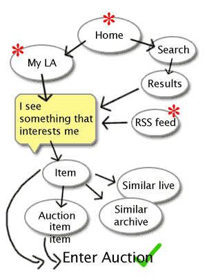
Here's a real first site sketch I've just done on paper, which lets me think and work quickly.
Don't worry about the particulars of the design. This sketch isn't a project deliverable to share with other people. It's for my use, to help me clarify what's important.
This particular sketch shows a few successful scenarios, which may apply to different user personas. The important thing is I've started visualising the path to success (users taking part in online auctions), from different starting points.
Here, I've realised that the key point is ensuring that visitors can find something that they're interested in. If that doesn't happen, nothing else I can design will matter.
Therefore, to make this site successful, I have to make it easy and appealing to look around until you find something you like enough to find out more.
I may do lots of these sketches, but they'll never take more than a couple of minutes each. But I've got my head working freely on the problem, unencumbered by constraints like complicated drawing packages or modelling syntax.
6. Organise views into a site map
You will need to plan out what pages will be on your site, how they might be grouped, and how users will easily find their way around.
Your site map will effectively merge all the views from your initial free sketches into a structure that's clear and economical. You want your visitors to be able to move freely from place to place, following their noses to their goals.
Things to think about:
- Think what global or top-level links really need to be available on every page. Test your assumptions.
- Create enough sections that it will be easy to focus on what you want.
- Be careful not to over-segment. If you have too many sections, your site will look bigger and seem harder to navigate. Avoid creating sections that won't have enough content. ("No news is bad news").
- You need to include any other stuff that needs to be there (like Contact Us and Login), which might not feature on any of your sketches to date.
- Look for ways to use smart links and deep links that take users directly to what they're most likely to want next. Don't make them dig.
- Try to optimise the site so that the paths to the key goals are easy, i.e. with fewest possible steps. Your page design will build on this.
- Remember the principles of simplicity and Occams Razor. If you can achieve something more simply, if you can remove something and still maintain the required effect, do it.
See..
- The Information Architecture section.. (I'll add a lot more to this soon)
7. Sketch the essential features & look
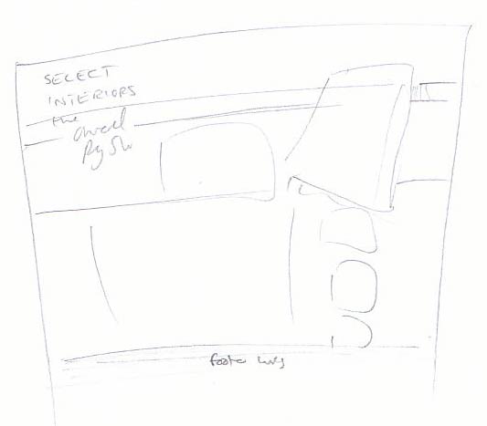
Now we'll start designing the page, still working on paper at this point. (I find that paper & pencil are much quicker tools than a computer, no matter what software package I use.)
Normally, I'll start by shutting my eyes or gazing out of the window, while I visualise what kind of layout and look will feel right, providing a nice clean interface that portrays the right personality.
I'll then sketch that quickly onto paper, in a rough rectangle, and slap on the essential features:
- Overall page structure and proportions
- Level 1 navigation (your sections)
- Other global navigation (like login/out, site map, help, footer navigation)
- Main areas of screen real-estate
- Any key graphical elements
Example
There's not much to see in this simple sketch. The body of the site will sit in the middle of the page. I've put in the top navigation bar, site logo and strapline, and I've got an idea where the content is going, and that there will be thumbnail images down the right hand side.
It doesn't look like much, but all it's doing is helping me crystallise the vision in my mind's eye of what the page will look like.
Why I do more designing in my head than I do on the computer
The quick pencil sketch just helps me quickly record the likeness of what I've visualised in my head. Then I don't forget and can make it up quickly in Photoshop. I find this way of working a lot more efficient than starting off in Photoshop. Again, it's getting clear first, then doing (think-then-do).
8. Map your visitors' attention
A key step in doing your page layout sketch is getting a good idea of where your visitors will want to look.
When you craft the page on the computer, your job is to balance the relative noticeability of all the visual elements on the page, so that visitors will be drawn to the things that are most important.
Things that increase noticeability
- Bigger things!
- Strong colours (used sparingly)
- High contrast (either shapes, lines or edges with significantly different tones)
- Movement (either actual animation or dynamic lines that give the impression of movement)
- Things with plenty of space around them (they're easier to identify and seem more important)
- Things placed at high-value positions on the page (e.g. towards the top-left and down the middle -- depends on your layout)
The Golden Rule comes into play here.
Everything on your site must either:
- Help your visitors achieve their goals, or
- Support the site's goals without obstructing the visitor's goals
So we'll use these devices to show visitors where to look, and where they don't need to look (unless they need to).
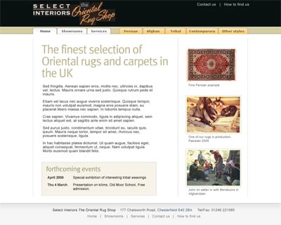
Here's how my page sketch (above) came out looking..
On the screenshot above, notice what's most noticeable. See how you can get an impression of what the site's about, and what you're likely to find there, with just a quick glance (and without being able to read much of the text).
This is made possible by carefully prioritising the most relevant visual elements - the ones that are most useful in explaining what the site is about, what you'll find here, and where you might go next.
9. Arrange the visual elements to work together
It's only now that I'd dive into Photoshop. I'm totally prepared, and ready to work quickly (because I know that playing on the computer can easily make me lose perspective).
- I know what the site has to achieve to succeed
- I know what my visitors are looking for, and what they're trying to achieve
- I understand the site's personality and what it wants to achieve while the visitors are on there
- I know what pages and sections are on my site
- I have a good idea of the right page layout that will help visitors flow round the site easily, keeping them interested until they have done what they want
- I know what visual elements will be on my page, and their relative priority
This prior work will help me quickly execute a design that's fit-for-purpose, without getting too bogged down trying lots of different page layouts in Photoshop (which is time-consuming).
There are a few other principles & disciplines that help me create something that's more than adequate, without taking up too much of mine & my client's time:
- I work in short bursts. If I feel tired or unclear, I'll stop and do something else.
- I keep it simple. I'll try to find simple page layouts, navigation structures, and tonal/colour schemes. I'm not afraid to adapt something that has worked before, if it's suitable.
- I invest energy where it is most beneficial. I'll happily craft custom buttons, an icon or logo, if doing so will deliver impact. I know that each page doesn't need too many rich visual features, if they are applied with care.
Buy this entire Design process section as a PDF e-book:
only £1.00 GBP
Home | Audio | DIY | Guitar | iPods | Music | Links | Brain and Problem Solving | Site Map | Contact
![]()