|
|
Home | Audio | DIY | Guitar | iPods | Music | Brain/Problem Solving | Links| Site Map
This work is licensed under a Creative Commons License.
The Attention Map
Attention mapping is a tool to help you start to plan a visual layout around realistic communication between user and site.
It can also be a helpful analysis tool, helping you work out what's wrong about a layout.
The most important elements on a page are those that help the user (and site) achieve their goals. Those things should be nearest to hand, and in positions where they'll be seen.
Attention maps are great because it is much quicker and easier to sketch out your priorities first on paper than to try to do it as you go in Photoshop etc.
Once you've got your map, you can use it to guide the amount of contrast/noticeability you give to each screen element.
1. Primary importance
What are the most important elements on the page - the ones the user probably needs to use? Is there any? A regular web page will normally have three or less of these elements.
Only applications that use a common interface that features multiple tools should ever have more than three. If you can think of more than three, consider whether they are really all top-priority. Take a piece of paper and draw a placeholder for the top-priority elements, really big and bold, up near the top-left.
2. Secondary importance
Next, consider the things that the user might need to find, but not urgently. Add these to your attention map, half as big and half as bold as any urgent elements. Then, take the minor elements that probably belong on the screen, and add them, smaller and less bold.. and so on.
etc. etc..
A rough example
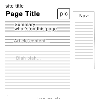
This is the kind of attention map I might draw.
The layout of this site is very simple, but there is still a pecking order among its elements.
- The page title is the highest-priority item, because it tells you where you are / what's there. It should get the first attention, which is why it's large and very bold on my attention map.
- Second in the line for the user's attention is the site logo (site identifier). Obviously, the logo should be clear, because it tells you where you are, and someone could land on any page on this site, following a link or search engine result. I want them to know where they are quickly and easily. But a site's logo surely isn't as important as the page title, or the page contents, because you don't *need* to be reminded what the site is on every page. Although I've got the site id as second-highest priority, I know that it isn't *actually* 2nd priority, because of the way the brain works. If you've browsed several pages on this site, you'll know what the site is already, and you'll automatically ignore the logo (as long as it isn't too in-your-face). This is one reason why the logo should always be in the same place on the page - i.e. at the origin!
- Same goes for the title bar pictures at #3. Once you've seen a pic, you'll start to ignore it on subsequent pages.
- I've got the page summary in next. It is important, because it answers the question "Am I in the right place? Is what I'm looking for here?".
- I have the course navigation less noticeable than the site id, page title, title pic, and page summary. I can make a general assumption that someone looking at a page on my site has followed a link for a reason. This is a content site: a destination, not a stepping stone, not an obstacle. Also, I value all pages on the site equally. I don't want the user to buy, subscribe, or click on adverts. That means that giving my user the page content is higher-priority than sending them somewhere else. That's why the site navigation isn't particularly prioritised visually.
- Footer navigation is very low priority, and serves more to round off the page than provide useful links.
Home | Audio | DIY | Guitar | iPods | Music | Links | Brain and Problem Solving | Site Map | Contact
![]()