|
|
Home | Audio | DIY | Guitar | iPods | Music | Brain/Problem Solving | Links| Site Map
This work is licensed under a Creative Commons License.
Tableless Layouts with Dreamweaver
Stephanie Sullivan
If you've been doing web development for years and you've decided to take finally a look at "all this CSS stuff" you've been hearing about, it will likely require a bit of a paradigm shift. If you're a new developer and you're starting out by learning how to separate the structure of your document from its styling and presentation, you likely won't find it quite so difficult.
Using CSS to position the elements on your page is a very powerful thing. In this article I'll review a simple page layout, show you how to create it in Dreamweaver 8, and discuss some of the things you need to consider as you build.
If you're just starting out with Dreamweaver 8, you'll likely find Julie Hallstrom's article, An Overview of CSS in Dreamweaver 8, helpful in understanding the new tools available to you. As I mention them later, and if you aren't familiar with them, please refer to this article. Though this article is about building a simple site without tables, I'm first going to cover how I personally set up Dreamweaver to write clean code. Your mileage may vary.
Preparing and Creating the Site Structure
Look at the Preferences dialog box. This first one is somewhat counterintuitive because you are building a site using CSS for positioning. Go to Preferences > General > Use CSS Instead of HTML Tags and turn that off. There's a good reason for doing that. If you leave that option on and use the Property inspector to add styling to an element, you will likely create classes called "style 1," "style 27," and so on, which will be placed in the head of your document.
I can't stand "classitis"; I believe in building small, succinct, well-organized pages. This means that, wherever possible, I redefine an element instead of creating a class for it. We'll look at this more thoroughly later but, for now, turn this preference off so that these random classes won't appear. This means you won't be using the Property inspector to create styles (or else you'll now be adding font tags). However, you can still apply styles you've already created with it.
Some of this is personal preference, of course, so if you've found something that works best for you, you may not want to follow my method exactly.
Let's move now to the CSS Styles panel in the Preferences dialog box. In the section When Creating CSS Rules: Use Shorthand For, you should check all the options. In the section When Editing CSS Rules: Use Shorthand, select the According to Settings Above option. Uncheck the Open CSS Files When Modified check box because you may want to use the Property pane or the CSS dialog box to edit. If I need the page open, I simply right-click (Control-click on Mac) the property in the Property pane and choose Go to Code. For the When Double-Clicking in CSS Panel option, check the Edit Using CSS Dialog option. I rarely double-click anyway; if I do, I prefer to edit with the dialog box.
Tip: If you're unfamiliar with writing CSS in shorthand, read John Gallant and Holly Bergevin's article on Community MX, called Writing Efficient CSS.
Creating the Structure
Download the files that accompany this article and define a new site in Dreamweaver. If you're unfamiliar with this process, please refer to the Help files within Dreamweaver 8 (Content > Dreamweaver Basics > Setting Up a Dreamweaver Site).
You can refer to the completed project files as needed, but let's start with a fresh page to begin your work now. Create a new page by choosing File > New (General pane). In the New Document dialog box, click Basic Page under Category and click HTML under Basic Page (see Figure 1).
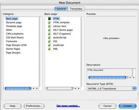
Figure 1. New Document dialog box
In the lower right corner you can choose your Document Type (DTD). I will be using XHTML 1.0 Transitional, but if you're uncomfortable with that, feel free to create an HTML 4.01 Transitional document. (XHTML is not difficult; the main thing to remember is that all tags must be closed. For more details, see Dan Short's coding standards article, The (X)HTML Files. Save this file and call it index.htm.
Another way to create a new document is to right-click inside the Files panel and choose New File. Dreamweaver allows you to name it right away by showing the name area highlighted. Let's name it demo.css. Once you open this file, you'll see how smart Dreamweaver now is; it creates the default document based on what extension you gave the file.
I recommend working in Split view so that you can see the code that Dreamweaver writes while you have a visual representation of it in Design view. Attach the style sheet to your index page. If you're unfamiliar with how to do that, look at your Dreamweaver help files or read Zoe Gillenwater's tutorial on Community MX, Apply CSS to Your Page.
Now place your div elements on the index page. I'll demonstrate a variety of ways that Dreamweaver 8 can do this. In time, you will find whatever suits your working style. On the Common pane of the Insert bar, click the Insert Div Tag icon (fifth button from the left; it looks like a page with a small box in the lower right corner). In the Insert Div Tag dialog box (see Figure 2), leave it set to the default (Insert: At insertion point), type holder in the ID field, and click OK. This will place a single div on the page.
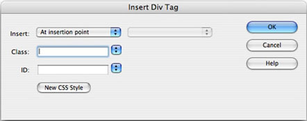
Figure 2. Insert Div Tag dialog box
Look at Code view and be sure your code looks like this:
<body> <div id="holder">Content for id "holder" Goes Here</div> </body>
In Design view, highlight the words "Content for id 'holder' Goes Here" and delete them. Just as you did above, and without moving your cursor, insert another div element. This time, give it the ID of header and click OK.
View the code you've just written and notice that the header div is nested inside the holder div. That's exactly what you want. Now you'll insert two more div elements after the header. Place your cursor after the closing tag of the header div and insert a div with the ID of nav. Following that div element, create the content div.
By nature, div elements take up 100% of their parent container. They also stack up on one another as if there were a break element in between them because they're block elements. Since none of the divs have any styling applied, let's see if they behave as expected. On the main document toolbar, you'll see a little Visual Aids icon at the far right—it looks like an eye. (Refer to Julie's article if you're unfamiliar with this.) Click it and choose CSS Layout Backgrounds. Your divs will magically appear with background colors (see Figure 3). Since these background colors are randomized, your colors will no doubt be different from the ones shown here.
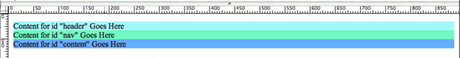
Figure 3. Background color examples for the Layout Backgrounds visual aid
CSS Styles Panel and CSS Tools
Div elements are like building blocks—but made of clay. You can mold and carve them into the size, shape, and placement you need. In this case, you're going to set a width on the holder div and center it in the browser. You could just as easily leave it left-aligned, but limiting the width of the entire area is sometimes a wise choice for creating a comfortable, readable line length.
Open the CSS panel by selecting Window > CSS Styles if it is not already open. In the CSS panel, click the New CSS Rule button (among the icons at the bottom of the panel, it looks like a page with a plus sign). This brings up the New CSS Rule dialog box (see Figure 4).
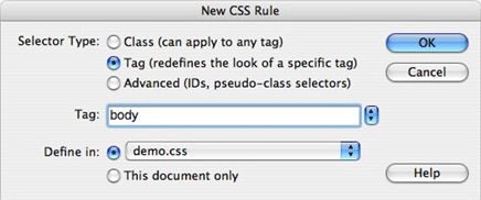
Figure 4. The New CSS Rule dialog box
Although this is unchanged from Dreamweaver MX 2004, before you define the #holder div, you need to define the body element's styling. For Selector Type, choose Tag (so it redefines the look of a specific tag) and then in the Tag text box, either type body or choose it from the pop-up menu. For Define In, choose demo.css from the pop-up menu.
Click OK. The CSS Rule Definition dialog box appears. I always begin by zeroing the margins and padding, and setting my font size, color, and background color. The panes of the CSS dialog box should be fairly self-explanatory, but for this first one I'll point you in the right direction:
Category > Type
Font: Choose the list beginning with "Verdana, Arial..."
Size: Type 100 and choose % for the unit of measurement
Color: Enter #000000
Category > Background
Background Color: Enter #ADA189
Category > Block
Text align: Center (to force Microsoft Internet Explorer 5 to comply with the centering)
Category > Box
Margin: 0 (leave same for all checked)
Padding: 0 (leave same for all checked)
Click OK.When you open your demo.css document, you should see a rule something like this:
body { font: 100% Verdana, Arial, Helvetica, sans-serif; color: #000000; background: #ADA189; text-align: center; margin: 0px; padding: 0px; }
Notice when you view your index.htm page that your divs now all appear centered. If you've left your CSS Background colors visualization on, you'll also notice that you don't see the background color defined for the page. This feature turns off all background colors because it adds its own. If you want to see the effect that your rules are having, feel free to leave this feature on for now.
Code Hinting
For the #holder div, you'll use another method of creating the rule. This demonstrates how code hinting works. Beneath the body selector in the demo.css file, type #holder {. Beneath that line, type width: 760px;. Notice how Dreamweaver gives you hints based on what you type. When you see the property you need, press Enter; it will put the property and color separator on your page and will then move on to the value hints.
Beneath that line type background: #FFFFFF; and close the rule by typing }. Once a rule is begun in the CSS page, you can use the Properties pane of the CSS panel to edit and add to it.
For this reason, I create my own code snippets for a two-column layout and a three-column layout. They have simply the selector names with curly brackets. This gives me that little start that allows me to edit wherever I'd like. If you like a speedier workflow, snippets are your friend. You can learn more about code snippets in the Dreamweaver LiveDocs, Working with Code Snippets.
The Properties Pane
You'll now complete the rule with the Properties pane of the CSS panel. Click in any of the divs in Design view. Notice that you can see the document tree at the bottom of the document. Depending on the div in which you placed your cursor, it will look something like this: <body> <div#holder> <div#nav>. This handy little tool is called the Tag selector.
Click <div#holder> on the Tag selector. Notice in the Properties pane of the CSS panel that you can see the two property/value pairs you just created. You may need to drag down the panels below the CSS panel to see the Properties pane. You may also need to click #holder in the All Properties pane of the CSS panel to make the holder selector properties appear.
Now add a couple more properties. I keep my Properties pane set to "Show only set properties" so I don't have to scroll through all the unused properties. Click on Add Property. On the left side there will be an input. You can type your property in if you're sure you know the exact label. Or else use the pop-up menu to select it (they're in alphabetical order). Select the text-align: option. Once it's selected, an input appears on the right side. Again, type the value in or select from the possible choices shown in the pop-up menu. Select left.
Finally, click Add Property again and select margin. Notice that you don't get a pop-up menu showing any values. As I mentioned, I prefer shorthand-style CSS because it's so much more succinct. If you can't remember the order to place the shorthand values, don't worry. Dreamweaver reminds you if you hover your cursor over the value input (see Figure 5). Type in 0 auto 0 auto (if you really want to be short about it, 0 auto gives the same results).
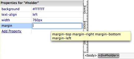
Figure 5. Property hinting in the CSS panel
Back in the demo.css file, your rule should now look something like this:
#holder { width: 760px; background: #FFFFFF; text-align: left; margin: 0 auto 0 auto; }
Let's review the #holder rule and discuss the values given. Since you're centering this page, the div must have a width. Otherwise, as I mentioned earlier, it will be 100% as wide as the body element (which is its parent). The margins given, with both side values set to "auto," is the magical property that forces that #holder to be centered. No matter how wide the browser is, this 760 pixel block will be in the center. Since you gave the overall page a background color, you gave this div a white background for legibility.
Finally, you placed "text-align: center" into the body rule to center this div in Internet Explorer 5 series browsers. Thus, you put "text-align: left" into the holder to bring everything back to the default left alignment.
Defining the Header
There are three more divs to define, which appear below. Feel free to use any of the previous three methods to create these rules. Play around with them and see which works best for you:
#header { background: #DCCBAC; } #nav { width: 140px; float: left; padding: 15px 10px; } #content { margin: 0 0 0 165px; padding: 15px; }
Allow the header to stay at 100% of the width of its parent container (the holder div). That means it is also 760 pixels wide. There's no need to define it. Also allow the contents of the header to define its height. In general, this area is used for the company name, logo, and tag line. Many times it will be an image, but I'll use text for this demonstration. Type in a fake company name in a <p> element and remove the placeholder text (see Figure 6).
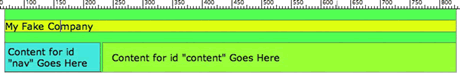
Figure 6. Three divs defined
Now that you've carved and formed the blocks that create your page, view them with the CSS backgrounds again. Turn on the CSS Layout Outlines as well. Notice how the #nav div is now sitting to the left of the #content div. This works because the #nav div is given a width (140 pixels + 20 pixels padding = 160 pixels) and is floated left, and the #content div is given a margin that clears that width. There's now room for them on one line.
Notice that the left margin for the content div is 5 pixels wider than the width of the #nav. I always give the margin values at least 3–5 pixels more than they seem to need because Internet Explorer for Windows sometimes adds a phantom 3 pixels to the value.
If an item is placed in the #content div that is wider than the space provided, the content div will drop to the next line (below the #nav div). This is called float drop and if you'd like to see it in action, simply place an image (or div with a width setting wider than the @content div allows - over 600px) into the #content div and preview it in Internet Explorer. (John Gallant and Holly Bergevin wrote a great series on Community MX about floats and how they work, called Float: The Theory.)
Note: You could absolutely position the #nav div and give the #content div the same left margin to get the same effect. In general, I don't do this because an absolutely positioned div is taken out of the flow of the page so that none of the other elements know of its existence. So if you had a great deal of content in your #nav column, it would simply run off the bottom of the page and not respect the same boundaries that the other divs do. This can be messy, so I don't advise it. For more information on the flow of the document, read John Gallant and Holly Bergevin's article on Community MX, called Flowing and Positioning: Two Page Models.
What to Watch Out For
Now that you've got the basic structure in place, let me give you a few tips and pointers to watch out for.
Dealing with Floats
These are some of the basics that you must know when you float.
First, Internet Explorer currently has a double-margin bug. This affects the side of the div that you're floating toward. For a right float, it's the right margin; for a left float, it's the left margin. For this reason, I always zero that margin. If I need to create space, I use padding (remember that padding is inside the div and margin is outside the div). You can use the padding either inside that floated div or on the div's parent container, depending on the effect you want.
Second, floats may also need to be cleared. There are a variety of ways to clear your floats, but the one I personally prefer is this:
.brclear { clear:both; height:0; margin:0; font-size: 1px; line-height: 0px; }
In your XHTML page, you would add <div class="brclear"></div> as the last element in the div you're clearing. In your page, that would be right before the close of the #content div. This causes the #content div to contain the float even if the float is taller. (You can read more about clearing floats, using a different method than I do, in John and Holly's article on CommunityMX, called Clearing Floats, the Easy Way.)
Finally, remember float drop. If an element is placed inside that is wider than the allotted area, the div will simply drop down to the line that has enough room for it. This could be a gotcha when you're adding images to the #content div and it's wider than the 595 pixel space given (760 pixels – 165 pixels). If your clients use Contribute to do their own website editing, make them aware of their maximum image size to avoid that phone call they'll make in the middle of the night when they blow up the page.
Adding a Footer
Most pages have a footer area containing text links, copyright notices, and so on. In your CSS page, add the following:
#footer { padding: 5px; }
Now go to your XHTML page and place your cursor right before the closing tag of the #holder div. This is right after the #content div. It's simpler to target the exact spot in the code portion of your window. As you did before, insert a div element from the insert bar. This time, though, notice that because you already defined a rule for #footer in your CSS, this ID is available to you from the pop-up menu in the Insert Div Tag dialog box.
Also notice that none of your other div IDs are available. This is because they're already in use and Dreamweaver is smart enough to know that they can be used on a page only one time (while a class can be used unlimited times). View this page with CSS backgrounds again (see Figure 7).
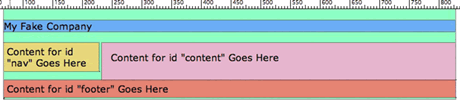
Figure 7. XHTML page with the footer added
A Touch of Styling
Because this article's purpose is to show you how to create a simple page using the tools in Dreamweaver, I'm not creating a beautiful layout here. But to demonstrate a couple more tips and techniques, let's add a touch of styling.
In your CSS document, add this selector:
.callout { font: bold 130% Georgia, "Times New Roman", Times, serif; color: #333; margin: 0; padding: 20px 10px; }
In Design view of your XHTML page, place your cursor into the Fake Company name you typed in. Right-click the <p> element shown on the Tag selector at the bottom of the document and choose Select Class > Callout. Notice how this changes the Tag selector to read <p.callout>. This is a handy way of placing styles on elements. You can also apply the style using the Property inspector, which will show the styles available in the pop-up menu rendered in the font, color, and style defined.
Tip: I want to point out one thing in the previous .callout selector. If you were viewing with CSS background colors earlier, you may have noticed that the p element in the #header had a color shown on it, but that there was space of another color above it. In some browsers, you will run into this escaping-margin bug. This is caused by the outer margin on the element inside the div. So you can zero the margin and padding of the div and it won't do any good. But remove the margin of the element inside the div and you're fixed (see Figure 8). You'll notice I zeroed the margin of the callout div and then added padding to create the space I wanted around it.
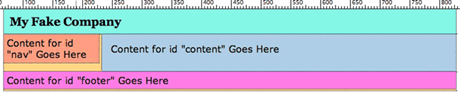
Figure 8. Removing the margin of the element inside the div to fix the escaping-margin bug
Descendant Selectors
Let's put some Latin (lorem ipsum) or jibberish of some sort into the #content div of the XHTML page so that you can view the styling more clearly. (I do this with a homemade snippet as well.) Make sure you put this into p elements. Go ahead and do this now; you'll use the power of CSS to define what these p elements should look like. This is one of the best ways to avoid classitis—the classing of every element on your page to style it.
First, universally make the size of all p elements 80% by creating a generic rule to define them all:
p { font-size: 80%; }
Now vary some of the values from div to div. Place your cursor inside one of the p elements in the #content div. Click the icon to add a new CSS rule. Notice how it appears with the input already filled with the path to that element: #holder #content p.
Remove the portion with #holder because you don't need to be that specific. You will have #content p. Click OK. This rule selects any p element inside the #content div. It does not affect the p elements in the #nav, #footer, or #header divs. In the dialog box that appears set the line-height to 130%.
Create your own styling for your #nav links using descendant selectors. Since the p elements that contain those links are in the #nav div, they've already been affected by the universal p rule you wrote previously. You simply want to style the links. To target them, you should write them like this:
#nav a:link { /*property:values here*/ } #nav a:visited { /*property:values here*/ } #nav a:hover, #nav a:active, #nav a:focus { /*property:values here*/ }
Notice that the final rule is separated by commas. This means that all the selectors shown have the same values. I create my links like this for accessibility reasons. This gives the person who uses a keyboard to navigate the site the ability to see the same style changes when a link has focus that a mouse user does. Remember, they must be in the order shown.
Lastly, I gave my #content div a left border, made the #footer div a top border, and made the footer text smaller with a lighter color to make it less obtrusive (see Figure 9).
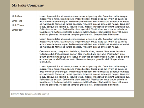
Figure 9. The final layout
When the Client Isn't Happy
Let's pretend that Joe Client views the page and now decides he'd really like the navigation on the right side like he saw on his competitor's site. With the old style of coding, that would be a major pain. When you position with CSS, it's a non-issue. A quick change gives Joe the ability to view the new look right away.
Change the #nav to float: right and put the margin on the #content div on the right instead of the left. Also change the border on the #content to the right. It's done!
Create these changes on your own or attach the demo file demo_right.css to see the difference.
Home | Audio | DIY | Guitar | iPods | Music | Links | Site Map | Contact