|
|
Home | Audio | DIY | Guitar | iPods | Music | Brain/Problem Solving | Links| Site Map
This work is licensed under a Creative Commons License.
Designing with CSS – Part 3: Using CSS for site layout
Adobe
Adrian Senior
www.webade.co.uk
www.communitymx.com
www.ukcsstraining.co.uk
Created: 16 April 2007User Level: Beginner, Intermediate
This is the third part of a six-part tutorial series on CSS design concepts. If you missed Part 1, Understanding CSS design concepts or Part 2, Defining style properties and working with floats, you may wish to review them before following along with this tutorial.
This tutorial series covers how you can use Dreamweaver CS3 and positioning techniques in CSS to developing web pages. In this part, we'll examine the CSS code we created in Part 1 and 2. It is important to understand how the rules in the CSS file work, so we'll take a deeper look at the syntax and techniques for working with CSS. This knowledge will allow you to add and manipulate CSS rules to suit your needs as you design pages for new projects.
Prerequisite knowledge
This tutorial focuses on working with Dreamweaver CS3 to create sites that use CSS positioning to layout the page elements and assumes you are familiar with working with both the Internet Explorer and Firefox browsers. (Other browser options: Safari, Opera, Flock, Google Chrome, or compare browsers.)This is Part 3 of a six-part tutorial series—be sure to review Part 1 and 2 of this tutorial series and become familiar with the concepts discussed before continuing.
Reviewing the CSS rules created in Part 1 and 2
As we continue on in our series, towards our goal of developing pages with tableless layouts, it is a good time to review the code we've written so far. By examining the code, we'll identify new ways to adjust the properties and discuss some tips and techniques to avoid common formatting issues. In Part 1 of the tutorial series, we created a layout in Dreamweaver CS3, using one of the included CSS Layout templates. We selected the two column, elastic, left sidebar, header and footer file named twoColElsLtHdr.css; quite a mouthful, but very descriptive. I think the naming conventions of these layouts and the descriptive image that is shown when previewing an option are very helpful when choosing a template from the New Page dialog box in Dreamweaver CS3.
In Part 2, we discussed the importance of adding a CSS rule that removes the margin and padding settings that some browsers add to site pages by default. We created a CSS rule at the top of the style sheet that sets zero values for padding and margins for all page elements (using a wildcard selector) so that the layout remains consistent when viewed in different browsers. We also created and updated other selectors during the course of that tutorial. In the process of following along with these exercises, you have become more familiar with CSS rules and syntax in general. With that in mind, let's now take a look at the code we created in the style sheet to get a better understanding of how the property settings we made affect the display of page elements.
Launch Dreamweaver CS3 and open the CSS style sheet named twoColElsLtHdr.css that we've been updating in Part 1 and 2. Alternately, you can download the source files at the beginning of this tutorial, to follow along as we review the CSS code.
As you look at the CSS style sheet, the first rule you'll find below the utf-8 declaration is the wildcard selector that removes default browser values for the padding and margins. It is always important to place that rule first on the style sheet, to avoid accidentally zeroing out values that are set in the other rules you create. Next up is the rule that we've applied to the body element of the page. If you followed the instructions in Part 2, you'll recall that we removed the lines of code that set the padding and margin values to zero for the body element, because they were redundant and no longer necessary. The first rule (using the wildcard selector) sets a zero value for padding and margins for all page elements, and due to inheritance, this means that zero values are automatically applied to the body element as well.
The CSS rule for the body property
Take a look at the rule for the body element in your style sheet. It should look like this:
body { font: 100% Verdana, Arial, Helvetica, sans-serif; background: #666666; text-align: center; /* this centers the container in IE 5* browsers. The text is then set to the left aligned default in the #container selector */ color: #000000; }
The font property settings
As we review the CSS rule for the body element, we'll see it begins with a font declaration. The font property can be written in a shorthand style, which means you can assign multiple values to various font-related properties. In this instance, the font property declaration is setting two font characteristics. The measurement of 100% is a reference to the default size of the font. As we discussed in Part 2 of this series, the font size set in the rule for the body element is used as a base of measurement. All other font-size values are scaled based on this value, when you use percentage measurements. Changing the percentage of the font in the body CSS rule effectively changes the other text size values proportionately.
The font property also includes a font-family to use as the default setting for text display. It is important to note that the user must have the font installed on their machine for it to be used when they view your site in a browser. This is why a list of fonts is provided in the rule. The browser reads through the list, and uses the first font to display the text, if it can. If Verdana is installed on the user's machine, the site will display the text in Verdana. However, if the first font is not available on the system where the site is viewed, then the browser will move on to try using the second font specified in the list. This pattern continues, and if the user's machine does not have Verdana, Arial or Helvetica fonts installed (which is not likely) then the rule specifies that the browser should display the text on the page using any sans-serif font that is available on the user's system.
The background property setting
The background property can also be defined using a shorthand writing style. The background property can set several values, such as background image and background color. In the style sheet we are working with, there is only a definition for color: #666666. This hexadecimal value sets the background color of the page body to a mid-grey.
The text-align property setting
The text-align property is set on the body simply because it resolves an issue that occurs in Internet Explorer version 5.x on Windows, in regards to the display of text. The text-align setting corrects the display issue that is built into IE5 browser's default margin settings. Without this correction, your page (when viewed on a Windows machine using IE5) would result in your content being displayed so it is aligned center on the horizontal plain. This is an interesting example of a CSS workaround to achieve cross-browser compatibility. For all other browsers, the text-align property does not work when applied to pelements. However, the IE5 browser does apply text-align settings to pelements. This is an excellent strategy, because it means you can use the text-align property with the center value to center pelements when the page is viewed in IE5. The main drawback to this approach is that your text elements also become centered. However, do not be concerned; this is easily fixed—as we'll see in the upcoming examples.
The color property setting
The color property defines the color used for text display. In the style sheet, this is set to #000000, (the hexadecimal value for black).
The CSS rule for the container pelement
As we discussed previously, the container div, (the outer pthat surrounds the other items on the page) contains all of your design elements. The container puses an ID selector and is written as #container, as shown in the code example below:
.twoColElsLtHdr #container { width: 46em; /* this width will create a container that will fit in an 800px browser window if text is left at browser default font sizes */ background: #FFFFFF; margin: 0 auto; /* the auto margins (in conjunction with a width) center the page */ border: 1px solid #000000; text-align: left; }
The code example above is carefully commented and contains explanations for the choice of width. As you can see, the margin values for the right and left sides are set to auto, which will cause the container pelement to center in the browser window. As the comment in the code describes, the auto value uses the value in the width setting to define the pelement's placement in the window. The top and bottom margins are set to a zero value. To review, the syntax of "0 auto;" indicates pair values. In longhand CSS writing style, this line would be written as:
margin: 0 auto 0 auto;
However, since margin is a shortcut property and the values desired are the same (for top/bottom and for right/left margins) we can reduce the length of the code and use the shorthand CSS writing style to define the margins using pair values.
When the setting of auto is declared for the left and right margins, any available space in the browser window that is not used to display your web page will be split evenly between the left and right edges of your design. This functionality results in a design that is perfectly centered on the page, and will "adjust itself" as the browser window is resized manually. This is a very common convention in CSS positioning, to ensure your design is centered. This is the exact property that IE5 renders incorrectly, which is why it was necessary to add the centered text-align setting to the CSS rule for the body element as mentioned above.
Using descendant selectors
As we work our way through the code in the CSS style sheet, you may have noticed that the majority of the selectors are written as descendant selectors; this is deliberate and has many advantages. The first part of the descendant selector .twoColElsLtHdr is applied to the body rule, as shown below:
<body class="twoColElsLtHdr">
By adding a CSS class to the <body> tag, you can define and then redefine elements. This approach offers the flexibility that makes it possible to combine your design so that some pages display three columns while others display two columns. By defining the rule for the class of each layout, you can set the appropriate class in the <body> tag for each site page. Using the descendant selector makes it easy to manage which styles are utilized in each of your site pages. In this tutorial series, we've been focusing on the two column layout template provided in Dreamweaver CS3. If you look in the New Page dialog box, there is also a three column version of the CSS layout we've been working with, and it contains a class on the <body> tag called .thrColElsHdr. If you are building a site that uses both layouts, you may decide that you want different margin settings and or a different width setting on your #mainContent pelement, to accommodate the different layouts and content. By using a descendant selector, you can change these settings as desired for each page layout, while retaining the same naming convention for the pelements. Because a descendant selector is used and the class is added to the body element, you can filter specific rules to specific pages without having to keep changing the name of your <div> tag—the specified class will render the pages differently even though the <div> tag's ID remains "container" on all of the pages. The CSS rule below shows the three column class as the first part of the descendant selector, with the <div> tag that contains the ID "mainContent" as the second part. If this style is applied to the <body> tag, the values defined in the rule will be applied to the mainContent pelement that exists within the <body> tag:
.thrColElsHdr #mainContent { margin: 0 12em 0 12em; /* the right margin can be given in ems or pixels. It creates the space down the right side of the page. */ }
Now let's take a look at the two column layout template provided in Dreamweaver CS3. If this class is applied to the <body> tag instead of the class above, its settings will be applied to the mainContent pelement that exists within the <body> tag:
.twoColElsLtHdr #mainContent { margin: 0 1.5em 0 13em; /* the right margin can be given in ems or pixels. It creates the space down the right side of the page. */ }
If you compare the two CSS rules above, you'll notice that the margins for the #mainContent pare different. Declaring the class on the body allows you to filter the applied styles through to the mainContent div, depending on whether your page has two or three columns. Using descendant selectors and applying the rules to the <body> tag is a best practice and allows you to update your pages very efficiently.
The text-align property setting
The text align property in the #container rule is set to a value of left. This setting overrides the text-align setting we applied to the CSS rule for body, which was done to fix the issue with IE5 text display. Due to specificity (as discussed in Part 2 of this tutorial series) this setting overrides the body's setting, and it ensures that the text that exists within the pelement named "container" will align to the left as desired:
.twoColElsLtHdr #container { width: 46em; /* this width will create a container that will fit in an 800px browser window if text is left at browser default font sizes */ background: #FFFFFF; margin: 0 auto; /* the auto margins (in conjunction with a width) center the page */ border: 1px solid #000000; text-align: left;
Examining the property settings for the #mainContent selector
The #mainContent selector is shown below:
.twoColElsLtHdr #mainContent { margin: 0 1.5em 0 13em; /* the right margin can be given in ems or pixels. It creates the space down the right side of the page. */ }
This selector uses the shorthand version of margin, and the four values are read from left to right: top, right, bottom and left. You can remember this order by imagining a clock that begins at 12 (top) and continues in a clockwise motion to 3 (right), then 6 (bottom), then 9 (left). This CSS rule sets a margin that provides room for the navigation sidebar. This is why there is a wide margin setting of 13em applied to the left side of the div. The value of 1.5em is set to the right side to provide a reasonable amount of space against the edge of the pelement, to prevent content from displaying too close along the right side of the defining border edge.
Examining the property settings for the sidebar1 selector
In the #mainContent selector, we saw how there was space provided via a wide margin applied to the left side of the mainContent p element. Now let's look at the sidebar selector to see how the two rules work together:
.twoColElsLtHdr #sidebar1 { float: left; width: 12em; /* since this element is floated, a width must be given */ background: #EBEBEB; /* the background color will be displayed for the length of the content in the column, but no further */ padding: 15px 0; /* top and bottom padding create visual space within this p*/ }
First, notice that the width of the side bar is set to 12em, which is 1em less than the left margin set on the #mainContent selector. This setting ensures that the mainContent pand the sidebar1 pelements will be displayed with a spacing of 1em between them, in order to provide a distinct separation of the different page elements.
Then also notice that the sidebar1 pis floated to the left. By setting a left float value to the sidebar1 div, it is effectively removed from the document flow. This means that the #mainContent p can "move up" on the page and will display alongside the sidebar1 div, which results in a two column page layout.
Using the .clearfloat class
Floats can be tricky to use and they can cause unexpected behavior unless you have a good understanding of how to correctly implement them. Every time you float an element, it is a best practice to apply a clearfloat class that contains the definition clear:both; to an element on the page that immediately follows the element that has been floated. You can think of a clearfloat class as a way of drawing a line in the sand that tells the browser: In the code above, I have floated an element—but from this point on, I don't want any other elements on the page to move up higher than this point. By defining the clear:both; setting, you are effectively defining a point where all elements that follow will not rise above.
Review the clearfloat CSS rule below and notice that in addition to clearing the float to ensure that subsequent page elements will not attempt to "wrap" around the floated element, the height, font size and line height are also defined to minimal values, to avoid adding unwanted spacing to the page's layout:
.clearfloat { /* this class should be placed on a por break element and should be the final element before the close of a container that should fully contain a float */ clear:both; height:0; font-size: 1px; line-height: 0px; }
The XHTML page adds the clearfloat class on <br /> elements to reset the document flow immediately following a floated element, as shown below:
<br class="clearfloat" />
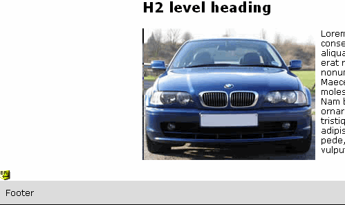
In our sample files, the <br> with the clearfloat class is added to the XHTML page immediately before the footer element, to ensure that the footer does not attempt to display up above in the area where the text is wrapping to the right of the car image, (see Figure 1). By adding the clearfloat class to the <br> tag, a minimal amount of space is added between the areas that contain the car image and text, and the page's footer element.
Figure 1. The footer element is displayed along the bottom of the page and does not attempt to wrap along the right side of the car with the text, because a <br> tag with the clearfloat class is placed immediately before the footer element.
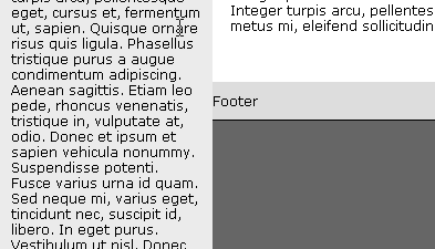
In this example, the clearfloat class is applied to the <br> to ensure that the footer always sits below the floated sidebar1 p element. This is very important, because if the clearfloat class was not added to the <br> above the footer, and if the sidebar1 pcontains content that displays longer than the mainContent pcontent, the sidebar content would display straight through the footer, (see Figure 2).
Figure 2. If the content in the sidebar1 pelement exceeds the length of the content in the mainContent pelement and a clearfloat class is not added to the <br> element before the footer, the sidebar1 content will display down, pushing the footer to the right.
Obviously, this is not the desired layout. It is important to remember when troubleshooting pages with floated elements that adding a clearfloat class immediately after the floated item will often resolve page display issues.
You may have noticed that the clearfloat class sets the value of the clear property to both. This means you can use the clearfloat class to clear any floated element on your site pages, regardless if the element is floated to the left or the right. It is important to mention that the clearfloat class does not have to be added to the <br> tag in the XHTML page. If desired, the clearfloat class (with its clear:both; property) could be added to the footer <div> tag to achieve the same results. This is one of the advantages of using a class to clear the float, because it can be used on any tag you wish.
As mentioned above, the remaining properties in the clearfloat rule of font-size, line-height and height are set to prevent unwanted space in your design. The Internet Explorer browser is particularly known for adding unwanted spacing, so adding the font-size and line-height settings with low values will help prevent display issues as you develop your own page layouts.
Where to go from here
Once you are familiar with the concepts presented in this section, proceed to Part 4 of this six-part tutorial series: Designing with CSS – Part 4: Preparing header images and styling content.
About the author
Adrian Senior owns the UK-based web design agency Webade, which has been in business since 1998. He is also a member of Team Macromedia and a partner at Community MX. The year 2004 saw Adrian's first trip to America, where he visited Orlando and delivered two sessions at the TODCon conference. Adrian also provides training courses for companies who need to train their designers how to build compliant, accessible web sites using CSS and xhtml. He's been married to his wife, Janette, for 24 years and has two children, Antony and Eleanor.
Home | Audio | DIY | Guitar | iPods | Music | Links | Site Map | Contact