|
|
Home | Audio | DIY | Guitar | iPods | Music | Brain/Problem Solving | Links| Site Map
This work is licensed under a Creative Commons License.
Color Vision Confusion
Burcu Karagol-Ayan
burcu@cs.umd.edu
Department of Computer Science
University of Maryland
College Park, MD 20742 USA
April 2001Introduction | Recommendations | Guidelines | Conclusions | Resources and Web Links
Introduction
Color blindness is mostly neglected, even most of the people do not consider this as a serious problem. However, color blindness can be a problem that disrupts many tasks.
Although the exact number of color blind people is not known, officially, more than 8% males and between 0.4% - 2% females in US are color blind. Even if it is commonly known and referred to as color blindness, or sometimes called as color deficiency, what it really is color vision confusion, or CVC for short [1]. However, throughout this article, mostly the term "color blindness" will be used.
Color blindness is a problem in seeing colors as most others see them. But it is not blindness, it has nothing to do with the eye sight. These people confuse some colors, and may not see some ones at all. Many people think color blind users only see black and white - like watching a black and white movie or television. But only a few people really do not see all colors.
At the back of our eyes there are cones (blue, red, and green) that pick up color and rods that pick up brightness. Color blind people have fewer cones than normal, so they get colors confused.
Color blindness is mostly inherited, or it may be acquired as a result of some illness, such as head trauma, or treatment. There is evidence that environmental factors (such as industrial pollution) and sun may cause color blindness as well. Also, although not called color blindness, when people age, their corneas typically turn yellowish, severely hampering their ability to see violet and blue colors [2].
Color blindness has several forms. Trichromats are the people who have full color vision. Dichromats are the people who can see only two of three primary colors of light (red, green, blue). Dichomacy has several forms. Achromatopsia is the inability to see any colors which may be called the actual color blindness. These people see life in monochrome, or greys.
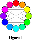

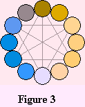

In Figure 1 on the left [8], normal color vision is shown. Same colors seen by color blind people who have absence of red sensitivity and red weakness can be seen in Figure 2. In Figure 3, absence green sensitivity and green weakness, is represented. Finally in Figure 4, absence of blue sensitivity can be observed.
For more detailed information about the description of color blindness please refer to [1], [2], [10], [12], [26], and [31]. Some online simulators, [20], [29], [30], that can show what an image looks like to people who are color blind are also available. The table in [32] holds the standard 216 color web palette, with an approximation of the hues seen by color deficient dichromats. These sources may help people to understand the problems faced by color blind people. There is a simple online color blind testing [25] as well. The International Colour Vision Society is an international group of physiologists, psychologists, physicists, geneticists, optometrists, ophthalmologists and others who have a research interest in the many aspects of color vision and color vision deficiencies [22].
Recommendations
In the web site design context, accessibility is a measure of how easy it is to access, read, and understand the content of a web site. This is directly related to making a page usable by as many people as possible.
It is important to consider the needs of individuals with disabilities during the initial product development phase. One of most serious accessibility problems given the current state of the web probably relate to the users with visual disabilities since most web pages are highly visual. Color blind people are as likely as the general population to use computers and the Internet. Therefore, web designers must consider color blind users when they are designing web pages.
It can often be quite challenging to select colors that will be appropriately viewable to all users. Developers should also consider the potential for improperly adjusted monitors and projectors, resulting in poor contrast even for users with normal color vision. These factors combine to make proper color selection not only important but also difficult. [8]
It is quite common to see combinations of background and foreground colors that make pages virtually unreadable for color blind users. Background, text, and graphics colors should be carefully chosen to allow for people with color blindness. Designing for color blind people is complicated. It's not a matter of green/red or yellow/blue combinations.
The most important issue is not to use color as a primary means to impart information. Colors and color combinations should be selected carefully as well. Not only color blind users but all computer users benefit from having the ability to customize display settings. Web pages should be designed to allow users to customize the interface to meet their needs.
While designing web pagers, designers should never assume that users will see the colors they choose. Not only color deficiencies, but running on a gray-scale monitor, or using their own browser's options to override designers choice of colors affect the perceived colors of the pages.
Guidelines
This section offers specific guidelines to consider during the web page design process in order to provide more accessible and higher quality web pages, especially for color blind users. Most of these giuidelines can be used while designing other documents to improve their accessibility to color blind users.
The most important issue in designing for color blind users is not to rely on color alone to convey information. Instead, provide redundant means of conveying information. Color-based distinctions may not be visible to people who are color blind. Therefore, ensure that all information conveyed with color is also available without color, such as from examples or context. For instance, when asking for input from users, do not write "Please select an item from those listed in green." Instead, ensure that information is available through other style effects (for example, font effect) and through context (such as comprehensive text links) [4].
A possible solution is to design in black and white, and adding color only for emphasis since color should never be the only visual cue for anything [5]. If colors must really be used to distinguish items, then use blue, yellow, white and black. These combinations are less likely to be confused than others [6]. It is important to distinguish between features that a user must be able to see in order to use the web page and those that would be nice to see [5].
Creating a flexible user interface is very important. The designers should provide user customizable font styles and sizes and user customizable foreground and background colors using the operating system display settings or application specific preferences.
Using FONT colors is an issue. Designers should be careful to avoid the use of these unless necessary, since if the users have their colors set to override those of the document, they may be incompatible colors with the FONT color used in the page and may make the text unreadable.
When specifying colors for a web page, use the hexadecimal color codes (such as "#FF0000"), and not the names of the colors (such as "red"), as some browsers do not support the color names [3]. Fortunately despite the multiple terminology, the colors and hexadecimal codes are the same.
When designing pages, designers should also keep in mind that many users view in 256 colors or less, and that the color palettes differ on different platforms and browsers, so make sure to keep web pages readable in 256 colors. In order to ensure cross-platform consistency in color scheme, it is common and recommended to design web pages with the 216 common browser-safe colors, which are also referred to as Web-safe palette [3], [5]. Please refer to [7] for the web-safe colors and names.
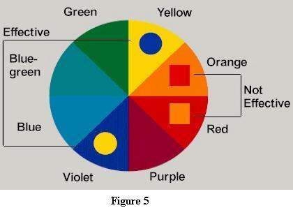
Sufficient contrast for reading is a key factor when considering accessible colors on webpages - not only for page text but also in images. Even totally color blind readers can differentiate similar colors which contrast bright with dark. Avoid contrasting hues from adjacent parts of the hue circle shown in the figure [10], especially if the colors do not contrast sharply in lightness. Avoid using (red - green - brown - grey - purple) (next to - on top of - changing to) (red - green - brown - grey - purple) [6].
Designers who practice proper color selection would select colors with greater contrast to make the information more pleasing to the eye. If for some reason this sort of color combination is necessary, another approach may be darkening one color and lightening the other, which is a way of increasing contrast.
When specifying one of the colors (BGCOLOR, TEXT, LINK, VLINK, ALINK), it is important to specify them all to ensure a pleasant and readable mix. Even when using a background image, BGCOLOR should still be specified, because the users may not have image loading on.
Table BGCOLOR should be used when necessary, since the text may become unreadable in a browser that doesn't support table BGCOLOR [3]. In addition, a foreground color should be specified with a background color as well (and vice versa).
Designers should avoid using colors in images to denote special areas, such as bar charts, maps and navigation bars. Instead, consider using textures or line shading instead [6]. An alternative is providing additional written labels.
Another issue is avoiding graphics which dither badly enough that they are undecipherable since some users may use grayscale or black and white displays [3].
Since color blind users may be able to decipher a text label easier than they can recognize an icon, providing text labels for all iconic elements and ALT="..." text for all images so they can be rendered by screen readers can be helpful. If users cannot understand your image they can reload with images off. Consider using JavaScript MouseOver events to provide status-line descriptions of images- especially maps and navigation bars [6].
Another issue is passing through operating system settings that will impact accessibility, such as color, contrast, and font size settings; cursor styles and blink rates, and system sounds [9].
An easier way to work with users is to leverage the same colors that they have chosen for the Windows operating system to use to display various user interface components. Using the Display Settings control panel applet, users will have already tuned the display colors such that Windows applications can be viewed and used. If the designers use the same color scheme, their web site should be safe. A drawback with this approach, however, is that it is not "browser neutral," since only Microsoft Internet Explorer currently uses these keywords [8].
There are some ways to test whether a page can be viewed by color blind users [4], [8]. In order to see whether a document still works without colors, it can be viewed with a monochrome monitor or browser colors turned off. Another way is setting up a color scheme in the browser that only uses black, white, and the four browser-safe greys and see how the page holds up. To test whether color contrast is sufficient to be read by everybody, printing pages on a black and white printer (with backgrounds and colors appearing in grayscale) is an option.
Web designers may test their pages online as well [19]. Bobby [27] is a Web Site Accessibility Verifier that checks a site for both accessiblility and correct HTML markup. If the page earns a four star rating, the designer may display the "Bobby Approved" graphic on the web page.
Conclusions
Color vision confusion or color blindness as it is usually known is a common impairment, affecting approximately eight percent of males and two percent of females. These individuals see a different range of colors, they confuse colors. Color blindness can express itself in many variations and degrees of severity.
Web sites, just like buildings, can be designed to meet the needs of all people, including those with disabilities. Unfortunately, most current web pages contain major access barriers.
Color perception problems are important considerations when developing web sites to ensure that all users have access to the content and the functionality of sites. Missing visual information can be as much of a problem as missing words in spoken sentences. What particular color is seen, how color is used does matter. If a color is a primary carrier of information and is confused or not seen, transfer of information is severely restricted.
The solution is to avoid using color as the only indication of what to do, or the information you are trying to get across. Instead, color should be used only as an unimportant hint to the users [8].
Although there is no one right set of colors that will fit the needs of all individuals with all color blind users, some guidelines will enable the majority of people with color blindness to access the web sites.
Resources and Web Links
Note: All the pages above are last accessed by the designer on April 2001.
- Coping with Color-Blindness, Odeda Rosenthal and Robert H. Phillips, Avery Publishing Group, New York, 1997.
- http://webexhibits.org/causesofcolors/2.html Why are things colored? Color blindness, November 17, 2001.
- http://www.anybrowser.org/campaign/abdesign.html Viewable with Any Browser: Accessible Site Designs Guide (Design Elements).
- http://www.w3.org/TR/WAI-WEBCONTENT/ Web Content Accessibility Guideliness 1.0, Wendy Chisholm, Gregg Vanderheiden, and Ian Jacobs, May 5 1999.
- http://www.suite101.com/article.cfm/5053/41178 Choosing Web Colour Schemes for People with Colour Blindness, Glenda Watson Hyatt, published on June 6, 2000.
- http://www.cimmerii.demon.co.uk/colourblind/design.htmlColor Blind Design, Andrew Oakley.
- http://www.visibone.com/vaccc/ Visibone. Web-safe colours and names, 2000.
- http://msdn.microsoft.com/workshop/design/color/hess10092000.asp Web Workshop-More or Hess: Can Color-Blind Users See Your Site? Robert Hess, October 9, 2000.
- http://www.afb.org/info_document_view.asp?documentid=198 Fact Sheet: Creating Accessible Computer Applications (American Foundation for the Blind), June 1, 1998.
- http://www.lighthouse.org/color_contrast.htm Effective Color Contrast Designing for People with Partial Sight and Color Deficiencies, Aries Arditi, 1999.
- http://www.webtechniques.com/archives/2000/08/newman/ Considering the Color-Blind, Chuck Newman, Aug 2000.
- http://www.delamare.unr.edu/cb/ About Color Blindness, Andrew Oakley.
- http://www.inform.umd.edu/EdRes/Topic/Diversity/Specific/Disability/Issues/Webaccess/Unidesign/colorblind.html Color Blind Friendly Web Pages.
- http://www.firelily.com/opinions/color.html Color Perception Issues, Diane Wilson, 1996-1998.
- http://www.webdesign.about.com/compute/webdesign/library/weekly/aa080800a.htm Designing for the Color Blind, Jean Kaiser, 2001.
- http://www.washington.edu/computing/training/560/zz-tufte.html Graphics and Web Design Based on Edward Tufte's Principles, 1999.
- http://language.perl.com/misc/div-www.html Diversity Compliance in Web Design, Tom Christiansen.
- http://www.tlc-systems.com/webtips.shtml Art and the Zen of Web Sites, Tnoy Karp, March 21, 1999.
- http://newmanservices.com/colorblind/default.asp Newman Color-Blind-Design Evaluation - 3 ways to see what your colors look like to the color-blind, 1997.
- http://www.vischeck.com/ Vischeck Color Blindness Simulator.
- http://www.microsoft.com/usability/webconf/lowney/lowney.htm Microsoft Usability: Designing for the Web: Empirical Studies, October 1996.
- http://orlab.optom.unsw.edu.au/ICVS/ International Colour Vision Society Web Page, Stephen Dain, February 12, 2001.
- http://www.ems.psu.edu/Research.html EMS | Recent Research Studies Map Makers Can Avoid Confusing the Color Blind.
- http://www.msg.ucr.edu/it/colorblind.html ADA Issues for the Color Blind-Academic Computing Color Blindness and the Web, Leo Schouest, July 12, 2000.
- http://www.iwss.ilstu.edu/services/web_colors.shtml IWSS - Color-blind Testing.
- http://members.aol.com/nocolorvsn/color2.htm What is Color Blindness and the Different Types.
- http://www.cast.org/bobby/ Bobby, 2000.
- http://trace.wisc.edu/world/web/ Designing More Usable Web Sites.
- http://www.colorfield.com/insight.html Colorfield Digital Media, Inc., 2000.
- http://www.visibone.com/colorblind/ Color Deficient Vision Simulation in the Web Designer's Color Card and Chart, 2000.
- http://www.toledo-bend.com/colorblind/index.html Colors for the Color Blind.
- http://innovate.bt.com/people/rigdence/colours/colours2.html Safe Colours - Transformations, Christine Rigden, 1998.
Home | Audio | DIY | Guitar | iPods | Music | Links | Brain and Problem Solving | Site Map | Contact
![]()
