|
|
Home | Audio | DIY | Guitar | iPods | Music | Brain/Problem Solving | Links| Site Map
This work is licensed under a Creative Commons License.
Universal Usability Web Design Guidelines for the Elderly (Age 65 and Older)
Introduction General Recommendations Specific Guidelines Examples Future Progress Resources
Haixia Zhao
Department of Computer Science
University of Maryland, College Park, MD 20742 USA
haixia@cs.umd.eduApril 2001
Introduction
The use of computers in everyday life, particularly the Internet, is growing at an astonishing rate [2]. The idea of universal usability has been put forward to address the problems of building "An Information Society for All". Ben Shneiderman proposed three challenges to attain universal usability for Web-based and other services [5]: technology variety, user diversity, and gaps in knowledge. While a variety of groups and organizations are working on hardware and software accessibility [16,17], how to design an easy-to-use interface that accommodates all user communities remains a major task.
On the other hand, the population of older people is increasing at an extraordinary rate. People 45 years and older will soon make up more than half the adult population, and people 85 years and older are the fastest growing age group [2]. While technology is rapidly being integrated into most aspects of life, changing the nature of work, the form and scope of personal communication, education, health care delivery, and home, older people are highly likely to be active users of technology [3].
Though studies show the attitude of the elderly towards computers is no different than younger adults [3], elderly people do face age-related difficulties in accessing and using technology. To achieve universal usability for the elderly, we need to understand the implications of age-related changes in functional abilities for the design and implementation of computer systems. This topic has received increased attention by researchers and organizations [3,4,6,8]. A lot of work has been done regarding the physical and mental changes associated with aging, acceptance of technology by the elderly, training, and hardware and software design [3]. Some recommendations have also appeared regarding hardware considerations, input device choices, training methods, and software issues for the elderly [3][4].
Instead of addressing the broad topic of universal usability for the elderly, this paper aims at providing web site design practitioners with some recommendations and guidelines in designing web pages to accommodate older people (age 65 and older).
General recommendations
There are two obstacles that retard the universal usability for the elderly. First, most of the current elderly population has spent the bulk of their life span without computing technology, so they usually have either no or very limited experience with the technology. In addition, the elderly usually face a number of technology accessibility impediments related to income and education. A 1995 study conducted by the American Association of Retired Persons (AARP) [13] indicates that income and education are far more important in determining universal access than age [15]. Thus, any recommendations and guidelines regarding novice users, users with lower incomes and education also apply to elderly people. (See other papers on this web site.)
Second, elderly people face technology usability impediments related to physical, mental, and cognitive impairments. Although these impairments vary a lot among elderly people, what is known is that certain abilities related to vision, hearing, psychomotor skills, attention span, and memory can degrade with age. Older people show a reduction in the width of their visual field, light sensitivity, color perceptions, resistance to glare, dynamic and static acuity, contrast sensitivity, visual search and processing, and pattern recognition. Hearing, especially the ability to hear higher pitched sounds, declines with age, as do response times for certain complex motor tasks and the ability to pay attention to particular details in the presence of distracting information. Older people speak less fluently with more evidence of language planning deficits. Their reasoning ability also declines. Short-term memory does not decline much with age, but spatial memory and working memory do show impairment, which are significant predicators of learning difficulty [3,4]. So the goal of improved interface design is to minimize the burden on all these aspects, such as demands on spatial memory, working memory, visual functions and motor ability, when designing a web site.
The next section focuses on specific guidelines for web page design. Considerations regarding hardware, input devices, and software issues can be taken care of by standard accessibility options. For example, Microsoft Windows has Accessibility Options in Control Panel that enable keyboard resetting for people with mobility impairments.
Specific guidelines
Color
Aging is associated with decline in color discrimination ability and contrast sensitivity. [3]. Elderly people have reduction in the transmission of blue light, have more trouble sorting or matching colors, and make more errors in the short wavelength and blue-green regions than in the other color regions [1]. To make effective color choices, designers need to know the three perceptual attributes of color: hue, lightness and saturation [10]. Hue identifies specific colors, such as blue, yellow and red. Lightness corresponds to how much light appears to be reflected from a surface. Saturation is the measure of a color's intensity. When choosing color combinations, consider colors that have differences in all three of these areas to provide maximum legibility.
Choose complementary colors: The color wheel is a tool that arranges the colors of the spectrum by hue. It is recommended to choose colors from opposite sides of the color wheel, e.g. when choosing a primary color such as blue, its complementary color would be orange [10].
Avoid some colors: Colors that are exceptionally bright, fluorescent, or vibrant can have edges that appear to blur and create after-images, which tire the eyes [6]. For example, yellow text is very difficult to read. A light type color on a dark background can cause the type to appear to "close in itself" [14]. Avoid short wavelength and blue-green regions.
Maximize the contrast between foreground and background colors: To maximize contrast, always use dark types on light or white backgrounds, exaggerate lightness differences between foreground and background colors, and avoid using colors of similar lightness adjacent to one another, even if they differ in saturation or hue (see the figure on the left). It is a good practice to choose dark colors with hues from the bottom half of the color wheel against light colors from the top half of the circle. Avoid contrasting light colors from the bottom half against dark colors from the top half. Also, be aware that people with color deficits will see less contrast between colors. So it helps to even lighten light colors and darken dark colors [10].
Don't rely on color alone: Ensure that all information conveyed with color is also available without color. Test your site by viewing it at different resolutions and color depths. For example, you can change your monitor settings to a resolution of 640x480 and 16 bit colors for one test, change to 1024x768 and 24 bit color for another, and use a non-color display for the third. Try to print out your pages since they may look quite different on paper than from what they appear on the screen.
Font
Choose fonts by legibility: To ease reading, choose fonts based on their legibility, and avoid using several types of fonts mixed together or very narrow or decorative fonts. Keeping to the most basic and common fonts may not seem very exciting, but it ensures that what you design is exactly what the users see. Drop shadows on text, often used to give words the appearance of depth, can also be difficult to decipher. Avoid using too many different fonts.
Use at least 12-point size: Larger font type is easier to read. For most seniors, twelve to fourteen point fonts are recommended for body while headlines and titles are typically two points larger. Those with partial sight may require a 16 point font or above [6,14].
Use relative sizes: Use relative font size, don't use any coding that will limit users' ability to set his or her own font, font size, or colors. Insure this applies to both content and navigation elements on your Web site. When a user enlarges a Web page, text images, including logos, banners and buttons are not enlarged with the rest of the text on a page. So avoid using them or make them initially larger. Also, be aware of navigation bars and other crucial elements that cannot be resized [6].
Typefaces: Font families come in two general categories: Serif and San Serif. Serif fonts include extra feet at the ends of the strokes and vary in line weight within the shape of each letter. For print applications, serif typefaces are more legible because the serif adds differentiation between letter forms, yet on lower resolution and small monitors, this may not always be true. Examples of serif fonts include Times New Roman or Courier. Sans Serif includes fonts such as Arial and Verdana [14].
Times New Roman is more legible. Arial is less legible.
Courier is more legible. Verdana is less legible.
Type weight: Many typefaces are available in light, narrow, bold, or extra bold. While boldfaced text may appear larger, its readability is decreased. Use bold only to emphasize a title or a key word [14].
Don't use all capital letters: Using all capital letters decreases readability. While sometimes used for design purposes, it tends to lead to higher levels of eyestrain and eye fatigue because there is too little differentiation between the letters, and the eye does not get a visual breather. At best, only use capital letters for key words or titles. Capitalize the first letter of each word in a heading instead of all of it, although bold type is recommended as a more effective alternative [6].
Navigation mechanisms
Avoid a very deep hierarchy: Due to spatial and working memory decline, elderly people are more likely to get lost while navigating a web site. So always avoid a very deep hierarchy. Providing clear and consistent navigation mechanisms -- orientation information, navigation bars, a site map, etc.-- will increase the likelihood that a person knows his or her location and will find what he or she is looking for at a site [8].
Provide information about the general layout of a site: For example, a site map or table of contents shown in a consistent position can describe the site layout, highlights and explain available accessibility features. The user can also easily tell his current position by a mark on the site map or table of contents.
Consistently underline links: It has been standard practice that underlined text is a link. Links without underlining are not easily recognized as links, and underlined text that does not respond when clicked can be frustrating. To make navigation mechanism consistent and easier for users, ensure your links are consistently underlined to make them identifiable, and also recognizable to "screen readers" (A screen reader is a software program that reads the contents of the screen aloud to a user. It is mainly used by blind individuals. It can usually only read text that is printed, not painted, to the screen.). Conversely do not underline text or headlines that are not a link [14].
Sound
Use lower frequency tones: The ability to hear higher pitched sounds declines with age. Interfaces that use sound to get the users attention will need to use lower frequency sounds for older user. It is found that a beep that swept a range of frequencies including the 500-1000 rage was reasonably effective [4]. Recorded voice should make use of speakers with low pitched voices.
Content
Always provide text equivalent to auditory and visual content: Provide a text equivalent for every non-text element, such as images, graphical representations of text, image map regions, animations, ASCII art, graphical buttons, sounds, stand-alone audio files, audio tracks of video, and video. (Use Alt tag in HTML). The power of text equivalents lies in their capacity to be rendered in ways that are accessible to people from various disability groups using a variety of technologies [8]. Text can be readily output to speech synthesizers, and can be presented visually (in a variety of sizes) on computer displays and paper. Synthesized speech is critical for individuals who have reading difficulties.
Provide non-text equivalents to text sometime: On the other hand, providing non-text equivalents (e.g., pictures, videos, and pre-recorded audio) of text is also beneficial to some users, especially nonreaders or people who have difficulty reading.
Minimize irrelevant screen information: Decline occurs in visual search skills and selective attention with age. Older adults have difficulty processing complex or confusing information and are more likely to experience interference from irrelevant information [3][7]. Therefore only necessary information should be presented on the screen and important information should be highlighted. Use only simple, highly relevant graphics.
Layout & Style
Use large areas of white space and small blocks of text: Large areas of white space and small blocks of text increase readability, making pages cleaner looking and easier to navigate [6]. If possible, use short text or lists to paragraphs of text [4]. However, larger blank space causes larger pages that mean more scrolling. In this case, consider including internal links within longer pages so users can jump from section to section with a single click. It is suggested to leave a wide margin of 1 1/2 or more inches on the right side of the page to maximize usability with different monitor types, window sizes and display resolutions.
Clear organization of content: Information organization on a screen is important as visual search skills and selective attention decline with age [3]. Principles of perceptual organization, such as grouping, should be applied [3]. Put related information together, because older users are likely to have to work harder to compare screen objects that are widely separated. Proper color coding also helps to make information organization clear, thus make the page easier to read.
Paragraph alignment: Use short line lengths and left justified text. Left-hand justification offers the highest level of readability. Center justification other than for a title, should be avoided.
Use short line lengths and left justified text. Left-hand justification offers the highest level of readability. Center justification other than for a title, should be avoided. |
Use short line lengths and left justified text. Left-hand justification offers the highest level of readability. Center justification other than for a title, should be avoided. |
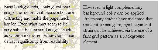
Keep background simple: People with low vision, or those using black and white monitors, can have difficulty reading information at sites with busy backgrounds. Background patterns, floating text over images, or colors that obscure text are distracting and make the page much harder [1]. Even what may seem to be very subtle background images, such as watermarks or embossed logos, can detract significantly from readability [6]. However, a light complementary background color can be applied. Preliminary studies have indicated that reduced screen glare, eye fatigue and strain can be achieved via the use of a faint grid pattern as a background element [14].
Text as a background: Text in itself provides a complex background. Within text, older users may have target acquisition problems when locating the typical carets used to indicate the current insertion position. This could be made more difficult if the blink rate for a caret gets close to the lowered critical flicker frequency for older adults or the caret lies at the edge of the reduced visual field. Perhaps the insertion point caret should be customizable, e.g. a slow blinking, red caret.
Minimize blinking images and animation: Animation, or any quickly flashing or blinking elements, are highly distracting to peripheral vision [6]. They distract people's attention from focusing on the main information, as well as causing short-term memory loss, slower reading speed, and compromise reading comprehension. With the increased use of multiple advertising banners on Web pages, this can be a significant problem. One possible way to alleviate this problem is to allow users to pause or stop animation, flashing or blinking elements as described in the next guideline.
Ensure user control of time-sensitive content changes: Elderly people may not be able to read moving text quickly enough. Movement can also cause such a distraction that reading is even slower and more difficult. If the people have mobile disability, he or she may not be able to move quickly or accurately enough to interact with moving objects. So try to avoid using moving, flicking, blinking, scrolling, or auto-updating text, objects or pages in your design. If inevitable, at least ensure that they may be paused or stopped with adequate feature control mechanisms provided to the users. [8]
Provide additional cues: Designs which use depth perception to convey information should provide additional cues in the case of older users. Never expect older users to detect small movements but instead find more obvious ways of indicating changes.
Provide larger graphics and click targets: Aging is usually associated with impairment in motor ability. Simply double-clicking a mouse or scrolling proves difficult for some elderly people, especially those with hand function restrictions [3], so make all graphical links and buttons large and easy to click on. Sometimes ease of use can be enhanced by increasing the size of the area around a link, making it hot as well. Never ask people to click on a moving target.
Education
Provide easy to use on-line aiding and support documentation: Elderly people are usually novice users (see the paper about novice users on this web site for guidelines). Many of them are unaware of the level of customization available with their computer and software, and there is a peripheral upgrade possibility. It helps to provide a link or downloadable document that explains the options they can use to control the interface and software programs, such as resize the cursor, set up single-click mouse control, set browser preferences (colors, fonts and backgrounds). Tutorials can be found online, such as Microsoft [11]. Check the web sites of common operating system (Microsoft, Apple, Linux) and browser software company (Microsoft, Netscape, AOL, etc.) for the information, and make it available on your web site.
Other
Page size: Many elderly people access the Internet through slower modems. See other paper on this web site for guidelines for users with low connection speeds.
Test you web site: Test your web sites for usability. There are a lot of tools on the Internet that can help you, such as BOBBY [9].
Examples of successful web sites
Fortunately, the issues of web usability for the elderly are gaining more and more attention. A lot of web sites have quite successfully incorporated special considerations for older people into their design Here are some examples.
SeniorNet (http://www.seniornet.org/) [12] is a nonprofit web site providing adults 50+ both access to and education about computer technology and the Internet to enhance their lives and enable them to share their knowledge and wisdom. For most parts, it uses black text on a white background, which is a conservative combination but is very effective. There is no exceptionally bright or fluorescent colors, even the hyperlinks have been colored dark red to avoid the blue region. A tree-structured site map, which shows the main contents, is accessible from every page, with the current position marked by a small red ball to the left of the index or a different color for the index in the site map. Users can keep track of their current position easily and change to other pages by a simple click on the site map. The whole page has a simple and clear layout, with large areas of white space and small blocks of left justified text. The page width is designed to fit down to 640-pixel wide screen resolution. Relative sized fonts are used so they can be resized. Though some parts, such as the banner and site map do not resize, they are a reasonable size for most elderly. The background is simple. There's no distracting element such as fast blinking images. The advertisement on the top of the pages changes smoothly. All graphics are carefully chosen, and with text description.
American Association of Retired Persons (AARP) (http://www.aarp.org/) [13] is an organization for people age 50 and older. It serves their needs and interests through information, education, advocacy, and community services, which are provided by a network of local chapters and experienced volunteers throughout the country. Its web site is another good example of all the successful points mentioned in the previous paragraph about SeniorNet.
As said in the previous section, a light complementary background color, such as a faint gray can reduce screen glare, eye fatigue and strain. Microsoft Windows use light gray as default frame color. This application can also be found in web sites such as http://www.agelight.org/. Agelight also provides some examples that offer different versions for downloadable documents based on users modem speed [14].
Future progress
Although research in the area of aging and interface design has grown, and some important findings and guidelines have been proposed, our knowledge is still limited in some areas. Research needs to further evaluate such issues as the effect of target sizes, the level of complexity, memory commands, etc. and, in addition, answer these important questions. How problems specific to aging are distributed though all ages? Will the predicted vulnerability of older users change? How older users learn new interface, and how deeply they model applications and complex documents? Do those older users who are successful in using interfaces have compensatory strategies that can be usefully shared with other older users and better supported by the interface? How interface style interacts with the motivation of older users, and how interface designs can support training that suits older groups. How stress affects and is affected by interface use for older users? [9]What are the best screen design and input devices for older people? Speech recognition devices may be one alternative, but efficient and accurate software needs to be developed to cope with slower speech [2].
For practitioners, there is still a far way to go before universal usability is a reality for most web sites. Practitioners need to keep in mind the special needs of elderly people when designing and include older users in usability testing. Furthermore, they need to carefully consider appropriate trade-offs in what may be called the "inter-generational fairness" [9]. It is not just a matter of whether interface designs allow older users access to software's services, but also whether we can design for older users without crippling the power of interfaces to serve younger users.
Resources
[1] Bernard, Michael, Criteria for Optimal Web Design (designing for usability), [online April 15, 2001] http://wsupsy.psy.twsu.edu/optimalweb/
[2] Browne, Hilary, Accessibility and Usability of Information Technology by the Elderly, [online April 15, 2001] http://www.otal.umd.edu/UUGuide/
[3] Czaja, Sara J., Handbook of Human-Computer Interaction, second edition, Elsevier 1997
[4] Hawthorn, Dan, Possible Implications of Aging for Interface Designers, Interacting Computers 12(5) (April 2000): 507-528.
[5] Shneidrman, B. Universal Usability: Pushing Human-Computer Interaction Research to Empower Every Citizen, Communications of the ACM, May 2000.
[6] Spiezle, Craig. Effective Web Design Considerations for Older Adults, Seattle, WA., May 1999. [online April 15, 2001] http://www.microsoft.com/seniors/default.asp
[7] Plude, D.J. and Hoyer, W.J., "Attention and Performance: Identifying and Localizing Age Deficits", in N. Charness (ed.), Aging and Human Performance (pp. 47-99). New York: Hohn Wiley.
[8] World Wide Web Consortium. Web Content Accessibility Guidelines 1.0. May, 1999. [online April 15, 2001] http://www.w3.org/TR/WAI-WEBCONTENT/. It also provides checkpoints and techniques for HTML implementations of the accessibility guidelines.
[9] BOBBY, 1996, [online April 15, 2001] http://www.cast.org/bobby/. This free interactive tool provided by CAST helps Web designers analyze their sites for usability for all Internet users, including those with disabilities.
[10] Lighthouse International, [online April 15, 2001] http://www.lighthouse.org/color_contrast.htm
[11] Microsoft Accessibility Technology for Everyone, [online April 15, 2001] http://www.microsoft.com/enable/. Provide guides of customizing Microsoft Products for people with vision impairments, hearing impairments, mobility impairments, cognitive and language impairments, and other resources.
[12] SeniorNet. San Francisco, CA., March, 2000. [online April 15, 2001] http://www.seniornet.org/. SeniorNet is a nonprofit web site providing adults 50+ access to and education about computer technology and the Internet to enhance their lives and enable them to share their knowledge and wisdom.
[13]AARP (American Association of Retired People). [online April 15, 2001] http://www.aarp.org/. AARP is an organization for people age 50 and older. It serves their needs and interests through information, education, advocacy, and community services, which are provided by a network of local chapters and experienced volunteers throughout the country.
[14] The Age Light Institute, A guide for web design usability for users of all ages, March, 2000. [online April 15, 2001] http://www.agelight.com/. Age Light is a company aiming at increasing the understanding of the needs, lifestyles and activities of all active adults and seniors.
[15] Too Old for Computers? Portland, Oregon, August, 1999. [online April 15, 2001] http://web.pdx.edu/~psu01435/tooold.html.
[16] European Union, [online April 15, 2001] http://europa.eu.int/. EU is running the Telematics Application Programme to encourage and fund assistive technology projects that aim at integration of the disabled and elderly.
[17] International Conference on Technology and Aging, [online April 15, 2001] http://www.icta.on.ca/. The conference is a place where people, including designers, researchers, policy makers, senior consumers, industry representatives, and homecare program operators exchange their ideas and experiences in order to explore how the technological revolution can contribute to a positive quality of life as people age.
Home | Audio | DIY | Guitar | iPods | Music | Links | Brain and Problem Solving | Site Map | Contact
![]()